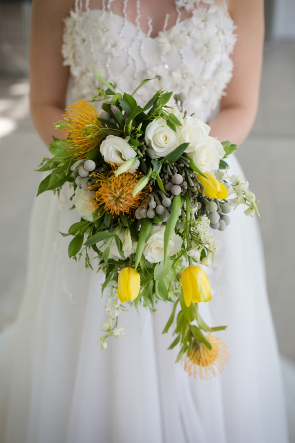
Afternoon lovelies! Very excited to share this styled shoot with you today, which comes from a very talented team of suppliers, including photographers Heathyr Huss and Nicole Rich, as well as event designer Nicola Jane Wedding & Event Specialist. The theme of the shoot was Nutopia, a romantic infusion of citrus and slate. I am always a huge fan of modern wedding styling, especially when it uses innovative colours or textures and this shoot is chock full of lovely ideas to inspire you. First of all, it is sunshine yellow, which has to be the most cheerful colour ever. With a healthy dose of citrus detailing and gorgeous flowers (including pincushion proteas, my best), parts of the look are really organic and certainly very summery. And did I mention the romance of the dresses? Wow, Elbeth Gillis gets me every time! These soft aspects contrast with some industrial elements – not scary industrial though, pretty modern industrial. As in, hanging bulbs, concrete planters (LOVE this idea), and slate grey which really makes the lemon yellow pop. The whole look is fresh and elegant and gorgeous!Read More
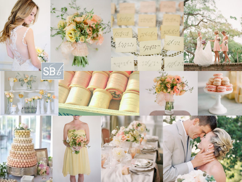
Time for some proper gorgeousness my friends. Peach has been beautiful in many ways this year, but today it is especially beautiful in the company of a soft lemony pastel yellow. It’s sweet and delicious, like a cup of cool sorbet on a summer afternoon. How amazing are the rananculus bouquets? Not to mention a bit of portrait lace back perfection on the bride. When you choose a colour scheme like this one, you don’t need to go overboard – choose a light, bright, white venue and fill it with pastel and gently ombre details and a bit of milk glass (real or imitation), and then just let the colours and the season speak for themselves. Awesomesauce.
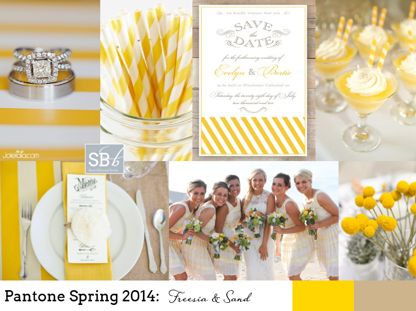
How I do love a new set of colours to play with! And I must say, I think the bold, bright yellow of Pantone’s Spring 2014 collection, ‘Freesia’, may be my fave. It immediately reminded me of the bold yellow stripes that characterise a great place I went to last week in Abu Dhabi, the Monte Carlo Beach Club – everything there is kitted out (tastefully) in preppy yellow and white stripes, and it looks amazing. Paired with ‘Sand’, another of Pantone’s 2014 picks, you have the makings of a perfect beach wedding, or even of a rustic farm look. As always, be sparing with the brights, let them punch out. And punch is certainly what this colour does! Love it.
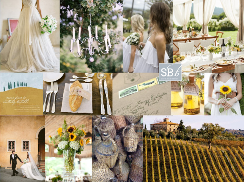
Okay, this is about to be a jealous-making post. Because tomorrow, bright and early, I’ll be jetting off to Bella Toscana for three weeks in some of the most heartbreakingly beautiful scenery on earth. Picture every Tuscan vineyard you’ve ever seen in a film? Yup, exactly like that. I can’t wait! I’ll be working hard under the summer sun, but I’m actually looking forward to it – and to my ‘farmer tan’! ;) As promised, the blog will continue as if nothing has changed, but please be patient if emailing me, because I am officially off the grid. In fact, that’s something I’m almost as excited about, since for the last few years I’ve been constantly connected to some kind of electronic or social media, and it’s time to switch off and just be in the moment. So to celebrate my trip (YAY!), I’ve created a Tuscan-style inspiration board. There were a lot of ways I could have gone with this – understated olive leaf and grey, lavender and green… But one of the things I love about Tuscany is its warmth and abundance, and the fields of sunflowers I saw for the first time from a train window many years ago. These flowers are gorgeous, but they can be overpowering, so I’d just use single blooms for the bridesmaids and then in sporadic arrangements in the reception venue. Include materials such as terracotta and linen, and the straw covered bottles that traditionally hold chianti (called a fiasco, how fun is that?). Fabrics are floaty, and an open sided marquee with long tables is a must (or just set up under the trees). Tuscan olive oil is the best (believe me, I plan to eat lots of it!) and makes the perfect favour. So there you go. And here I go! See you in a month!
Colours: Sunflower yellow, olive green & Tuscan terracotta
Hello lovelies! How has your weekend been? Mine was awesome, but stressful – only two weeks left to get everything done before I take my month off. The good news is that I have lined up a TON of gorgeousness for you on the blog while I’m gone – all fresh new posts, real weddings, trend roundups, inspiration boards etc. The bad news is that I feel like I haven’t slept since June. Ah, the things I do for my readers! ;) Anyway, it’s been hard to work with the sun out, and that same summery feeling is what I wanted to bring to today’s inspiration board. I’m still so in love with Pantone’s Spring 2013 colour palettes, and a combination I’ve been wanting to do since I first saw them is this one: grayed jade, lemon zest and African violet. I love how the three colours complement one another and are so fresh and pretty together. Greyed jade and soft purple together are so calming, but the pop of bright yellow really livens them up. Perfect for a summer wedding!
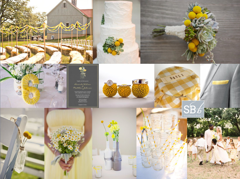
Hey friends! It’s been a little while since I did an inspiration board request, but today we have a gorgeous yellow board for reader Cheri. She’s planning a barn wedding (LOVE barn weddings!) at a rosemary farm, with the ceremony in a flower maze – how pretty is that? They’d like a relaxed, old farmhouse feel, with a palette of yellow, grey and white reflected in the flower combination of succulents, billy balls and baby’s breath. They’re also planning to use old jam jars and wine bottles, which I think is a great idea. I absolutely love yellow as a wedding colour, because it’s so happy and sunny and bright – it immediately sets the tone for smiles all day long. Succulents and billy balls make an awesome combination – isn’t this bouquet lovely, and that cake! – and I like the idea of recycled glass throughout. I’m especially a fan of painted wine bottles used as vases – they work beautifully here, don’t they? I’d add succulents in small wooden crates to the table decor as well. Although Cheri plans to use baby’s breath (which is lovely), I’m also a big fan of little daisies for this wedding theme – look how pretty the bridesmaid bouquet is below. And I also like the idea of a very, very subtle yellow gingham motif, perhaps for preserve favour tops and on the groom’s pocket handkerchief. Finally, you can really make the ceremony area pop with ribbon aisles, like the one above – they really add that carnival feeling. Hope you like your board, Cheri!
Get ready for wedding gorgeousness you guys! I have been dying to share Lana and Albertus’ wedding for a while now, and you don’t have to look much further than the sparkly bridesmaid dresses to see why! But in fact, that’s just one (very) pretty detail in what is otherwise a light and bright, clean yellow wedding with sweet origami touches and a lovely summery feel. It all comes together so perfectly! Chevron is something we’ve been seeing a lot of, and I think the print is used so perfectly here – nice, subtle touches like the groomsmen’s ties, the ring pillow and the dance floor. The result is a look that’s very much of-the-moment, but to be honest, I don’t feel that you’ll look back on this and feel it’s very dated in years to come, as the basic blank canvas is very classic. And isn’t that what so many brides aim to achieve? Great job, guys! And speaking of great jobs, as always I am LOVING the pics from the awesome Moira West – she always captures the look of a wedding so beautifully.Read More
Good morning, SouthBound Brides, and a special welcome to all the new readers with Valentine’s Day proposals! You know, as you all start planning, some of you will find that you have a clear vision – a palette you’ve always loved, a style that’s distinctly your own, a venue that dictates where you go with your decor. But for others, it’s harder. You like some of this, some of that. I get the feeling that the bride who requested today’s pretty board falls into this category (and if you do too, worry not – it’s completely normal!) In her mail, Shylet asked for a board for her summer Zimbabwean wedding. She wanted it to be chic and contemporary, but she also wanted it to be vintage. She wanted extravagant centrepieces and a cake, but she also wanted DIY. It could be a bit of a mishmash, but I think I know what Shylet is after. See, what many brides now think of as vintage – lacey, girly, prettiness – doesn’t have to be old fashioned at all. And items can be DIY without looking crafty. It all starts with a great palette, and Shylet definitely has that covered – with purple, yellow and grey as her colours (I opted for a pretty violet that goes so nicely with a fresh lemon zest yellow!). In putting the board together, I immediately thought of this SBB wedding – notice how the tables have dramatic tall arrangements (made of baby’s breath, which saves a ton) as well as lower arrangements for colour. It’s a very effective look. The bride also chose an amazing cake, which was a replica of the stunning Peggy Porschen creation below. Team this with soft bouquets and frosted lemons on platters for a really elegant look. I’d limit DIYs to things like this pretty wall of table plan frames, or maybe to interesting favours (Martha Stewart’s Good Things are the perfect place to look for this sort of idea) – that way you can feel that you’ve made your personal mark without changing the overall sophistication of the look. Hope you like your board Shylet!
Sometimes I get the COOLEST requests for inspiration boards, and I have been looking forward to this one for a while. Reader Leigh-Anne mailed to tell me about her trendy urban meets country chic summer wedding, with bold black and white stripes and punches of yellow. The relaxed but elegant celebration will feature a number of fun touches to reflect their hip personalities, including black Converses, a braai menu, orchids, peonies and a Vespa! Wow. The board kind of created itself! First stop was a great table setting (check out this wedding for more) – I love the striped table runners and the yellow chargers, and bringing in an organic yellow (lemons) is a fun nod to the country chic aspect. I love the soft flowers, especially this yellow orchid bouquet, and the white painted mason jars are the coolest. Stripes of course are a big motif – as well as the table runners and invitations (how stylish are those envelope liners?), I have fallen in LOVE with these striped Bruno Frisonis, but alternatively you could pair a yellow shoe with a striped sash (I know Leigh-Anne is planning some Louboutins). Bridesmaids could also do stripes, but I love these black belted yellow numbers (especially if paired with soft white bouquets) and stylish heels. I love the idea of the groom in a yellow bowtie and suspenders (reflecting the stripes) – and they go perfectly with the Converse look. I love the sound of a braai menu, and it made me think of what photographer Christine Meintjes told me about her sister’s wedding, where they had a braai station with all sorts of mini braai treats during cocktail hour. So cute. Finally, for equally stylish guests (and fun photos), give cheap shades as a favour, and then ride off into the sunset on a yellow Vespa. Just one last tip for Leigh-Anne, not pictured here, is to grab some black and white striped washi tape – there will be a zillion fun last-minute uses for it. Good luck with the rest of your planning Leigh-Anne, can’t wait to see your wedding!
I’ve had such a brilliant reaction to the inspiration board I posted last week, with rich shades of red, orange, yellow and copper, that I know you’re going to love today’s classic autumn wedding. In fact, autumn seems to be a bit of a thing here this week, but it’s such a beautiful season – I have only to look out of my office window at the tapestry of leaves all over our garden to be inspired. So I was delighted a while back when my lovely friend Nicola told me she was booking an autumn wedding and really embracing the season and the palette; I knew it would be gorgeous. Nix is another of my varsity girlies – she was my partner in crime back in the day (we even shared a 21st – it rocked, if I say so myself) and I’ve seen her grow from a farm girl from Estcourt into a switched-on sophisticate (albeit a fun and down-to-earth one), and this was one wedding I was devastated to miss. Especially since Nix married the loveliest man, and I wanted to be among the first to wish them the happiest of lives together. But instead, I get to do that here, and to relive their special day through Nix’s words, and KZN photographer David Rees’ pictures. I am so loving the colours in this wedding, especially since they work perfectly with the natural backdrop of the season. Who needs a summer wedding, right? I for one think Nix and Col are onto something.Read More