
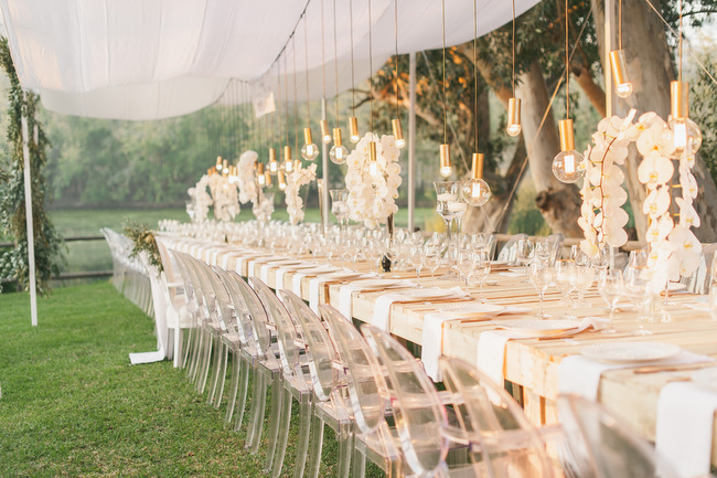
Hello lovely ones! I’m super SUPER excited today, because I finally get to start rolling out the brand new, all-singing, all dancing (okay, it doesn’t sing and dance, but it’s still pretty awesome) SBB Collection, our new directory specifically for venues. We’ve been working with the best of SA’s places and spaces over the last few months, and we’ll be adding them in small groups over the next couple of weeks so that you get a chance to ‘meet’ them all properly, before the full directory is in place. At which point you’ll also be able to download it as a pretty (and handy) magazine! Yay! (Be sure to check it out HERE.) And here’s one of the reasons I love our new directory so much – we’ve tried to make sure that the listings are not only pretty but extremely functional – we’ve included all the info you need to know before making an enquiry or heading out for a site visit. After all, we know what it’s like – you get engaged, you see some gorgeous places online, friends are throwing recommendations at you every day… ack! It’s overwhelming! And while there’s the exciting stuff (the style! the features! that adorable place for photos!), it’s the practical aspects you need to keep an eye on because the last thing you want to do is fall in love with a venue that’s too small for your guest list, for example, or isn’t available on that date you’ve already carved out as yours. Because let’s be honest, some things are just going to be a non-negotiable, but those things vary from couple to couple. So, to help you out, we’ve compiled the essential list of questions to ask when researching venues (take a peek at the bottom at how our new listings answer them!).


