Pantone Spring 2014: Placid Blue & Hemlock

Time for some more inspiration! And I must admit, I am excited to see the reaction to this one. In the last while I’ve been noticing a drift toward the pairing of pale green and blue, and even though Dazzling Blue is the lead colour for this collection, the combination of Placid Blue and Hemlock is my tip for the perfect contemporary wedding look and one I think we’ll be seeing quite a bit of in 2014. It’s such a cool, fresh combination – so chilled and so elegant, and I love how it combines with elegant country details effortlessly, including lots of organic greens and blues. Like diving into a cool pool of water at the bottom of a shady garden. Don’t you love it?

Colours: Placid Blue & Hemlock

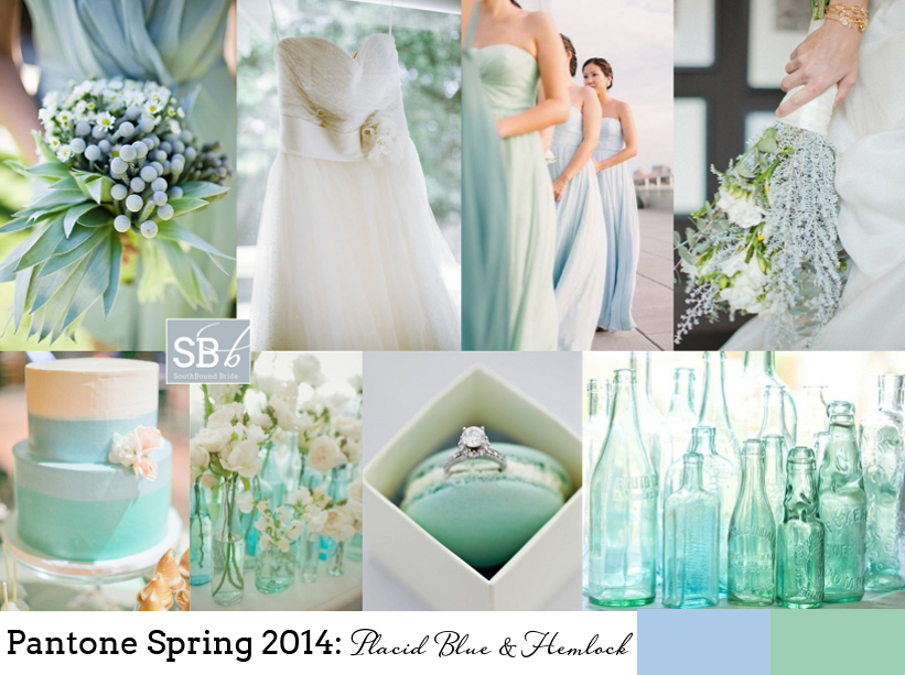
Top row (l-r): Bridesmaid’s bouquet {Anna Kuperberg}; dress {Scott Piner Photography}; bridesmaids {Judy Pak Photography/Bella Bridesmaids}; bouquet {Scott Andrew Studio/Tracy Taylor Ward Design}
Row 2: Cake; flowers in bottles {Pobke Photography/White Room Events}; macaroon with ring; bottles.


Pantone Spring 2014 Colour Report

Happy Wednesday, friends! Today we’re continuing our celebration of the new Pantone colour report with even more fresh inspiration. The great thing about these reports isn’t that anyone expects brides to slavishly follow the new colours or feel like the ones they already have are ‘out’. But it’s a chance to take a fresh look at the colours you’re using, play with new combinations if you haven’t chosen a palette yet. But best of all, it’s an insight into the colours that are coming into homeware and fashion. Why should that matter? Well, as anyone who tried to find coral bridesmaid dresses three years ago will tell you, it does. When Emerald first made an appearance last year, I’d only seen it on celebrities – this year I have been spoilt for emerald images and bridesmaid dress options – even wedding dresses. So picking one or more of these colours might make your life easier if you’re planning a wedding in the next year. So those are the practical aspects. But for today, we’re just going to enjoy the colours. I really love this year’s choices – they’re not far off what we’ve seen before, but a bit more matte or with a bit more depth, or a bit lighter. Pastel blue and green are a big trend for 2014 in my view, and Hemlock and Placid Blue are perfect for that. The neutrals are also lovely – Paloma and Sand – just with a bit of warmth for grey and taupe shades. There are two very pretty purples – Violet Tulip and Radiant Orchid. And then some fabulous brights – Cayenne (LOVE this red), Celosia Orange and a gorgeous pop of Freesia yellow. But the colour that leads the collection is Dazzling Blue, a cousin of the blues that have been showing up for a couple of years now, that has really come of age. Get ready to see a LOT more of this one. This week we’ve already seen two full boards using the Spring 2014 colours, and there’ll be even more later today and Friday, but here I thought I would do some mini boards to inspire – which is your favourite combo?Read More

Pantone Spring 2014: Freesia & Sand

How I do love a new set of colours to play with! And I must say, I think the bold, bright yellow of Pantone’s Spring 2014 collection, ‘Freesia’, may be my fave. It immediately reminded me of the bold yellow stripes that characterise a great place I went to last week in Abu Dhabi, the Monte Carlo Beach Club – everything there is kitted out (tastefully) in preppy yellow and white stripes, and it looks amazing. Paired with ‘Sand’, another of Pantone’s 2014 picks, you have the makings of a perfect beach wedding, or even of a rustic farm look. As always, be sparing with the brights, let them punch out. And punch is certainly what this colour does! Love it.

Colours: Pantone Freesia & Sand

Top row (l-r): Ring {Joielala Photographie}; stripey paper straws; invitation; dessert {Grandes Fetes/Jessica Schilling}
Row 2: Place setting {Krissy Allori Photography + Courtney Jade Photography/Double Take Event Styling}; bridesmaids in yellow stripes; billy buttons {Nineteen Eighty Five/Christine Meintjes}.


Pantone Spring 2014: Placid Blue & Paloma

Morning, lovelies! It’s that time of the year again, when Pantone releases their spring colours. My favourite. I’m still being inspired by last years’ crop, in fact. That was, until I got a whole new ten colours to dream about. I’ll be doing a full roundup on Weds of the whole set of colours, but this week I’ll also be bringing you inspiration boards of my favourite colour combos, starting with today’s. I just love this soft blue, ‘placid blue’, especially when combined with the softest grey, ‘paloma’. So romantic! It’s also a lovely alternative if you’d been considering pastels or a blush and grey mix for your wedding, and I have a feeling we’ll be seeing a lot more of placid especially. Or just consider wearing a blue wedding dress in the shade – so unusual and gorgeous. I’ll be back with another board this afternoon, but meanwhile, what do you think?

Colours: Pantone Placid Blue & Paloma

Top row (l-r): Horseshoe escort cards {paper antler via style me pretty}; blue wedding cake with ruffles {Hey There, Cupcake!}; place setting {Jose Villa/Beth Helmstetter}; blue dress {Alicia Swedenborg}
Row 2: Watercolour invitation suite {Bubblerock/Quelque chose de Bleu}; blue wedding dress; blue and grey tie; paint samples {Lauren Bamford}.