10 Botanical Wedding Inspiration Boards

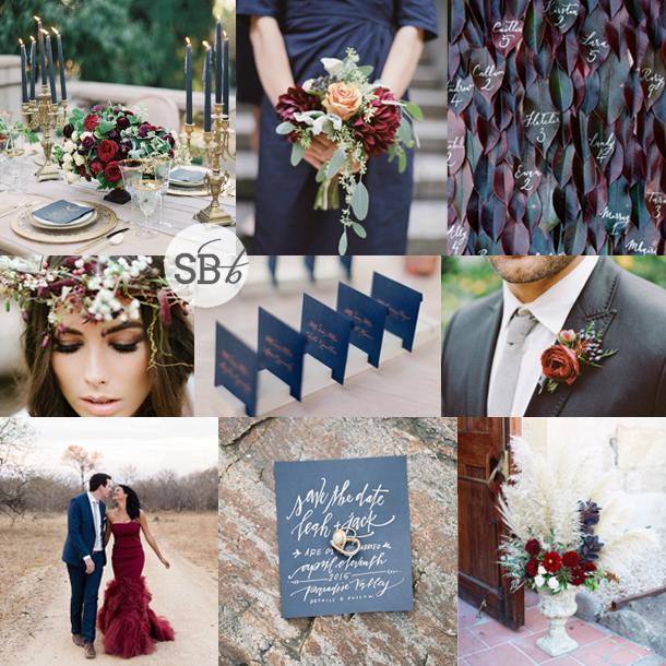
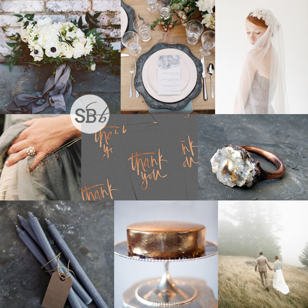
Hello lovelies! We’re about half way through our ‘Greenhouse’ month, and I’ve been looking through some of the botanical themed boards we’ve featured in the past and just loving every single one of them so much! I honestly think this is one of my favourite wedding trends/looks of all time. And, while many of these palettes use green as a base, you’ll see there’s no reason to limit yourself, which is great news if you’re loving the look of floral prints or botanical table details, but already have your heart set on a different colour or season. The main point is to get your creative juices flowing – get ready to be inspired!Read More

Inspiration Board: Blossom & Grow

Sometimes I go through a phase where I do a bunch of more subtle and sedate inspiration boards, and I absolutely love working gentle or neutral tones and elegant, grown-up combinations. And then some days I just want to go mad and play with some colour. That’s today, and I have to tell you, I am loving the result. That’s the thing about using bold colour in your wedding- it adds a feeling of fun and happiness to the day, and there’s no reason why there has to be a trade-off in sophistication. Take today’s flower-filled inspiration board – big, bold punches of orange and fuschia and peach, with an underlying white to offset all of that colour. Modern, beautiful, and inspiring.

Colours: Peach, orange, fuschia

Top row (l-r): Bride in flower crown {Ali Harper Photography/Amy Osaba}; bouquet {Stylish & Hip Weddings/Shiramisu/The Green Vase}; floral print bridesmaid dress
Row 2: Tablescape {Rebecca Wood Photography/Cynthia Martyn Events Inc./Stemz}; floral invitation {Wedding Paper Divas}; paint dipped cutlery {KT Merry/David Arthur Fittin/Lucia Paul Design}; cake {JoPhoto}
Row 3: Cocktails {Christy Tyler Photography/Reenie Rose}; table with peaches {Justin DeMutiis Photography/Jade Lee Events}; flowers in wire basket {Rebecca Wood Photography/Cynthia Martyn Events Inc./Stemz}


Blossom & Grow Pink, Peach & Orange Floral Wedding Inspiration | SouthBound Bride

Inspiration Board: Greenhouse & Garnet

Time for some inspiration! As you may have heard last week, our theme for July is ‘Greenhouse’, so I’m letting myself be inspired by everything beautiful and botanical. I just LOVE the idea of a wedding in a greenhouse setting, and of course you’d want to include lots of lush greenery in that sort of setting, but there’s no reason why that shouldn’t mean a big pop of colour too. I love green and red together – they don’t need to look like Christmas either. Garnet is a gorgeous shade of red – just a berry breath away from this year’s colour of note, Marsala, and a super flattering shade for bridesmaids and flowers too. Doncha just love it?

Colours: Garnet red, emerald & white

Top row (l-r): Invitation suite {Visual Cravings/Laura & Co. Events/Rachel A. Clingen Wedding & Event Design/Paper & Poste}; bouquet {Lime Green Photography/Statice Couture}; greenhouse setting {Lane Dittoe/Greystone Mansion/Flower Wild}
Row 2: Table decor {Lani Elias/Ashley Nicole}; greenery & chandeliers {KT Merry}; red bridesmaid dresses {Azuree Wiitala/Elizabeth And James}
Row 3: Bride with flower crown {Floral Earth/Alise Taggart/Paula O’Hara} ; botanical gardens ceremony {The Wedding Artists Collective}; candles & ferns {Ryan Ray Photo/Signora e Mare/Sprout Flowers}


Inspiration Board: Terracotta & Tulle

Holy cannoli, is it seriously July already? Well almost, and with just a couple of days to go until our Natural Beauty month comes to an end, this inspiration board is actually the perfect way to segue on to our next theme – although I’m not telling what it is just yet! When I was thinking about natural textures, I couldn’t help but think of terracotta, one of my absolute favourite warm colours and a look that really reminds me of Mediterranean sunshine, as well as pottering about in a garden shed. Pairing it with tulle might seem like strange bedfellows, but then we already know that opposites attract in wedding design, and I love the rustic edge that terracotta brings to a dreamy, romantic wedding design in shades of beige and blue.

Colours: Powder blue, beige & terracotta

Top row (l-r): Tablescape {Carrie Patterson Photography/Lily and Co.}; place setting with terracotta charger {Ozzy Garcia}; bridesmaids {Danielle Poff Photography}
Row 2: Bride {Elizabeth Messina for The Knot/Catherine Sheppard}; boutonnieres {Elan Klein Photography/Sweet Emilia Jane}; calligraphy {Beaux Arts Photographie/Oh, How Charming!}
Row 3: Chair with veil {Elizabeth Messina}; long tables {Jose Villa Photography/Flower Wild/Coastside Couture}; plant pot favour {Vela Images}; curtain ceremony backdrop {Sarah McKenzie/Two Be Wed/Maxit Flower Design}


Inspiration Board: The Oyster & the Pearl

Can you seriously handle the fact that we’re heading towards the end of June you guys? Time is running way too fast in my 30s. But before the month comes to an end, I thought I would create a little board inspired by the month’s birthstone, the pearl. The colours of nature are always so inspiring, and the beautifully subtle pastels lights and colours in a pearl are like a reflection of a seaside sunset – plus, they make for a really serene and pretty wedding colour scheme. And along with the sophisticated pearl, why not add in a bit of natural rustic with oyster shells? There are so many creative ways to include them – calligraphed escort ‘cards’, cake topper, place marker, invitation. Add a gorgeous pair of earrings, and I think the combination is just lovely.

Colours: Pastel pink, blue, grey & oyster

Top row: Shoes {Kate Holstein}; invitation {Greer G Photography/Tying the Knot Wedding Coordination/Tupelo Honey}; pearl earrings {Ernest Jones}
Row 2: Oyster shell with pearl; cake with shell topper {Joseba Sandoval/Cake Couture}; oyster shell votives {jose villa/joy thigpen}
Row 3: Oyster shell escort tags {Hunter Ryan Photography/Elleson Events/Laura Hooper Calligraphy}; bridesmaid dresses {June Cochran Photography/Amsale}; place setting {Jessica Lorren/Sarah Tucker Events}

Those pretty earrings come from Ernest Jones, who just happen to have a huge half price sale on at the moment, so be sure to check that out:

Ernest Jones


Inspiration Board: Rose Gold & Greenery

Good morning lovely ones! I am back (and rested, after passing out for ten hours last night) from the loveliest hen weekend for my beautiful friend Michelle in Clarens – so fun! I just love a good hen – it’s such an awesome chance to catch up with old friends, meet new ones, and spoil the bride before her big day. And if budget permits, a weekend away is the best. Especially in such a gorgeous place – now I see why so many of y’all have chosen it for your weddings. ANYWAY, I’m kicking off the week with another inspiration board, this time combining stark white and rich greenery with the elegant warmth of rose gold. Delightful.

Colours: Emerald green, white & rose gold

Top row (l-r): Laser cut chair sign {Host and Toast Studio}; dress with dipped sequin effect {Truvelle}; porcelain envelopes {Red Raven Studios}
Row 2: Table setting {Ben Q. Photography/Lindsey Zamora Wedding Styling + Design/The Southern Table}; rose gold engagement ring {Suzanne Kalan}; flower girls {Jose Villa}; leaf sash {Something Ivory}Row 3: Candles {Kae & Ales}; bride & groom {Jose Villa/Laurie Arons/Sarah Winward}; shoes {Sarah Postma Photography/J Crew}; candles & greenery {Jose Villa Photography/Brooke Keegan Weddings And Events/Holly Flora}

Let’s just take another look at that amazing wedding dress, shall we? It’s called Sierra, and is from the Truvelle collection (see our feature on it here), which just happens to be available in South Africa at the LOCA Vintage Bridal Lounge in PE. Sierra has a dreamy chiffon overlay that melts into rose gold sequins, creating the most gorgeous ‘dipped in glitter’ effect. Swoonage.


Inspiration Board: Love Rocks

So, talking of natural beauties (as we are this month), there’s a lovely little trend in weddings at the moment for crystals and geodes and everything semi-precious. From table decor to favours to stationery, I for one am absolutely loving it – such a mixture of elegant glamour and natural, organic beauty. For today’s geology-themed board, I’ve combined soft green and pink with grey, silver and gold. The result manages to be both earthy and ethereal. I love it!
*Links in bold denote affiliate links. The cost to you remains the same, but SBB may receive a commission for any sales made.

Colours: Mint, blush, grey, silver & gold

Top row (l-r): Engagement ring in geode (Blush Wedding Photography/Delovely Creative); protea and succulents (Apryl Ann Photography/Stefanie Miles Events/Bows & Arrows); crystal escort cards (Laura Gordon Photography)
Row 2: Geode invitation suite (Minted); agate table number (Leo Patrone/Honey of Thousand Flowers/Print in Cursive); ring; centrepiece with crystals (Apryl Ann Photography/Stefanie Miles Events/Bows & Arrows)
Row 3: Cake with crystal topper (Taylor Lord/Lindsey Zamora); bride in mint dress (Morgan Lamkin/Elizabeth Dye); marquee reception (Adam Barnes Fine Art Photography/Just A Little Ditty)

Let’s take a closer look at that invitation suite (by Kaydi Bishop on Minted) shall we? So pretty. And it comes in a bunch of lovely colours.

Row 1, 2 & 3: Geode invitation suite from Minted | Row 4: Raw Geode Crystal Earrings by Gemologies (left); Rose Quartz Crystals by Throwin Stones (right) | Row 5: Natural Agate Bookends (for Table Numbers) by The Hollow Geode (left); Natural Sugar Rock Candy by The Sweet Party Shop (right) | Row 6: Light Grey Agate Escort Cards by Hello Posh | Row 7: Florence Skirt in Mint by Sweet Caroline Styles (left); Herkimer Diamond Engagement Ring by Camila Estrela (right)


Inspiration Board: Natural // Beauty

Hey lovelies – time for me to reveal our brand new monthly content ‘theme’. This month we’re doing something a teensy bit different, in that we’re focusing on a more loose idea – that of natural beauty. Or rather, as I’ve called this board, natural-slash-beauty. Expect beautiful (natural) neutrals, boudoir and bridal shoots, hair & makeup and beauty advice… you get the picture! The idea behind this board is a simple one: simplicity itself. Because for some brides, less fuss is definitely the way to go. Think calming neutral colours, elegantly basic details, natural textures, simple details like candlelight, blossoms and a whisper of lace. And, most importantly, allowing the beauty of the landscape and your surroundings to take centre stage. As the saying goes: simple may not always be best, but the best is always simple.

Colours: Layered beige neutrals

Top row (l-r): Bride {Lacie Hansen/Vera Wang}; bridesmaid dresses {Maggie Harkov Photography/Vera Wang}; centrepiece {Ashley Woodson Bailey/Ginny Branch/Haley Sheffield}
Row 2: Ring {Tec Petaja/Bash, Please}; invitation suite {firstmatephoto.com}; cake {Angelworx/Moda e Arte/Joy Proctor}
Row 3: Candlelight stairs {KT Merry Photography}; landscape {Nicole Rich}; bride {Elizabeth Messina}


Inspiration Board: Autumn Grace

Hello lovelies! We have one last inspiration board to share for our autumn month, utilising some of the colours in the Pantone’s Fall 2015 palette. Truth #1: I wasn’t totally crazy about these colours when I first saw them, but as I’ve been working with them, I’ve found so many pretty possibilities – today’s is definitely my favourite. Truth #2: I swore I’d never do another Marsala inspiration board and I couldn’t help but include it here (although I still maintain this is more scarlet than Marsala, but whatevs). I’m not even sorry, because the deep blue and red paired with a soft touch of sage and a little glimmer of gold look absolutely amazing, and are beyond perfect for a sophisticated autumn wedding. Don’t you agree?

Colours: Pantone Reflecting Pond, Pantone Marsala, Pantone Desert Sage & Gold

Top row (l-r): Table setting {Kurt Boomer Photo/Joy Proctor Design}; bouquet {Amelia Johnson/Karson Butler Events/Sidra Forman}; leaf escort cards {Ann-Kathrin Koch Photography/Knot & Pop}
Row 2: Bride with flower crown {Yolandé Marx/Anneke Roux & Nicola Pretorius from The Pretty Blog}; blue cards {Jose Villa Photography/Pilgrim’s Quill/Jenna Lam Events}; boutonniere
Row 3: Bride in red dress & groom {Emilia Jane Photography}; invitation and rings {Brett Heidebrecht/Kylie Swanson/Lindsay Letters/Juliet Grace Designs}; flowers in urn {Christian Cruz For Max & Friends/Sweet Marie Designs}


Inspiration Board: Stormy Weather

All of this month we’re bringing you boards inspired by the colours in Pantone’s Fall 2015 palette, but today, instead of combining two or more, we’re focusing on just the one. When I was looking up images for our Pantone bridesmaid inspiration post last week, I just fell in love with Stormy Weather, a beautiful shade of dark grey that I think is amazing for a winter or autumn wedding. I actually think it works well on its own, with some lighter shades of grey and cold weather natural textures, but I couldn’t resist warming it up just a little with a touch of copper, and oh my gosh, I love it! Cool, sophisticated and cosy, all at the same time. And with a bit of a romantic, Wuthering Heights feel too. So here you go. Stormy weather isn’t always a bad thing on your wedding day ;)

Colours: Pantone Stormy Weather, dove grey, copper & white

Top row (l-r): Bouquet {Adam Barnes/Amanda Gray of Ashley Baber Weddings/The Arrangement Company}; place setting {Cassidy Carson/12th Table/Kelly Lenard}; bride {Sibo Designs}
Row 2: Grey dress & ring {Brosnan Photographic/Pearl and Godiva/Claire Pettibone}; copper foiled invitations {Cocorinna}; copper ring
Row 3: Grey candles {Cox & Cox}; copper cake; bride & groom {Braedon Photography}