Inspiration Board: Ascot Opening Day

I’M BACK!! Hello lovely friends, I’m delighted to return to you this fine morning. This last morning of my old life, where I’ll make my last journey to Oxford on the train. (Boy, can I ever not wait to see the back of that train.) From tomorrow, I’ll be starting a new chapter, and Paddington will be just a bear and not the station I spend half my life waiting in. I’m terrified, I’m excited, I’m nervous, I’m relieved. But most of all, I’m ready. And I can’t WAIT for the next part of the journey. In the next few weeks I’ll be starting to introduce some new features to you, I’ll be making some big announcements, and ultimately, I’ll be introducing you to the new website. This morning, as I look back on a great five years of my career, I honestly feel that the best is yet to come.

For today, we have some fabulous inspiration, in the form of a board inspired by one of my FAVOURITE movie scenes. (Well, sort of.) I mean, the black and white Ascot Gavotte scene in My Fair Lady is beautiful, not just because it has Audrey Hepburn being Audrey Hepburn in it, but because all the dresses and set were designed by the incredible Cecil Beaton. (Unfortunately, I hate musicals, so as long as it’s on mute, we’re all okay.) Add the lightest pearly pink, and you have a design that is thoroughly modern and absolutely perfect for an elegant (possibly vineyard) wedding. Don’t you just love it? Smashing. Positively dashing.

Don’t forget to come back later to see more yummy inspiration from our real life bride, Cheryl.

Colours: Black & white, blush pink

Top row (l-r): Parisian stripes ceremony arch (Simple Splendor Photography); blush pink bridesmaids’ dresses (Anastasia Photography); oysters (Flory Photo); ceremony chairs (Adam Barnes Photo)
Row 2: Audrey Hepburn in My Fair Lady; blush pink, black and white invitation suite (sugar paper); crowd from Ascot scene in My Fair Lady
Row 3: Black & white macaroon tower; shoes (Studio Impressions); wedding dress with stripe sash

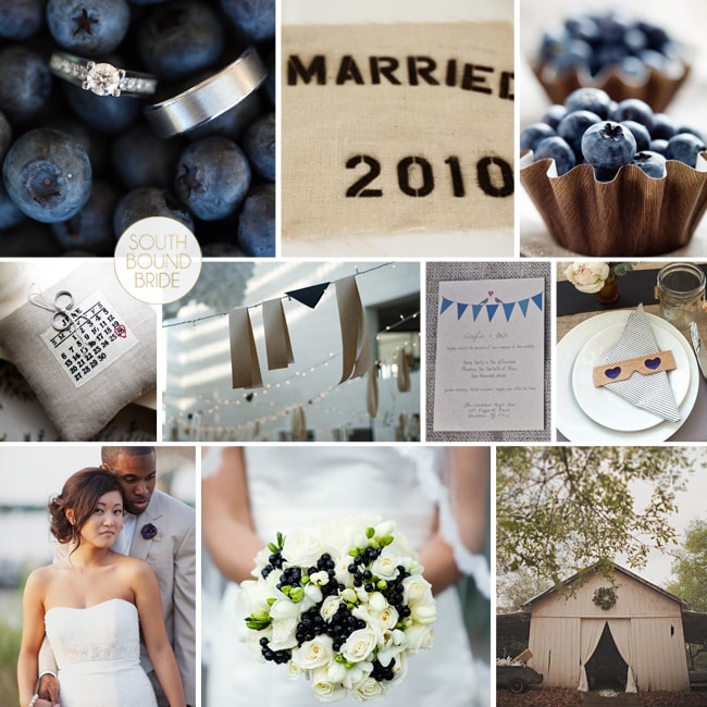
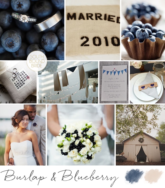
Inspiration Board: Burlap & Blueberry

Good morning! How was your weekend? I spent mine on a massive organisation kick – moving into my new office, and trying to implement a system for getting things done. Although the To Do list is massive, it’s actually really empowering to feel more on top of it all! One thing on this weekend’s task list that didn’t take me very long to complete was this little inspiration board, because I’ve been dreaming it up for ages. I am totally smitten with navy at the moment, and while I do adore a nautical wedding, there are so many other ways of using navy as a wedding colour. One of my favourite is to combine it with burlap or hessian for a stylish cross between preppy and rustic that I am just crazy about. And of course blueberries make the perfect country motif. I am dying over the blueberry bouquet below (okay, those are probably choke or elderberries, but they have the right look – your florist may be able to achieve something similar with ivy or similar, and make sure to have them wrap it in twine for the perfect rustic detail) and the blueberry cups – such a sweet dessert, or leave one at each place setting. Printed burlap elements give that extra preppy edge (don’t you just love the date ring pillow?), as do the striped navy napkins. Kraft or corrugated paper also work really well here alongside the burlap. And of course, what would a farm-style celebration be without strings of bunting and fairy lights? (Best news – the bunting invitations come from this free template!) As always, it’s the tiny details that make a big difference – matching burlap rose and boutonniere for the bride and groom, and navy nailpolish for the bridesmaids (where do I find that? sign me up). You could introduce other colours – a soft pink, coral, yellow, or green would all work, but I like the cleanness of this simply stylish palette.

Colours: Navy, white and beige

Top row (l-r): ; Blueberry ring shot (Jamie Delaine); burlap place mat (Amy Karp); blueberry cups
Row 2: Burlap Save the Date ring cushion (Shawn Connell for Christian Oth); navy and burlap garland (Domestic Construction/Max Dworkin); blue bunting love birds invitation (EE photography/Wedding Chicks); striped navy napkin and 3D glasses (Domestic Construction/Max Dworkin)
Row 3: Bride & groom (Jodi Miller Photography); blueberry bouquet (Oasis Flowers/Sakura Photography); barn (Stone Crandall Photography)

Inspiration Board: Burlap & Blueberry

Inspiration Board: Just Peachy

Happy new week, friends! Hope you had a lovely weekend. I spent it catching up with friends and indulging in a little side of rugby – what did you get up to? I wish weekends could last forever, but here we are, back at Monday, *sigh*. On the upside, Monday means pretty inspiration boards, and today’s is exactly that. I love peaches as a motif for a wedding – not only are they symbolic in Chinese culture of marriage and longevity, but in Renaissance art a peach with a leaf attached represented truthfulness and speaking from the heart. Plus, they’re totally pretty and a little bit rustic. Soft peachy pink goes beautifully with a warm coral orange and green, and pair that with brown neutrals like wood, craft paper and even copper, and you have the perfect combination. I just LOVE the idea of these peach pouches at each place setting – a totally sweet and affordable favour – but you could also treat your guests to homemade peach jam in pretty glass jars. For escort cards, try this sweet rustic option of little labels tied to birdcages – the cages can also be used to house gift envelopes from your guests.

{Pssst! Like this? Check out our Rustic Peach & Apricot board as well.}

Colours: Peach pink, coral, white & green

Top row (l-r): Peach pocketoutdoor ceremony area (Jesi Haack);peach jam favours; flowers in copper pot (Simply Bloom Photography)
Row 2: Tie; kraft/brown paper menu and wooden utensils (Austin Gros);folk art wedding invitation; peach shoes (Troy Grover Photography); bouquet with lace accent (Simply Bloom Photography)
Row 3: Bride & groom (Austin Gros);fruit cooler in mason jar; bridesmaids; birdcage escort cards (Jen Huang).

Inspiration Board: Elegant Pewter

Hello lovelies! I’m back from my holiday, feeling refreshed and tanned and enjoying a last little day off for the bank holiday today. Greece was spectacular, and apart from having tonsilitis for a few days, I had the best time. And the food! Oh my word. I’ve eaten enough fresh fish, feta and calamari to feed a small Greek army. Not to mention the spectacular sunsets… Sigh. Back to reality. Of course, when reality is getting to make pretty inspiration boards for Cap Classique brides, then reality aint so bad! As you know, I just love when readers get in touch to ask for their very own inspiration boards, and today’s was created especially for Elana, who has chosen pewter and white as her colours. Elana is getting married at Dieu Donne, a stunning Franschhoek venue that is all light and glass and views and facebrick, and she wanted to create a look that was classic and elegant. Think all white flowers (with touches of fynbos), long silvery bridesmaids’ dresses, mirrors and chandeliers, with macaroons as favours. I don’t know what Elana’s planning for her dress, but I love the idea of including a brooch detail either on the dress or shoes, and picking this up with the cake later on – a subtle way of pulling everything together. But the idea that really made me excited was including suspended blossoms either above the tables or as a backdrop in a key part of the space like the dancefloor or dessert table. This is a hot trend at the moment, and it’s just the kind of quirky, memorable detail that can set the decor apart. The overall effect is beautiful and timeless. Hope you like your board, Elana!

If you’d like to request your own inspiration board, email me at capclassique {@} yahoo {dot} co {dot} uk.

Colours: Pewter & white

Top row (l-r): Rose and fynbos bouquet; bride & groom (Bowersock Photography); Badgley Mischka shoes (Amy Wellenkamp Photographers); champagne flutes (Natalie Spencer); fynbos confetti (Nikki Meyer)
Row 2: Chandelier detail at Dieu Donne (Roxy Laker); suspended blooms; ornate mirror table plan (Shoot Lifestyle); grey and white macaroons (Taylor Jackson Photography)
Row 3: View at Dieu Donne (Lizelle Lotter); hanging flowers; centrepiece (Amy Wellenkamp Photographers); bridesmaids in pewter dresses (Shoot Lifestyle); cake with brooch and ribbon detail.

Inspiration Board {1 Theme 3 Ways}: Vintage Safari

This week we’re featuring three safari-themed inspiration boards to show how a single theme can be interpreted in a number of different ways. Which one is your favourite?

**************************************************************

Thursday, hooray! Almost the end of the week. You’ll have noticed by now that the blog schedule’s been shaken up a bit what with 3 inspiration boards due to appear this week and then the unexpected quiet day on Tuesday. But whatever, let’s just go with it. So today I have the next in our inspiration board series, and the latest trend roundup due this afternoon. And tomorrow is going to be jam packed, so be sure to keep checking back!

I’m really excited about today’s board, because it’s a reader request as well as the second variation on the safari theme I’m featuring this week. Simone contacted me to help with ideas for her game farm wedding. She didn’t want the ‘typical’ safari decor, with animal prints and Big Five table decorations, but preferred vintage decor and softer colours. (It should go without saying that this is a style reference to Sydney Pollack’s Out of Africa, rather than suggesting any kind of glorification of colonialism, obviously.) You’ll remember a few weeks back we touched on this as part of the Blog Around the World post, and Alicia put together that look so perfectly that I couldn’t help using a few of her images again (click here and follow round all the blogs to get all the pictures) but I combined them with a palette of sage green and soft coral which I hope Simone will love. It’s inevitable that there are going to be lots of brown neutrals in a bushveld environment, and these colours lighten and modernise things up a little and complement them perfectly. The real key to this look is in the interplay between wild natural surroundings and classic fine dining elements, so for table settings you’ll want patterned crockery, crystal glasses, silverware (I love the idea of using old silver to contain flowers) and pressed linen. The really fun part is in including lots of found vintage objects – gramophones, compasses, storm lanterns, binoculars, and of course old suitcases (which you can use as props in a number of ways). Scout around your friends and family’s homes to begin with – you may find some gems! I’d have the bridesmaids in floaty, slightly vintage green dresses, and the bride in a gorgeous vintagey gown (birdcage veil is a must!). Fill your table with lush white blooms and pops of coral, and a few succulents. And don’t forget the cocktails! This is the perfect place to serve a classic (and delicious) G&T.

Colours: Sage, coral, white, beige and bronze

Top row (l-r): Bouquet; bride with giraffes (Fancy Fin Photography); bride with binoculars (Fancy Fin Photography); safari tent
Row 2: Out of Africa book cover; cocktail; compass escort cards; table setting (Jose Villa); hurricane lamp with jewellery (Fancy Fin Photography)
Row 3: Bridesmaid dress (Nadine Photography); gramophone (Justin & Mary); flowers (Jose Villa); boma reception; vintage suitcases.


Inspiration Board {1 Theme 3 Ways}: Chic Safari

Happy Monday folks! We have one of my favourite features on Cap Classique this week – 1 Theme 3 Ways, where I bring you three inspiration boards around a particular theme or motif, all with very different looks. Safari style isn’t something we always associate with the Cape, since there are such spectacular bush venues around the rest of the country, but I’ve had many requests recently for safari style (more about venues later this week). In fact, one of this week’s boards was designed specifically for a reader who is considering vintage safari as her theme. But today I thought I would start with a more modern palette – one that is bang on trend in fact: green, grey, black and white. I know lots of you want to avoid the very obvious animal motifs, but I think a touch of zebra works perfectly here – just be sparing and use it wisely. I love the combination of pale green and grey bridesmaid dresses and a delicate white and green bouquet with a touch of brunia, and then bolder graphic touches like the zebra stationery and the black and white striped rosette. And this being 2011, we can’t not have a bit of sparkle – how gorgeous is this bride’s bolero? This look is ideal for a couple who want an elegant modern wedding that still has a touch of the bushveld about it, or who want to reflect elements of a game lodge setting without going overboard, and it’s very easy to achieve. I love it – what do you think?

Colours: Green, grey, black and white

Top row (l-r): Bride with sparkly bolero (onelove photography); green and grey bridesmaids’ dresses (13:13 Photography); hanging lanterns (Cari Photography); lamp with rosette (Cari Photography)
Row 2: Zebras; bouquet with roses and brunia; I Married Adventure (onelove photography); rings with stamp (Laura Ashbrook Photography)
Row 3: Bride & groom (Zara Zoo); zebra stationery suite (Paper Moss/Laura Ashbrook Photography); outdoor reception (Shanna Jones).

Inspiration Board: Par Avion

Happy Monday, everyone! Wow, it has been an exhausting weekend for me – I finally did the big move, so it has been non-stop packing and unpacking, etc. What a schlep. But I’m so excited about my new place, and can’t wait to get decorating! One of the best parts is that I have an en suite bathroom again, so get to pull out of storage a fab little gadget I have – it’s a bath rack/caddy that stretches over the bath and instead of having place for soap, has a rack for a book, and a holder for a glass of wine. Actually, it also has place for a candle, but I figured paper… alcohol… flame… maybe not the best idea! Anyway, I can’t wait to make use of it again, and with all my sore muscles from carrying boxes and a day of cleaning today, I’m sure I will soon! ANYWAY, on to today’s board, which is inspired by a different kind of moving: travel! As you may have picked up, I adore air mail stripes, and I like the idea of combining them with a soft vintage palette and fun travel, aeroplane and postage-inspired details.  It brings together the idea of love letters, and far flung places, and the old world romance of the aeroplane. This would be perfect for a couple who have done long distance, or just for one who love to (or long to!) see the world. Favourite real wedding detail? The ‘departure planes’, which were thrown at the bride and groom as they made their exit instead of confetti. Cute, huh?

Colours: Peach and soft neutrals

Top row (l-r): Bride with bouquet (Tying.the.Knot Wedding Coordination); bouquet (Ella Jae Weddings); dresses (Jose Villa); globe (Rock Paper Scissors Events/Ohana Photographers); vintage suitcases with framed escort card display (Kate Foley Designs/Catie Ronquillo Photography)
Row 2: Airmail invitation; aeroplane biscuits; air mail stamp; DIY toy glider save the dates
Row 3: Departure planes (Nine Photography); vintage plates; boutonniere (Josephine Sicad); airmail escort cards on map (Kate Foley Designs/Catie Ronquillo Photography); cake with stamp garland.

**Like this idea? Click here for more travel-inspired wedding details.**

Inspiration Board: Message in a Bottle

Happy Monday lovelies! I’ve been dreaming up this inspiration board for months, ever since I saw the line of dresses in the second row. I just love how the soft pinks and blues work with beach neutrals and a touch of dark grey, and it reminded me of a beautiful beach sunset. There’s a dreamy, castaway feeling to this palette, and it would make for the most romantic of seaside weddings! As always, the key is in the textures – a billowy bride’s dress, fabric floating in the breeze, and coloured glass, contrasted with rustic touches like raffia, coral and shells, and indigenous foliage like brunia. I’m obsessed with the astilbe bouquet, and I think it would be perfect to complete the look. Plus, don’t you love the sailor’s knot favours/escort cards? I pretty much just want to dive into this board and stay in it forever. If only… ;)

Colours: Pastel pink, blue, white and slate grey

Top row (l-r): Beach sunset with boat (Millie Holloman); sailor’s knot favours (Simply Bloom Photography); couple on beach (welovepictures); bottles (Millie Holloman)
Row 2: Dresses (Lane Dittoe); astilbe bouquet (Windy Dougall); urchin place setting (Elizabeth Messina); cake (Elizabeth Messina); torches (Elizabeth Messina)
Row 3: Couple with banners (Bella Sera Event Design/She Wanders); map (Bella Sera Event Design/She Wanders); flowers (Simply Bloom Photography); ceremony seating (Elizabeth Messina).

Inspiration Board: Green & Gold

Good morning everyone! My apologies that last week I didn’t get to post everything I had planned – bear with me, as there’s an awful lot going on behind the scenes. For now, here’s this week’s inspiration board and it’s one of my personal favourites! Green and gold are very special colours to South Africans, as they’re our national sporting colours and also represent our beautiful land and its natural resources. So I can’t think of a more appropriate palette for a South African wedding, and don’t they just look beautiful together?! By adjusting the details slightly you could make this work for just about any season, and add more rustic or more sophisticated touches depending on your venue and taste. One of the details I love is the elegant use of green glasses and gold utensils to get the colour scheme across on the table without going overboard. In terms of flowers, you could really go with any white flowers but I ADORE the combination of ranunculus and baby’s breath in this bouquet, and baby’s breath makes a great filler for elsewhere around the church or venue, which can allow you to have a bigger floral presence than you may otherwise be able to afford. Green shoes are a must for the bride, and this is a perfect opportunity to dress your girls in trendy white bridesmaids’ dresses. In terms of DIY, moss monograms are simple and incredibly lovely, and I also love the gold spraypainted wishing tree for your guests to leave messages on. And you guys, how gorgeous is this cake? All in all, I think it makes for a beautiful wedding. Who knew you could be patriotic so prettily?

Colours: White, green and gold

Top row (l-r): Place setting (Rebecca Hansen Weddings); ranunculus bouquet; white bridesmaids’ dresses (Atlas and Campbell); wedding cake with gilt and lace details (Sweet and Saucy Shop)
Row 2: Wishing tree; moss monogram letters; green shoes (Leo Patrone); general decor with hanging mason jars (Jamie Grenough)
Row 3: Bride & groom (Tec Petaja); invitation suite (EvaPaul Design/Rebecca Hansen Weddings); mini toffee apples; baby’s breath with gold monogram letters (Hailey Erickson)

Inspiration Board: Pretty in Purple

Happy 4th of July to all my American readers! Today’s board is another reader request (I’m loving how many requests I’m getting these days!) – this time from the lovely Ingrid – and I have to admit, it was a bit of a challenge. I knew exactly what I was looking for, but it wasn’t easy to find in the right colours. I’m so excited with how it turned out though, and I hope you are too, Ingrid!

When Ingrid emailed me, she knew exactly the sort of colour palette she was after for her Kleinevalleij wedding. She’d also fallen in love with the table arrangements for this unbelievable Style Me Pretty wedding, which pretty much inspired everything else. Let me break down this look a bit. The key is in its contrasts: modern paired with a bit of vintage and a touch of rustic. Succulents and silver? Shouldn’t work, but they SO do. The components – lush purple flowers (dahlias! so gorgeous!), succulents, mercury glass, wooden boxes, moss, distressed ceramics and silver. I’ve added in a few avian details and some blackboards and lilac for even more of that French country style. Doesn’t it look amazing together?

Ingrid’s bridesmaids are going to be getting their own dresses, so she wanted to make it easy for them, and chic little black numbers are a great way forward. To distinguish the girls, I suggested giving them long strings of pearls that they can all wear in a different way, but purple shoes are another alternative (Ingrid could wear sparkly and silver if she wants to stand out). I love that guests would start off with a classic black and white wedding (maybe with a couple of small purple touches in the stationery at the ceremony) and then be wowed by the whole look when they move into the reception hall. I see a lot of weddings currently at Kleinevalleij using some pretty grey/silver damask tablecloths, and these could also work brilliantly here. I don’t know about you, but I’m dying to see how this wedding turns out! (And don’t forget – if you’d like me to create a board just for you, drop me an email and let me know a bit more about what you’re looking for.)

Colours: Deep purple, lilac, grey and green

Top row (l-r): Purple bouquet (JL Designs/Marianne Lozano); silver and succulents (Stephanie Williams); printer’s tray (Stephanie Fay/Jasmine Star); feather boutonniere; lavender wreath
Row 2: Bride with succulent hair accessory (Stephanie Williams); arrangement with candles (Stephanie Fay/Jasmine Star); bird ornament (Amber Events); bridesmaids in little black dresses
Row 3: Shoes (Jani B); blackboard escort cards (Millie Holloman); signature drinks; purple envelope with calligraphy (Corbin Gurkin); distressed ceramics.