Inspiration Board: Blossom & Berry

Happy Monday, folks – here’s to a super-productive week! Today we have a pretty, rustic red and white board, that would be just perfect for an autumn wedding. There’s a little touch of French bistro, and textures of wood, kraft, burlap and berry. So pretty! Red and white is a combo that I often see in real weddings, but it’s often used either in a more modern way or as a stark accent against a classic white wedding. But here it’s a gorgeous alternative to the pretty pastels or muted neutrals that you usually see for a rustic wedding. Lovely, isn’t it? Don’t be afraid to play with your ideas on colour a bit when planning your wedding – just because you have chosen a specific style doesn’t mean that you have to use the same palette as many others before you. Often just this little twist can make a look really fresh and interesting. My favourite touches here are the mannequin escort cards, the tin dessert menu, the gorgeous burlap runner with table number and the bridesmaids’ mismatched shoes. Which do you like best?

Colours: Red, white, green and mocha

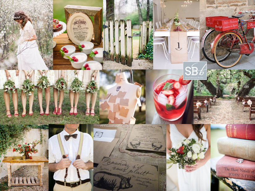
Top row (l-r): Bride in blossoms {Tec Petaja/Joy Thigpen}; berry desserts {Danielle Capito}; wooden gate {Tec Petaja/Joy Thigpen}; table with burlap runner {Nikki Meyer Photography/Kraak}; bicycles
Row 2: Bridesmaids with red shoes {Emily Johnston Anderson}; mannequin escort cards {m three studio}; strawberry cocktail; outdoor ceremony {Caroline Tran Photographer/Kelly Oshiro Design}

Row 3: Table with red flower arrangement {Flowerwild/Jose Villa}; groom in braces {Zara Zoo Photography}; farm inspiration suite; bouquet with strawberry {Nikki Meyer Photography/Kraak}; book ring shot.


Ombre Bridesmaid Dresses

Image: Our Labor of Love

We’re heading towards the end of our series on the top bridesmaid looks for 2013, and I must say, I have loved pulling them together! I honestly don’t know how you all are choosing which one to go with, because I love them all. And today’s is no exception – as you may have figured out by now, I’m a huge fan of ombre, the French term for graduated colour – see more of this wedding look here. It also happens to work perfectly with the watercolour trend that’s making everything so pretty right now. There are lots of ways to bring ombre into your wedding, but one of my favourites is through bridesmaid dresses – it’s the perfect evolution of the mismatched look. But what IS the difference between ombre and mismatched bridesmaids? Well, the key is really in the colours, of course. With mismatched, you could pick a colour (green, for example) and let your girls buy whatever dresses they liked, as long as they’re blue. With ombre, you’ll need to be a bit more OCD about it, picking an exact shade along the same colour spectrum for each bridesmaid, starting at an intense colour and ending at a light one, spaced out according to the number of BMs you have. Sound complicated? Well, it can be – one way to make it a bit easier is to have dresses made (the same or in different styles) so you have a bit more control. Take paint samples with you when you go shopping for material or dresses – each will usually show you an ombre colour family, so they’re the perfect reference. But even if you go high street, it’s not as difficult as you might imagine, and to show you, I’ve put together three ombre looks from current high street finds. My favourite is the peach ombre look – it just works so perfectly!

Click on any of the dress images below to shop. For the most recent BM dress finds, check in with our Bridesmaid Boutique Pinterest Board.Read More

Real Wedding at Shepstone Gardens {Luisa & Simon}

What is it about proteas, you guys? Is it something innately South African in me, that falls in love with them every time I see them and even more so when I see and smell one up close, hold it in both hands, marvel at its size, sturdiness, delicacy? Maybe, but then the whole world is currently falling madly in love with our national flower. When I started in weddings, there were already lots of SA brides using them, and I used to get comments about how unique the bouquets I featured were, but now I see them in weddings from all over. I like to think that maybe, just maybe, myself and my fellow SA bloggers and photographers and brides may have a little something to do with spreading the word about this gorgeous flower, in all her many guises. You’re welcome, The World. Anyway, what’s got me musing on all this is today’s lovely wedding, which has pincushion proteas at its very heart. I love these spiky blooms – especially when paired with the kind of no nonsense prettiness of shiny tin vases, fynbos, and the rich green of a spring morning in the bushveld as they were in Luisa and Simon’s wedding. The look contrasts perfectly with the easy elegance of their Shepstone Gardens venue, reflecting the ‘opposites attract’ nature of our bride and groom’s relationship. Andrea Carlyle was there to take these gorgeous pictures.Read More

Inspiration Board: Green Gables

Good morning, brideys! How was your weekend? I’ll admit, I spent most of yesterday dying on the couch after an awesome day with my university girls – gosh, I love them, but when we get together it usually means a day of recovery! Anyway, in between feeling sorry for myself, I put together this pretty board, which was a reader request from Bonnita. I don’t know much more than her palette of peach, green and grey and while this is a combo I’ve done before, I always think that the balance of warm, sweet peach and cool, fresh green is so perfect for a wedding. Clearly Claire Pettibone thinks so too, because her gorgeous 2013 range has peach and mint accents like the back detail shown here. I’m totally in LOVE with the ceiling garlands at the reception pictured below – what a way to bring outside in for a marquee wedding especially, and I also love the handpainted feel of the invitations, with a chic envelope liner setting the tone. And I have to admit, I am coveting that ring, big time! Anyway, Bonnita, hope you like your board!

Colours: Peach, grey, mint

Top row (l-r): Table setting {Joy de Vivre Wedding Design & Coordination/Michael & Anna Costa}; dress {Elizabeth Messina}; reception decor with ceiling garland detail {Liz Banfield}; Claire Pettibone dress {Brian Leahy Photography/Claire Pettibone}
Row 2: Bouquet {Depict Photography}; peach diamond ring; invitation suite {Clark Creative}; green bridesmaid dresses {Elisabeth Millay Photography}
Row 3: Bride & groom {Depict Photography}; petal strewn aisle {Gabriel Harber Photography}; flower girl {Rebecca Arthurs Photography}; rose {Elizabeth Messina}; cake {Joy de Vivre Wedding Design & Coordination/Michael & Anna Costa}.


Real Wedding at Tanglewood {Maria & Gerrit}

Serendipity. It’s the loveliest of words, isn’t it? Happy accidents. And with some couples, it really seems to fit, so it was no surprise to me that when I read Maria’s story of her beautiful wedding it was a word that she used herself. See, Gerrit and Maria have a serendipitous beginning – both religious, they decided to ready themselves for a lasting relationship with a marriage course at their church, and it was there that they found each other. They share a surname – another happy accident – and you can see from the love and happiness surrounding them on their wedding day that that’s just one of many things that they share. And goodness me, how much am I in love with Maria’s incredible grey silk dress and floor-length mantilla combo? Wow. Not to mention the really fresh styling of their decor, in bold green, navy and pink with an adorable cartoon stationery touch. My favourite part is the ficus trees they’ve used as centrepieces – such a unique touch, but one that is part of their story, as all the best wedding day details are. This is really a wedding to pore over and fall properly in love with, and that’s in no small part down to the stunning images from Cari Photography – love, love, love!Read More

Inspiration Board: Seafoam Vineyard

Good morning friends, and what a beautiful morning it is in London. The sun is out again, the garden’s freshly mowed (thanks Olly), and there’s still the hint of woodsmoke in the air from using the outdoor stove last night (unfortunately temperatures aren’t quite summery yet). Today’s board is a reader request from Kate, who’s planning a summer wedding at Constantia Uitsig (one of my favourite venues, and somewhere I am dying to stay!). Even though it’s very much a wine country wedding, with a rustic boho vibe and an incredible view of the vineyards and Table Mountain, Kate’s chosen a palette inspired by the sea, with soft blues, greens and cream as her colours. I love this – in fact, it’s the same palette my friend Heidi chose a couple of years ago for a garden-style wedding, and it looked fantastic. Using these cool colours is sure to make everything seem fresh and natural, and it’s also easy to warm them up with tiny touches of peach or pink. Kate had some really lovely ideas that she’ll be including, and hopefully I’ve added a few more to the mix with her board. Hope you like it, Kate!

Colours: Pastel blue, green and cream

Top row (l-r): Boho bride {Rylee Hitchner/Joy Thigpen}; barrels as tables {Caroline Tran Photographer/Malibu Family Wines}; loose bouquet {Erich McVey}; blue and green glass containers with white flowers
Row 2: Bridesmaids {Judy Pak Photography}; hanging carnations; doily cutlery wraps; reception sign {Braedon Photography}; cake {Abi Q Photography/Sugar & Fluff}
Row 3: Constantia Uitsig; cork escort cards {Braedon Photography}; hydrangea bouquet {Scott Piner}; dress {Scott Piner}; groomsmen {Jenna Walker Photographers}


Real Wedding at De Uijlenes {Nadine & Alan}

I have such a special wedding to share with you today! We hear a lot about ‘boho’ weddings, but today’s bride and groom really embody the bohemian life, and not just because the bride wore a flower crown on her big day. When they tired of the corporate world and wanted more freedom, they started their own business creating the most beautiful lasercut lights. Groom Alan is also a skateboarder, and spends the rest of his time skating or filming for skate videos and magazines. Nadine signs all her emails ‘love and light’, and that’s exactly the feeling I have when I look at their INCREDIBLE photos from Love Made Visible. Bex and Bruce have outdone themselves with their gentle documentary style that always captures the amazing emotion of a wedding day, and there’s so much love and joy throughout Nadine and Alan’s forest ceremony and eco chic reception. I love that they did things a little differently, with sack and egg & spoon races instead of throwing the garter and bouquet, and ended their night with their guests around the fire, singing and playing the guitar. Get ready for loveliness!Read More

Sparkle & Blush

Afternoon, lovelies! It’s time for Part 2 of today’s Sparkle & Blush fest. Hopefully you won’t be tired of seeing this shoot already, but I couldn’t resist doing a full post of all my favourite images (some that you won’t have seen before). That said, I’ll shut up and let you enjoy them! ;)Read More

From Inspiration to Invitation to Reality: Sparkle & Blush

Back when I moved into my current home and set up my office, I painted one wall in chalkboard and wrote a list in one corner. It was called milestones, and it was a list of ten things I wanted for my blog. On that list, was turning one of my inspiration boards into a styled shoot (what they used to call ‘inspiration to reality’ on Style Me Pretty). It seems like such a long time ago now, but I can still remember the first tentative posts on what was then Cap Classique, the first attempts at inspiration boards. Today (having been featured in magazines and on Wedding Chicks already) that milestone comes full circle, and I want to celebrate that, but more importantly I wanted to share what I learned about wedding design along the way. So before I share the full Sparkle & Blush post this afternoon, I thought I would take you through the whole journey, and hopefully inspire you along the way. :) (Remember, a styled shoot isn’t there to suggest you replicate it exactly the way we designed it. Rather, it’s big on ideas – just pinch one or two that fit your theme and budget.)
It started with an inspiration board…

Read More

Inspiration Board: Meet Me in Buenos Aires

Good morning, lovelies! I hope you had a fantastic weekend. I’m back from Abu Dhabi, feeling chilled out and even a little tanned, and ready for the week ahead. I’m still catching up from my jetsetting, and getting used to being four hours back again. But that aside, travel is just my best thing, and appropriately, today’s inspiration board is all about travel! Today we have another reader request, from German reader Esther. Now how’s this for an international tale of love – Esther and her Swiss fiance met in Buenos Aires (how ironic, when their home countries are so close together!) and they’ve decided to get married in Cape Town, which I obviously think is the best idea ever. Esther loves a bit of old fashioned elegance, and she wants to bring both Brazil and Africa into their design. She adores succulents (and succulent green) and would like to accent this with orange from pincushion proteas as a tribute to South Africa. Love this! I’d work with a neutral white backdrop, with bridesmaids in soft green and bold bouquets (but otherwise keeping the orange fairly soft). I’d also incorporate the elegant vintage with a travel theme, including maps, a globe ‘guest book’ and postcard escort cards. There are some really lovely Argentine traditions Esther can include – first off, the cake pull (where ribbons are baked into the cake, one with a ring attached, and all the single women pull them out in order to find out who will be married next), cocktails (although I’ve borrowed the pictured peach caipirinhas from neighbouring Brazil), a tango first dance and carnival carioca (where, late at night, guests don hats and props and have their own little carnival on the dancefloor – a perfect double use for your photobooth props!). It adds up to a sophisticated personal tribute to the couple’s history, rather than a theme party. Hope you like your board, Esther, and welcome to our beautiful country!

Colours: White, soft green, orange

Top row (l-r): Bride with carnival mask {Marisa Holmes/Wedding Italy}; globe {Rebecca Arthurs Photography}; pincushion and succulent bouquet {Q Weddings/Statue of Design}; green bridesmaid dress {Elizabeth Messina}; couple with map {Courtney Brooke}
Row 2: Table setting {Allyson Magda Photography/Glow Event Design}; postcard escort cards {KT Merry}; cake pulls {Nancy Ray/Kickstand Events/Weddings Etc. }; vintage passport invitation {Azzura Photography}; pincushion proteas {KT Merry/David Fittin/Parrish Designs}; individual cakes with succulents {Christa Elyce Photography/Ellanesque Weddings/Sugary + Chic Boutique}
Row 3: Tango {source unknown}; stationery with map; peach caipirinha {Simon Bevan}; groomsmen with orange ties {Esther Louise Photography}.