Inspiration Board: Lovely Laduree

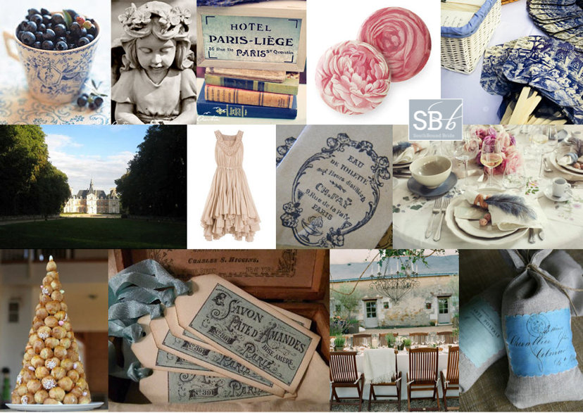
You didn’t think I’d let another Monday go by without a SouthBound Bride inspiration board did ya? This is a little colour combination I’ve been looking forward to working with, even since I saw the stationery set in the first row. I thought it was a gorgeous update to the grey and pink palette that has been so successful – a dark charcoal grey instead of a pale dove shade, a soft rosy blush, a baby blue and of course a bit of glamorous gold. It’s delicious, and I love how the pastels play so well together, but are made elegant and sophisticated by the neutral and metallic. The combination of pastels and gold reminded me a little of gorgeous Laduree macaron packaging, and the rest of the board was born!

Colours: Pastel pink & blue, charcoal and gold

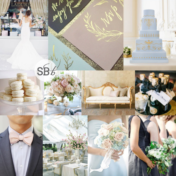
Top row (l-r): Bride at Laduree {Jen Huang}; stationery suite; cake {The Cake Parlour}
Row 2: Macarons; rose centrepiece {Aaron Delesie/Lisa Vorce, Event Design & Production}; vintage daybed; champagne {Arielle Doneson Photography}
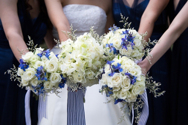
Row 3: Grey suit with pink bowtie {Adrienne Gunde Photography}; reception decor {Kristin Newman}; blue and pink bouquet; charcoal bridesmaid dresses {Forever Photography Studio/Something To Celebrate }


Delft Blue Glenshiel Wedding by Laurentia E. Photography {Elena & Liam}

Oh be still my Delft-loving heart! From the minute that an email from the lovely Laurentia E. landed in my inbox, I was head over heels in love with Elena and Liam’s stylish blue and white Delft-themed wedding design. This is a theme (or a motif rather) that I have been talking about for a while now, and the couple (together with By Word of Mouth) has pulled it off perfectly – beautiful feature plates on white linen, patterned vases full of white, blue and purple flowers, silver accents, lasercut table names, hanging Delft panels, and a blue and white check dancefloor. It’s all SO GORGEOUS. And on a personal note, I have to say that I have extra love for Elena & Liam’s wedding because they were married at the beautiful Rosebank Catholic Church, which is not only where my own mom and dad were married, but where my dear friends Ros and Jean were too. So here’s wishing Elena and Liam the same longevity and happiness that has blessed both of those marriages :)Read More

Inspiration Board: Wedgwood & Wildflower

Happy Monday, lovelies! It’s time for our weekly inspiration board, and today I am singin’ the blues. But the good kind. The kind that makes me think 2014 is the year that Something Blue becomes more than part of a motto for the bride. Now, don’t get me wrong, blue goes beautifully with many other colours, but lately I find myself drawn to the cool freshness that an all-blue palette can bring, especially when it combines a couple of interesting shades. It’s preppy and formal enough for a wedding, but bright and interesting too. I fell in love with the bouquet in this board from the second I saw it, and I adore how it mixes casual and formal, as well as two shades of blue with classic white. I thought it would make a great palette, but it wasn’t until I came across some lovely Wedgwood details that it came together – again, it’s the mix of formal and classic with a laid-back modern aspect that makes this so winning in my book! It really is the best of both worlds.

Colours: Cornflower blue, baby blue & white

Top row (l-r): Bouquet {Lisa Vorce/Kate Holt/Jose Villa}; bride {Virgil Bunao/Ooh Events}; monogram handkerchief {Bella Grace Studios/Allure Events}; shoes {Graham Terhune Photography}
Row 2: Wedgwood cookies; bridesmaids {Emily Steffen}; dress with monogram embroidery
Row 3: Invitation suite; wedding table {Carmen & Ingo/Doreen Winking}; flowers.


Stormers Wedding at Brenaissance by Agapé Studio {Stacey & Gio}

It’s not every day we get to feature a Springbok rugby player on these pages, so of course as a HUGE rugby fan myself I jumped at the opportunity when Charl Smith of Agapé Studio asked if I’d like to cover Gio Aplon‘s recent wedding! As many of you will know, Gio is a Stormer when he’s not in green and gold, and (whether by coincidence or design) his wedding to long-term sweetheart and fellow athlete Stacey was decorated in the vibrant blue and red of the Stormer’s logo. Stacey rocked not just one but two gorgeous gowns, and together with her handsome groom and seriously adorable daughter, Gia, made a picture perfect family as they celebrated this milestone together with 180 friends and family. You’ll see quite a few familiar faces from the rugby world among the guests, of course! And you can see even more from this happy day on Top Billing, where it will be featuring next month.Read More

Something Red, Something Blue La Petite Dauphine Wedding by Jules Morgan {Ndoni & David}

Get ready for wedding greatness people, because this one is a game changer! I am pretty much obsessed with this incredible wedding from the dream team of Wedding Concepts and photographer Jules Morgan, at the amazing La Petite Dauphine. Ndoni and David (what a gorgeous couple!) dreamed of a day that allowed them to chill out with their favourite people, and was designed in their favourite colours, red and blue. As a colour combo, that can be a challenge, because two primary colours are pretty strong together, so Wedding Concepts had the stroke of genius of splitting the decor into a blue period (so Picasso) and a red one. And that wasn’t the only innovation, because they also decided to throw the usual wedding timetable to the wind, starting instead with a relaxed jazzy blue-themed luncheon, followed by a sunset ceremony and a dazzling red reception. And not only does that mean a whole lot of decor amazingness, but it meant two dresses for Ndoni – LOVE a bride in a blue dress, not to mention the fairytale white one. As I say, wedding greatness. Let it begin!Read More

Inspiration Board: Copper & Cobalt

If I had as many boy crushes as I do colour crushes, I’d be falling in love every other day of the week. And here I go having my head turned again, this time by a gorgeous combination of copper/rose gold and blue. It’s amazing. And it totally works using every shade from a blue indigo to a dusk or smokey blue, to bright royal shades to sophisticated navy, so you can vary according to your favourite combination. I suspect that blue is going to be THE colour for 2014, and with metallics not going anywhere, bronze, copper and rose gold are a lovely update on glitzy gold or shimmering silver. What do you think?

Colours: Cobalt blue, copper & white

Top row (l-r): Shoes {Jennifer Laura Design/Val & Sarah}; cake {Fiona Kelly/Always Andri Wedding Design}; copper crockery; bridesmaids {Corbin Gurkin Photography/Loluma}
Row 2: Groomsmen in blue suits {Corbin Gurkin Photography/Loluma}; diamond ring; invitation suite {Kristen Weaver Photography/An Affair To Remember/9th Letter Press}
Row 3: Blue dress; cobalt vases; bridesmaid with corsage {Mr Haack/Jesi Haack}; hydrangea centrepiece {Docuvitae/Kourtney James Perry}

Real Wedding at Kleinevalleij {Alicia & Stefan}

Glitter, y’all! The magic word to get a girl excited. And actually quite an appropriate one for me today, because for the last couple of weeks that’s exactly what I have been on the hunt for. Let’s just say, I figured out why I get so many queries about glitter bridesmaid dresses from South Africa. Sequins may be everywhere in the UK, but I’ve been hard pressed to find the outfit I had in mind for my latest portrait shoot (taking place as you read this, eek!). In the end, I stumbled into YDE, which I have to say is the last place I thought I would find what I wanted. Last time I was there, I was a skinny 21 year old, and even so, I don’t think those dresses would have fitted on one thigh. I just assumed it was for very tiny, very young people, but today it turned out to be a surprise shopping success. So it made sense to see that today’s gold-loving bride also dressed some of her sequin-clad bridesmaids in YDE dresses – and they look amazing, as does the rest of the glimmering decor. I know the time will come when I’ll get sick of this trend, but for now, it still makes me get all swoony, especially when paired with a touch of lace and a splash of duck egg blue. Get ready for some really beautiful pictures from the talented Adene Photography, one of the cutest pups ever, and an all-round wonder of a wedding!Read More

Inspiration Board: Huckleberry Blues

Good morning my lovelies! Hope you had a brilliant weekend! Today’s board is all about a calm, serene, cool blue and a fizzy pop of vibrant red. I must say, I love this idea. Baby blue and bright red have been a popular combination for a while, but they’re usually associated with 50s diner style weddings, or Cath Kidston chintzes. I like the idea of it for a rustic farm or vineyard wedding, with beautiful blue tables and bushels of white flowers, and then every now and again, a powerful punch of red. After all, there’s something about red, isn’t there? A hint of red heels peeping out from under a lace dress, a bright red getaway car, or a scarlet bouquet in a bridesmaid’s arms. It’s sassy, and sassy is good. What do you think?

Colours: Baby blue, white and red

Top row (l-r): Barn setting {Andi Mans Photography & Design/Blush by Brandee Gaar}; bridesmaid with red bouquet {Elizabeth Messina/Elizabeth Messina}; blue and white meringues {Jennifer Hejna Photography}; wedding dress {Jose Villa}
Row 2: Raspberries; cutlery {Alea Lovely}; bouquet {Ashley Slater Photography/Spring Sweet}; red shoes {Elizabeth Messina}; blue flowers
Row 3: Bride & groom {Laura Murray Photography/Love This Day Events}; red getaway car {Jon Duenas Photography}; place setting {Millie Holloman Photography/Salt Harbor Designs}; blue invitation {Jose Villa /Linea Carta}


Pantone Spring 2014: Placid Blue & Paloma

Morning, lovelies! It’s that time of the year again, when Pantone releases their spring colours. My favourite. I’m still being inspired by last years’ crop, in fact. That was, until I got a whole new ten colours to dream about. I’ll be doing a full roundup on Weds of the whole set of colours, but this week I’ll also be bringing you inspiration boards of my favourite colour combos, starting with today’s. I just love this soft blue, ‘placid blue’, especially when combined with the softest grey, ‘paloma’. So romantic! It’s also a lovely alternative if you’d been considering pastels or a blush and grey mix for your wedding, and I have a feeling we’ll be seeing a lot more of placid especially. Or just consider wearing a blue wedding dress in the shade – so unusual and gorgeous. I’ll be back with another board this afternoon, but meanwhile, what do you think?

Colours: Pantone Placid Blue & Paloma

Top row (l-r): Horseshoe escort cards {paper antler via style me pretty}; blue wedding cake with ruffles {Hey There, Cupcake!}; place setting {Jose Villa/Beth Helmstetter}; blue dress {Alicia Swedenborg}
Row 2: Watercolour invitation suite {Bubblerock/Quelque chose de Bleu}; blue wedding dress; blue and grey tie; paint samples {Lauren Bamford}.


Colour Story: Toile & Rose

Hey lovelies! Following my feature of the Toile & Rose shoot this morning, I wanted to take another look at the Toile & Rose suite created for us by The Invitation Gallery. Canvas Stationery Boutique did a brilliant job in interpreting the inspiration board that started it all…

Full inspiration board credits here

I might have mentioned this before, but I LOVE it! And along with the suggestions I gave earlier for recreating the French country look at your own wedding, I’ve put together some pretty toile items to inspire. Now, obviously, you are not going to use EVERYTHING toile in a wedding design – as with all prints, less is definitely more! But there are some really pretty touches, from bridesmaid gifts to fabric (with a South African twist, nogal) and even a to-die-for Claire Pettibone toile de jouy wedding dress. Dying over that one!

Read More