Okay, how cute is this? The bride-to-be in today’s engagement shoot, Patchi (Patricia), is originally from Brazil and she first learned English from watching Titanic with English subtitles. Which must have given her an interesting vocabulary, but at least she could tell Mike he was the king of her world when she met him! Photographer Brett Atherstone sent this adorable shoot in – Brett and his wife Niki are relatively new to the Cape photography scene, but judging by these pics we’ll be seeing more of them soon.Read More
I’ve been focusing on reader requested boards for a while, but today I wanted to do one of my own that’s been brewing in my mind for a few weeks now. South Africans might be celebrating spring, but here in London it’s gone straight into winter, with casserole weather pretty much all of last week, boo. With that chill in the air, my thoughts begin to turn to rich cold season colours, particularly beautiful winter berries, and I’ve paired them here with dusky blue denim. I absolutely adore the idea of denim runners or napkins (ever since I featured this amazing wedding that did it), plus it’s a very of-the-moment colour (see the latest Pantone report, for example), so there’s really no better time for denim to smarten itself up a bit and have a wedding style revival. I’ve softened it up with some whimsical letterpress and charcoal accents, as well as the fresh berries and a tiny touch of gold. Doesn’t it look surprisingly spectacular?
Never let it be said that I don’t love my readers! I know how sometimes planning can be overwhelming (especially bringing all your ideas together as the big day approaches), so when I got a wedding 911 from SouthBound Bride Stephanie, I put together this little board for her quick sharp. Stephanie had chosen a lovely deep purple as her main colour, with beautiful bridesmaid dresses for her girls. However, Stephanie was also in love with colour and fun, but was having a tough time convincing everyone else involved with her wedding that she could be vibrant and still classic and beautiful. Her dream palette – purple combined with coral, yellow and pink – was certainly unusual, so I immediately started looking for florals in this combo. As I suggested to Stephanie, if you’re working with bright colours but you want to make sure they don’t become too much, the best thing to do is keep everything else simple and let the flowers really pop. Because flowers are colours from nature, they have natural tones to them, so you don’t get the same hard colour block effect that you might with something synthetic. It’s a softer and more classic look. Luckily I didn’t have to look too long before I found the perfect inspiration shoot, and all I can say is WOW. Isn’t this palette stunning? I’m such a convert. Paired with simple place settings and classic stationery, the florals really do the talking (and they say “hello, I’m gorgeous”). You’ll notice there are a lot of peonies in the board – and yes, peonies are incredible, but they’re also hard for a South African bride to find. However, chat to your florist about other options, as there are many lush colourful flowers (ranunculus or carnations, for example) that will do a great job here. Another tip I gave Stephanie was not to try to bring all four colours into everything – combine two here, two there, and the result is cumulative.
So, what do you think? Stunning, no? Good luck with the rest of your planning Stephanie! I’m sure it will be amazing.
Colours: Deep purple, violet, coral, yellow & pink
Time for some afternoon inspiration! Last week I was thrilled to be asked by BrideTide (a brilliant hub for wedding news, as well as the keepers of the prestigious Top 100 Wedding Blogs list) to be one of 20 bloggers predicting the big wedding trends for 2013. What an honour to be in the company of some of my absolute favourite bloggers, and people I respect immensely. The list is still being updated, but you can find it here.
Trends are always hard to predict, since sometimes it feels like by the time you notice them, they’re almost over, but there was one that I feel absolutely sure will be a defining look for next year, and that’s prints (or ‘prints charming’, as the article so sweetly phrases it!). In some ways, this is a natural extension of some of the fabric trends we’ve already seen: damask, stripes, chevron, toile as well as the move towards painterly style and modern graphics, resulting in bolder or bespoke choices in linen, be they table runners or napkins. Of course, prints are also big news in fashion, and with mismatched bridesmaids being a much-loved look, it was only a matter of time until brides took the leap into dressing at least one of their girls in a print as well. Some brides have already managed to work a lovely layered print look, incorporating it into their stationery as well – this can work best for a shabby chic or country vibe – or adopting a single look which, again, is incorporated into their stationery or ‘branding’. I have to say, I’m a huge fan of the style in its many guises, particularly the way that a unique fabric on the tables or in the bridal party can really make your colours pop and bring everything together. And, while having all your maids in prints can look amazing, I think my favourite BM groupings are the ones that have a range of colours and textures, including at least one print and one sparkly dress. But that’s just me! I’ve put together a whole gallery of inspiration for you, so you can see that this look doesn’t have to be scary. Let’s start with whole groups of bridesmaids in matching prints…Read More
A few years back, my dear friend Lenore sent me a link to a South African blog called indieBerries. Think you’ll like this, she said. And that was how I entered the deliciously barmy world of Che, writer of fun blog posts, drawer of hilarious cartoons, scrapbooker extraordinaire. Che is one of those people you instantly like, even just via the internet – she’s bubbly and warm, creative and ever so slightly mad. She also makes beautiful stationery, which I used as a thin pretext to get in touch years ago (she kindly wrote a guest post for me then). So of course, when she got proposed to in spectacular fashion and started planning a wedding, I declared myself her new bestie. Conveniently, she was going to be in London for a few months, so I’ve since got to spend some time with her and she is exactly as I’d imagined – which means that I dig her a lot in person as well as online. All of these would have been reasons on their own that I’d be excited to feature her engagement shoot with fiance Warren (or ‘The Warr’ as I can only ever think of him after Che dubbed him that on her blog – it’s fine, he calls me SBB), especially when I found out that their photographer was none other than the awesome Anneli Marinovich. But when I discovered that they had the CUTEST concepts for their shoot, I knew it would be one of my favey couple shoots ever. First, Che and Warren brought the ‘love locks’ tradition to London, adding their own little lock of love to Hungerford Bridge and throwing the key into the Thames. Then they headed for the London Eye, and had a quintessentially London picnic, where each gave the other a love letter to read while Anneli snapped away. What I love most is that these concepts weren’t just used as props – they were catalysts for genuinely romantic and emotional moments between these two lovebirds, and the expressions of happiness on their faces just say it all. They both seem to glow in each other’s company – just imagine how amazing their wedding is going to be! Be sure to read on below for details on the shoot, and for the AWESOME story of how they met (make sure you head over to indieBerries for how he proposed too!). Che and The Warr: huge congratulations!Read More
Okay, I have to tell you, I’m in love with this board. Which is a surprise, because turquoise and chocolate hasn’t always been a favourite combination of mine. I think it’s because I’ve seen it done tacky too many times, but when bride Klarissa wrote to tell me about her wedding, I knew this girl had style. After all, she chose an awesome venue – Searle’s Trading Post in Greyton. It’s super quirky and rustic and fabulous, and Klarissa knew well enough to work with its eclectic feel and just accent it with her colours. I adore the idea of a trading post ‘theme’ – a mix of found objects and rustic textures like wood and burlap. I started thinking about the sort of things you might have found at a trading post (or at least ones you might have found at my fantasy imaginary one!). How about pretty birds eggs in nests, for example? (Love these for place holders, or as part of the table decor, and they’re a fun DIY.) Old tins full of flowers. Mason jars, old door knobs, suitcases. I stumbled across this image of a poshokkie (what is the English for that, anyway?) with brown paper packages wrapped up in string – wouldn’t this make an ADORABLE escort card display? I also loved the idea of string decorations (this SBB couple did this brilliantly) and a statement turquoise necklace for the bride. It’s kind of a case of ‘anything goes’, but natural textures are the key to making it work – fortunately in a venue like this one, Klarissa will have no shortage of them. Thanks for waiting patiently, Klarissa – hope you like your board as much as I enjoyed creating it!
Inspiration board time, lovelies! I’m back with another reader request, and this one was so much fun to put together! Reader Shiree wrote to tell me about her wedding, describing it as “Old Hollywood meets Phantom of the Opera”. How. Cool. Is. That? She and her fiance have chosen silver, black and white as their colours, and are looking for “over the top elegance” and “masked ball opulance”. Oh my goodness, I have always wanted to go to a proper masked ball, and I just love the way that Shiree is planning to combine the glamour of Hollywood with the mystique of a masquerade. Usually when I’m putting concepts together for a board I’m aware of not including too many big ideas, but this theme is ALL about drama and statement and luxe. Shiree didn’t have a venue planned, but if possible, choose one with a dramatic staircase for the ultimate entrance! Otherwise, you can create that same sense of drama in just about any surrounding (although a high ceiling is a big plus) – I’ve even seen an amazing wedding where a parachute was used draped from the ceiling. Think big. I love the marquee pictured below, with what’s almost an installation of lanterns above the dancefloor – there’s that drama we’re talking about, but it doesn’t have to cost the earth – you can use relatively inexpensive materials, but think big and more (this one’s actually a DIY – see the image credits for the link). Fairy lights are another way to add visual interest – again the more, the better! I also love the idea of other luxurious focal points: bling on the bride’s dress, a cake mirroring that design, a brooch bouquet (the ultimately opulent bouquet, surely?) and a champagne tower (so old Hollywood!). Filigree masks are just my best, and I adore the invitation pictured here, which would then be reflected by a mask at each guest’s place setting (or pinned to a large board instead of escort cards). A good lasercut stationer like Doodles in Cape Town might be able to recreate this look for you. They’re not only the perfect favour, but ensure that when you all hit the dancefloor, it’ll look like a Venetian ballroom. Or just a very fancy party at Elizabeth Taylor and Richard Burton’s house. Hope you love your board Shiree, and I can’t wait to see the final results!
Quite early on, we decided not to have a ‘strict’ colour scheme… quite simply, because we thought it would too difficult to co-ordinate exact colour match swatches from 10 000 miles away! (We were right.) So our colour palette ended up being pretty broad, and was inspired by the earthy tones of our venue, and the pastel shades of the Joules Hedy bridesmaids’ dresses I’d bought on a whim in the January sales. To tie the girls’ look in with groomsmen and the rest of the wedding party (dads, moms, grans and aunties) I crafted a set of fabric corsages, using Liberty print fabric, vintage pins and various buttons, which formed the base for the fresh lavender and rosemary sprigs we added on the day.Read More
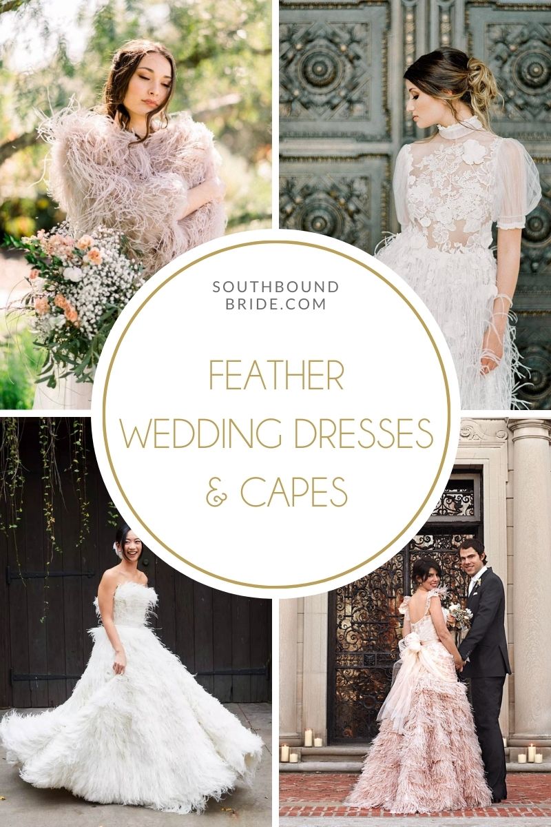
*COMPLETELY UPDATED FOR 2021* Of all the trends in wedding dresses right now, none has caught my eye quite like the use of feathers (usually ostrich). Like ruffles, only better. It must be heaven to float down the aisle in one of these beauties, whether it’s flirty feather accents around the neckline or hem, a feather bodice (so Swan Lake), or a full feather skirt that seems to froth around the wearer like a wave. They’ve been making a big impact on the bridal catwalks, and they’re perfect for the bold, whimsical feel that we’re seeing in 2021 bridal fashion. Whether your style is boho, glamorous, romantic, or Gatsby vintage, there’s a feather gown out there to catch your fancy. So here’s an inspirational roundup of ostrich feather wedding dresses, and some gorgeous feather bridal capes and boleros to share too!
*Links in bold denote affiliate links. The cost to you remains the same, but SBB may receive a commission for any sales made.
Okay, I have to be honest, I try not to feature too many beach engagement shoots. I know, I know, but when I was growing up in PE it became this thing that everyone who got engaged did – dress up in jeans and plain white t-shirts, and get photographed running down the beach at Sardinia Bay. I have looked at about a hundred of these albums (sorry, PE friends), and I think it scarred me. So I only feature beach shoots that I am totally in love with, and today’s e-session for Jeff and Josephine definitely qualifies. Kerry and Luis of Piteira Photography have perfectly captured the incredible light of a Camps Bay sunset – I can’t believe it was already four months ago that I was sitting with my lovely friend Robyn drinking martinis and looking out at this exact sunset just before coming back to London. Like all of Kerry and Luis’ images, I just want to wallow in the dreaminess. Josephine and Jeff (who live in London) were out in Cape Town for their wedding, which you can see in all its glory over on The Pretty Blog.Read More