Inspiration Board: Radiant Winter

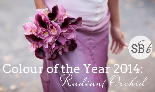
It’s been a little while since I did an inspiration board with this year’s Pantone Colour of the Year, Radiant Orchid – while this lovely bright lilac-ey purple immediately lends itself to a summer wedding, I wanted to show that it’s just as much at home in the wintery months. In fact, paired with a few other purple tones, grey, white and silver, it’s absolutely perfect for the bride and groom who want to create a winter wonderland with a trendy touch. Add a few pinecones and a smattering of snow (well, we can dream, can’t we?) and you have the makings of a beautiful wedding – a radiant one, in fact!

Colours: Radiant Orchid, plum, lavender, silver, white & grey

Top row (l-r): Bride & groom {Steve Gerrard Photography}; invitation suite {Aneta MAK}; place setting {Greta Kenyon/Leaf & Honey}
Row 2: Silver shoes; purple calligraphy escort cards; pinecone place holders
Row 3: Radiant orchid bouquet {Fleur le Cordeur/Catherine Mac}; purple dress & feather bolero; dried roses; winter landscape {Fiona Conrad}.


Inspiration Board: Last of the Summer Wine

I hate the end of summer. HATE. IT. Luckily in Durban I mostly get to kid myself that it hasn’t happened yet, but this weekend I’ll be in Joburg and that means finally conceding to the chillier weather and getting my jersey on. Which will be the first time in a year and I object :( ANYWAY, so maybe it’s my nostalgia for all things summer but today’s inspiration for me is somewhere in between the warm and cold weather seasons, a muted autumnal palette that’s perfect for a late summer bride. Dusky pink mixes seamlessly with soft minty green, with a touch of lavender to complete the happy trio. Almost worth giving into autumn for, isn’t it? Oh, and PS? Velvet is SO becoming my new favourite texture! Watch this space…

Colours: Rose, mint & lavender

Top row (l-r): Bride on velvet couch {onelove photography}; bouquet {Simply Bloom Photography}; door
Row 2: Bouquet {Eric Kelley/Easton Events}; champagne with lavender {Gayle Brooker Photography/Easton Events}; lavender macaroons; envelope
Row 3: Bride with bouquet {KT Merry/Dreamy Whites}; centrepiece {Brklyn View Photography/Michelle Edgemont}; cake table {Bryce Covey/Finch & Thistle}; velvet ribbon.


Inspiration Board: Moroccan Boho

Good grief, how is it Monday again? Today we’re bringing some boho sunshine to the blog, courtesy of this pretty inspiration board, which was inspired by a Hideous Kinky Morroccan bohemian-style vibe. Soft peachy orange combines perfectly with 2014’s colour of the year, Radiant Orchid, especially with intricate bronze detailing and our fave flower, the protea. If you love this look, then check out our suggestions for Morroccan wedding decor as well :)

Colours: Radiant orchid, orange, pink & white

Top row (l-r): Boho bride {Ciara Richardson}; bridesmaid with protea bouquet {Sarah Joelle Photography}; boho tent {Jenny Kim Photo/Drew Bennett + Sitting In A Tree}
Row 2: Moroccan lanterns {Sweet Emilia Jane & Sitting in a Tree}; boho dress with lace back detail {Poise by Nadia}; rose wine on brass tray {Mint Photography/Pink Parasol Designs and Coordinating}
Row 3: Bride {Grace Loves Lace}; purple VW camper {Danielle Capito Photography/Taylor Made Events and Design}; protea bouquet {Adam Barnes/Petal}.


Pantone’s Colour of the Year 2014: Radiant Orchid

Image source: Kate Triano Photography via Capitol Romance

Hello lovelies (and especially hello new SouthBound brides!). Mondays are when we typically debut a brand new inspiration board, but with this being a new year, we have a bit of a bonus. Every year, we celebrate the newest Pantone colour of the year around this time, and this year it’s the gorgeously named “Radiant Orchid”. At first I was a little surprised that this one cracked the nod, being that I think blue is going to be huge in 2014, but once I started working with it, I totally understood. The thing about radiant orchid is that it has all the brightening qualities of a fuschia, the deepening qualities of purple or indigo, and the calm romance of lilac. To me, the Business Mirror described it best: “More lush than lilac, more sophisticated than pink and more rapturous than purple… more sedate than mauve and softer than plum”. Basically, if pink or purple have featured in your colour scheme dreams, then radiant orchid is the perfect, modern alternative.Read More

Inspiration Board: Plumfetti

Happy Monday my lovely friends! Is everyone ready to be inspired? Today I thought we would play with one of my favourite things at the moment (glitter, you know it). Usually we see it combined with bright and soft pinks, but I got to thinking how lovely it would be with a range of purples. Plums, soft violets, lavender and lilac. Paired with glamorous gold, crisp whites and dreamy tulles. What’s not to love?

Colours: Lavender, plum & gold

Top row (l-r): Bouquet {Shari + Mike Photographers/Everything Beautiful Events}; dress with gold detail {Kim Maguire Photography}; bride & bridesmaids {Mint Photography}; ring box {Sarah Gawler}; place setting {Paige and Blake Photography}
Row 2: Gold paper straws; desserts on frames {Be Inspired PR/Be Inspired PR}; dress detailing {Kim Maguire Photography}; cork monogram {Stacy Able Photography}
Row 3: Bride & groom {Troy Grover Photographers}; flower girl; glitter {Robyn Kessler/Rebecca Wright}; gold shoes; champagne bottle.


Inspiration Board: Neutrally Beautiful

Hello lovelies! How was your weekend? Just to let you know, this week I am off to Joburg and Kruger with reduced email and internet access, so while you’ll still be getting fresh inspiration every day, there will be a reduced number of posts compared to normal. We’ll be back to doubles next week! Of course, there’s still plenty to inspire you, starting off with this board which I am absolutely loving! Mixed neutrals are such a pretty look, especially when you add in the softest puce. A lot of brides would associate this palette with a vintage look, but I personally love the romantic elegance of this board, a sort of Elizabeth Messina softness. Which is your favourite detail?

Colours: Mixed neutrals, puce, black and white

Top row (l-r): Bride and groom {Chelsea Mitchell Photo/Oak and the Owl/Twine Events}; bridesmaids {Birds of a Feather/Amorology}; invitation {Steve Steinhardt Photography/Beth Helmstetter Events}; champagne with blackberries {Jennifer Lindberg}
Row 2: Bouquet; shoes; pashminas {Carrie Rodman Photography/Raina Dawn Events}; bridesmaid dresses; key escort cards on door {Zelo Photography/Couture Events}
Row 3: Statue {Elizabeth Messina}; printed ring pillow {Laura Murray Photography}; table setting {KT Merry/Aisle Candy}; cake.


Inspiration Board: Mint & Lilac

There’s just something about purple palettes that I love, don’t you think? They really are just so pretty. And today’s is no exception. Lilac, lavender and mint make a great combination on their own, but when you add a bit of grey and a touch of silver sparkle, as well as a little dash of vintage, it’s just made for a wedding day. The cheese cake you may recognise from our roundup last week – I absolutely adore this one – but I also love the jumble of hanging bird cages, the mix and match bridesmaids, and the bride’s hair and gorgeous grey dress. I can just imagine how this would look in real life. The other great thing about this palette is that it’s so versatile – I could imagine this for spring, summer… and with a few tiny tweaks, autumn and winter too. What do you think?

Colour: Mint, lavender, lilac, grey & silver

Top row (l-r): Bridesmaid bouquet {Elisa B Photography/Amore Events by Cody/Sugar Magnolias}; lavender boutonniere {KT Merry/Sara Jean Events}; cheese wedding cake {Aaron Delesie/Laura Gresham Events/}; lace dress {Oh, How Charming/Braedon Photography}; bicycle
Row 2: Bride in grey dress {Joielala Photographie}; cocktail {Tim Halberg}; silver glitter shoes {Paperwhites Photography}; flowers in vase; hanging birdcages
Row 3: Bride & bridesmaids {Pam Cooley Photography}; place setting {Elisa B.}; lavender letterpress {Satsuma Press}; macaroons.


Inspiration Board: Grayed Jade, Lemon Zest & African Violet

Hello lovelies! How has your weekend been? Mine was awesome, but stressful – only two weeks left to get everything done before I take my month off. The good news is that I have lined up a TON of gorgeousness for you on the blog while I’m gone – all fresh new posts, real weddings, trend roundups, inspiration boards etc. The bad news is that I feel like I haven’t slept since June. Ah, the things I do for my readers! ;) Anyway, it’s been hard to work with the sun out, and that same summery feeling is what I wanted to bring to today’s inspiration board. I’m still so in love with Pantone’s Spring 2013 colour palettes, and a combination I’ve been wanting to do since I first saw them is this one: grayed jade, lemon zest and African violet. I love how the three colours complement one another and are so fresh and pretty together. Greyed jade and soft purple together are so calming, but the pop of bright yellow really livens them up. Perfect for a summer wedding!

Colours: Pantone grayed jade, lemon zest & African violet

Top row (l-r): Dress {Elizabeth Messina}; cocktail {Best Photography/Jennifer Aquilia Events & Floral Design}; yellow macaroons; place setting {Elisa B Photography}
Row 2: Ring with button chocolates; grayed jade shoes; letterpress invitation; blue dress
Row 3: Hanging chandeliers {Elizabeth Messina}; lemon escort cards {Jose Villa}; mint suit; violet bouquet.


Colour Story: Spring Pastels

Hello lovelies, how has your Monday been so far? A couple of months ago, to highlight our new Summer Rain invitation line in collaboration with The Invitation Gallery, I put together some colour boards. It was such a popular post, that I thought I would do it again today for another colour combo that had you all pinning and repinning when it appeared in our Spring Pastels inspiration board a few months back: aqua, lavender and pink. Here’s the original board…

Full credits here.

I personally think the combination is perfect for someone who wants something girly but sophisticated – it makes me think of Laduree and rose gardens and pretty crockery, and the three colours balance each other out beautifully. So here we go… be inspired!

Read More

Inspiration Board: Ocean Lavender

Time for another inspiration board? How are you guys enjoying having a daily one? Okay, there’s no way I could do this every week, but with so many requests coming in, it’s meant catching up a little, which means I get to make more of you happy. Win. Anyway, so today’s request comes all the way from Holland and I absolutely LOVE the colours bride Annet has chosen – lavender and blue. Because they’re complementary, they work perfectly in synch, but they’re also an unusual choice for a beach wedding (how’s this for romance – Annet and her husband are getting married at a castle they have to reach by boat, and then having dinner and dancing at a restaurant on the beach). I love this idea of bringing the country to the sea, and as well as incorporating natural textures like glass, I’d use fresh potted herbs as much as possible in the table centrepieces and lavender itself for the bouquet. The end result is soft and super stylish. Hope you love your board Annet!

Colours: Lavender and dusky blue

Top row (l-r): Bouquet {Lauren Kinsey Fine Art Photography/Lauren Kinsey Fine Art Photography + Shannon Reeves Events + Angela Haley of Hemstitch Vintage Rentals}; bottle {Krista Fox Photography/Fabulous Occasions}; bridesmaids {Images by Berit, Inc./6 Degrees of Celebration}, envelope with white wax seal
Row 2: Braided hairstyle; lavender confetti {Simply Bloom Photography}; tables {Claudia Rose Carter}; flowergirls {Olivia Leigh/Estera Events}
Row 3: Beach glass {Best Photography/Jenn Aquilia Events}; lavender pot {KT Merry/Sara Jean Events}; cake {Best Photography/Jenn Aquilia Events}; message in a bottle {Mike Larson Photographers, Inc./NLC Productions}; couple dancing {Millie Holloman Photography/Salt Harbor Designs}.