Inspiration Board: National Velvet

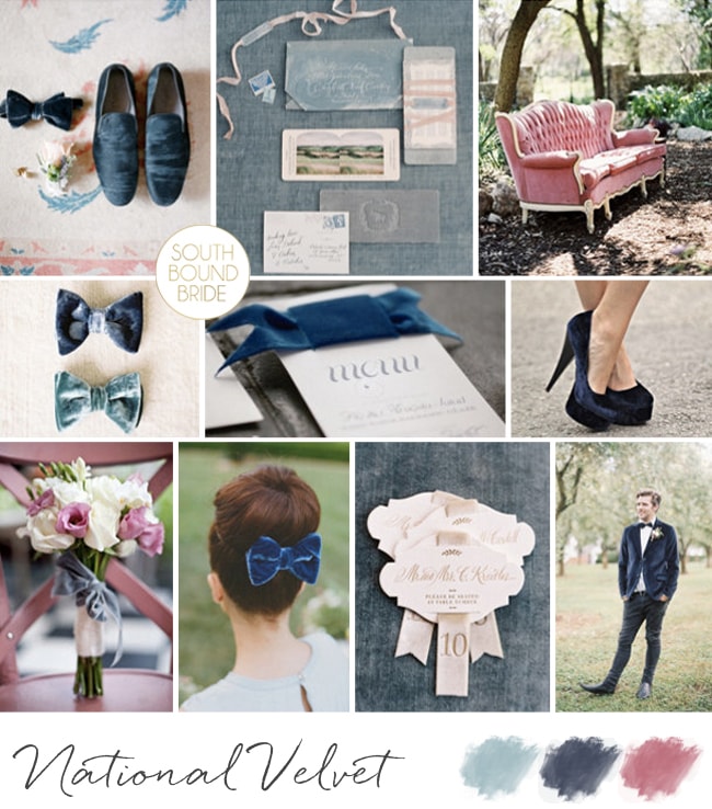
You guys, velvet is BACK. The texture that I was in love with when planning my matric dance dress circa 1995 and that did a disappearing act thereafter has come full circle in the cool stakes. So right about now, I’m in love with velvet as a warm fabric that adds that extra touch of luxe to a celebration. We’re not talking full scale velvet, but we are talking velvet ribbons tied around cutlery, menus or bouquets, velvet bowties (how much do we love the bow as a hairpiece below?), even a velvet suit for the daring retro groom. Best of all, I love the colours that velvet comes in, and today I’ve mixed together a gorgeous dusky rose with a soft blue, as well as a navy – all readily available in this texture. Welcome back, old friend.

Colours:  Powder blue, navy & rose

Top row (l-r): Groom’s shoes {Lacie Hansen Photography/Tamara Bolton}: invitation suite {Ceci New York/Elizabeth Messina }; settee {Gabe Aceves}
Row 2: Velvet bowties {Jen Huang Photography/Poppies & Posies}; menu with velvet ribbon {Elisa B Photography/Ribbons and Blue Birds}; navy velvet shoes
Row 3: Bouquet with velvet ribbon {Brosnan Photographic/Ruby and Bloom/The Bridal Lounge}; velvet bow hairpiece {Jose Villa/Boutaugh/Grey Likes Weddings}; escort cards {Jose Villa}; velvet suit {Jen Huang/Magnolia Rouge }

Velvet Wedding Inspiration | SouthBound Bride


Inspiration Board: Lovely Laduree

You didn’t think I’d let another Monday go by without a SouthBound Bride inspiration board did ya? This is a little colour combination I’ve been looking forward to working with, even since I saw the stationery set in the first row. I thought it was a gorgeous update to the grey and pink palette that has been so successful – a dark charcoal grey instead of a pale dove shade, a soft rosy blush, a baby blue and of course a bit of glamorous gold. It’s delicious, and I love how the pastels play so well together, but are made elegant and sophisticated by the neutral and metallic. The combination of pastels and gold reminded me a little of gorgeous Laduree macaron packaging, and the rest of the board was born!

Colours: Pastel pink & blue, charcoal and gold

Top row (l-r): Bride at Laduree {Jen Huang}; stationery suite; cake {The Cake Parlour}
Row 2: Macarons; rose centrepiece {Aaron Delesie/Lisa Vorce, Event Design & Production}; vintage daybed; champagne {Arielle Doneson Photography}
Row 3: Grey suit with pink bowtie {Adrienne Gunde Photography}; reception decor {Kristin Newman}; blue and pink bouquet; charcoal bridesmaid dresses {Forever Photography Studio/Something To Celebrate }


Inspiration Board: Emerald & Blush

Happy Monday, friends! Did you catch my little blogiversary post over the weekend? Well since our blog birthday got me thinking all things commemorative, I’ve decided to do a running series of inspiration boards inspired by birthstones, starting today. Although I almost canned that idea when I saw that the stone for May was emerald, since last year was ALL about this colour. But actually, it gave me a chance to revisit this gorgeous shade. That’s the thing about us bloggers – it’s not that once a colour has had its trend moment that we no longer like it, just that sometimes it’s a case of overkill. For us, because we see a hundred weddings a week, but not for you – and I personally still think emerald has a lot to offer a modern bride and groom, so it was a good time to look at it with fresh eyes. I started thinking about combinations, and I realised that somehow I’d not done emerald and blush before. Whaaaat? I couldn’t believe it, because the soft, romantic blush pink is PERFECT against the crisp, dark, emerald green. It’s the perfect alternative to blush and grey, or a more sophisticated version of blush and mint. What do you think?

Colours: Blush, emerald, white

Top row (l-r): Bride {Lizelle Lotter}; bouquet {Jemma Keech/Portobello Rose}; bridesmaids bouquets
Row 2: Staircase wreath {Jen Fariello Photography/Easton Events}; centrepiece {Leo Patrone}; bride with perfume {Ryan Ray/Stephanie Miles}; table setting with green glassware {Lauren Kriedeman/Green Goddess flower studio}
Row 3: Ceremony arch {Clary Pfeiffer Photography/Bride’s Vision}; ring {Erin Kate}; tables {Jose Villa}; bride with veil {Rachwal Photography}.


Inspiration Board: Protea Glitz

Some boards take me a while to put together, but some are so clear in my mind, it’s as if they’ve always existed. In fact, I had to go back and check my archives to be sure I hadn’t done this one before, because the concept of proteas + gold glitter is already such a favourite of mine. It’s like Joey eating Rachel’s beef trifle in Friends – to paraphrase: “What’s not to like? Proteas, good. Gold, good. Sequins, gooood!” It combines my favourite current wedding looks with our perennial South African favourite flower, and is as romantic as it is modern. And unlike beef, custard and jam, some ingredients really do just go together.

Colours: Blush, rose, gold & white

Top row: Bride with polka dot veil {Ali Harper Photography/Ginny Branch}; protea bouquet {Lavender & Twine/Twine Events}; glitter name cards {Rachel Carl on Etsy}
Row 2: Glitter cocktails {Rebecca Hansen Weddings/Style Me Pretty}; gold calligraphy invitation {Margot Madison on Etsy}; plate on sequin background {Justin Marantz/Julie Song}
Row 3: Protea centrepiece {Caroline Tran/Utterly Engaged Magazine/Propel}; confetti cake {Jen Huang/Sweet & Saucy Shop}; sequin wedding dress {Jeremiah and Rachel Photography/BHLDN}


Colour Story: Kraft & Blush

We love us some colour inspiration here on SBB, and so after this morning’s inspiration board I thought it was time for a wee colour story this afternoon. As in small, not actual wee, since a wee coloured wedding would be weird. Obvs. Anyway, so I took my starting point from a board I created a little while ago that proved to be soopa popular both on the site and social media – I guess the love of blush isn’t going anywhere soon! Here’s the original board:

Kraft & Blush

Full credits here

For me, I love how the soft colour brings sophistication to kraft/brown paper (especially with some calligraphy), which otherwise is usually associated with more rustic weddings. And it’s also quite an easy wedding palette to work with in that you’ll find a lot of blush, white and kraft details available in the shops at the moment (which always helps a lot). Whether you’re donning a pretty blush gown or putting your bridesmaids in this flattering shade, there are lots of stunning options.

Read More

Inspiration Board: Kraft & Blush

Hello my lovelies, how was your weekend? Today I’m indulging two of my wedding loves, those for kraft paper details and the softest shade of blush. Kraft (or brown paper) used to be one of those details that was really only associated with rustic or casual weddings, whereas what I wanted to show here is that it can actually be adapted for romantic, sophisticated celebrations as well (win for the budget). The little calligraphed packages are my favourite detail (calligraphy just makes everything pretty, fact) and I thought it went perfectly with the soft pink with the tiniest touch of gold. Not to mention the gorgeous kraft paper wall hangings and adorable frothy flowers. The prettiest way to start off our week!

Colours: Blush pink, white, beige and green

Top row (l-r): Kraft wrapped favours {Jose Villa/Beth Helmstetter/Laura Hooper}; bridesmaids {Nancy Ray/Rebecca Rose Events}; cake {KT Merry/Nine Cakes/Rock Paper Scissors Events}
Row 2: Envelopes with white calligraphy {Landon Jacob/Jessica Rourke/Lady Letterpress}; bouquet {Megan Dandeles Photography/mStarr Event Styling & Design}; rosé champagne
Row 3: Blush wedding dress {Adam Barnes/Katie Stoops}; table setting {Elizabeth Messina}; gold cutlery {Kate Grewal Photography}; kraft backdrop {Kristyn Hogan/Cedarwood Weddings}.


Inspiration Board: Cupid’s Arrow

It’s Valentine’s week, lovelies!!! And in honour of the annual festival of Lurve, we have a week packed full of lovey dovey goodness for you (more than usual for a wedding blog, even). You’ll be ah-ing over love stories and proposals, falling in love with some very pretty weddings and of course getting some V-Day style inspiration. Starting with our inspiration board today. Instead of going for the ‘typical’ reds of a Valentine palette, I decided to opt for the softest, sweetest blush and combine it with clean white and a touch of gold and grey. To play on the Cupid theme, I’ve included some cheruby details, as well as an arrow motif (this is actually very trendy in fashion and design, so if you have a Valentine connection in your love story, it’s a great way to bring it in subtly). I must say, I am rather smitten. How about you?

Colours: Blush, rose, white, gold & grey

Top row (l-r): Bride with bridesmaids {Brumley & Wells/A Vintage Affair Events + Rentals}; angel wings {Anita Spero Design}; portrait back dress {Elizabeth Messina/Claire Pettibone}
Row 2: Arrow wedding invitation {Minted}; bouquet {Logan Cole Photography/Beau & Arrow Events}; flower crown {Natalie Spencer Photography/Darling & Daisy};gold feather boutonniere {Michele Ng}
Row 3: Arrow bracelet {Our Labor of Love}; Cupid dessert display {Natalie Spencer Photography/Darling & Daisy}; arrow place setting {MCR PROJECTS}.


Inspiration Board: Botanical Blush

Monday, Monday… Never my favourite day of the week, except for one thing. We always get to start it off with a lovely inspiration board, yay! I absolutely love today’s – botanical has been a gorgeous theme that has come up in wedding design recently, and ferns are one of the florals that have been a big part of that. So I thought, what if you combined these pretty organic elements with just the softest touch of blush, for romance? I have to say, I LOVE the effect – what do you think?

Colours: Fern green, blush pink

Top row (l-r): Bride with fern {Heather Roth Photography/Simply & Forever}; fern table arrangements {Erin Grace Photography/Fieldwork Floral Operation}; cake {Heather Roth Photography/Simply & Forever}; bride in blush dress {Landon Jacob/Parkside Wedding Studio}
Row 2: Fern wedding invitation suite {Bailey and Emma of Antiquaria}; blush patent shoes {Aaron Snow Photography/Gibson Events}; table setting {Leo Patrone/Honey of Thousand Flowers}; ferns in vintage vases {Dear Heart Photographer/Function Flowers}
Row 3: Marquee {Birds of a Feather/Amorology}; fern wreaths {Leo Patrone/Honey of Thousand Flowers}; place setting {Anneli Marinovich Photography/Branco Prata -Sofia Ferreira}; chair {Jose Villa /Laurie Arons Special Events}; bouquet {Katie Stoops Photography/Events in the city}.


Inspiration Board: Portrait of a Lady

Happy Monday friends! How was your weekend? The weather has been completely mis here in Durban, although happily I was safely installed in a box for the Sharks game yesterday instead of sitting in the stands in all that rain. Hopefully the summer starts hitting South Africa a bit more soon though, because my tan is fading fast… Anyway, Monday morning means inspiration board time, and I must say, I am loving this one. A lovely dark teal (does that colour have a name?) with blush is the perfect combination of soft romance with dark jewel tones that are very much on-trend at the moment. The look is very sophisticated but pretty at the same time. What do you think?

Colours: Teal, blush and gold

Top row (l-r): Bride with statement necklace {Christine Meintjes/The Pretty Blog}; bridesmaids {Reg Campbell Wedding & Editorials/Keely Thorne Events}; shoes and bouquet {Desi Baytan Photography/Modern LA Weddings}; tablescape {Fondly Forever Photography/Yellow Bird Events}; teal groom’s suit {Fondly Forever Photography/Yellow Bird Events}
Row 2: Cake with blush flower detail; bouquet {Elisa B Photography/Southern Blooms}; car {Erin Hearts Court}; macaroon {Fondly Forever Photography/Yellow Bird Events}; flower in gold goblet {Fondly Forever Photography/Yellow Bird Events}; flower girl {Elisa B Photography}
Row 3: Bride {Fondly Forever Photography/Yellow Bird Events}; blush cocktail; pink calligraphy stationery {Ryder Evans Photography/White+White}; teal door; flowers {Fondly Forever Photography/Yellow Bird Events}.


Inspiration Board: Teal with a Kiss

Good morning my lovely friends! This is such a special week for me, I’m so excited for it to start! Because my awesome friends Abs and Phil are in town, together with their three sons, all of them my godsons. I just adore these little guys, but because they live in Australia I haven’t seen them for almost five years (apart from on Skype, not the same). So I am beyond thrilled at the idea of spending some time with them – hopefully it won’t affect the blog schedule, but if I go quiet, you’ll know why. Sometimes, you just have to let life get in the way of work ;) ANYWAY, for today, we’re getting started with another beautiful inspiration board, with a colour combo that I have a feeling will be very popular. Teal and pink are just such a pretty pair, but when you add that little gold kiss… well. Heavenly!

Colours: Teal, rose & gold

Top row (l-r): Place setting {Lisa Dolan Photography/Lauren Field Design}; bridesmaids {Brandon Chesbro/CJ’s Off the Square}; gold champagne bottles {Clary Pfeiffer Photography/Bride’s Vision}; stationery suite {Cheree Berry Paper}
Row 2: Cracker {Jennifer O‘Donnell Photography/La Fete Event Design}; glitter blue confetti; breakout lounge area {Frenzel Photographers/Joyful Weddings and Events}
Row 3: Bride; gold shoes {Ever Whim Photographs}; gold cake {Metro Custom Cakes}; table setting {Lisa Dolan Photography/Lauren Field Design}; balloon.