Inspiration Board: Peach Blossom

So, it’s Sunday as I write this, and I’m somewhere over the Karoo (probably) looking out from my aeroplane window and taking advantage of the Mango onboard Wifi. That’s a first for me – I have to say, internet has been my bugbear out here in SA (don’t even ask me how much I have spent on data), so it’s kind of cool to be experiencing an internet connection-related innovation before I leave SA. But apart from that, I’m feeling very sad today, as I have had to wave goodbye to my mom and dad (and our two delicious doggies) in Durban, on my way back to London via Cape Town. Never an easy thing to do, but worse when I’ve had such a long time out here rather than it just being the usual quick holiday. Still, what’s bound to be a big dose of homesickness that I’ve brought on myself was totally worth it. So Mom, if you’re reading this (and bless you, I know you do), thanks for a wonderful stay, and love you and my Dad and the little dudes lots xxx

OKAY, enough of the ugly-cry-inducing stuff. It’s time for prettiness! Today we’re working with a peach palette, and I have to say that I am absolutely LOVING this colour at the moment. It’s a slightly safer version of coral (which was one of last year’s breakout colours for me), but more unusual than pink and still works with most of the same colours. Bright oranges are everywhere (is peach even orange? pink? I don’t know) but not everyone can pull them off – this is the perfect way to make your wedding look contemporary and classic at the same time. One of my favourite combos is soft pastel peach with a flat foresty green – which I also think is perfect for this time of year without being too self consciously ‘autumn’. I also love the inclusion of lush blooms, handmade details and black wrought iron (inspired by the gorgeous shoot bottom left), as well as the pretty handfasting ribbons. What do you think? And don’t forget, I take requests for custom inspiration boards – find the link at the end of this post.

Colours: Peach, green, black, cream and gold

Top row (l-r): Peach centrepiece with medicine bottles {White Room Events/Pobke Photography}; peach bridesmaids dresses {White Room Events/Pobke Photography}; embroidery; hanging lanterns {Rebecca Reategui}
Row 2: Handfasting ribbons {Shannon Leahy Events/Larissa Cleveland}; blossoms; wrought iron ceremony chairs {Bliss Event Productions/John & Joseph Photography Inc.}
Row 3: Ballet wedding shoot {Ashley Baber Weddings/Aaron Watson Photography}; menu and place setting {Rebecca Reategui}; Vivienne Westwood shoes; peach centrepiece with suitcase {White Room Events/Pobke Photography}.

Inspiration Board: Mint to Be

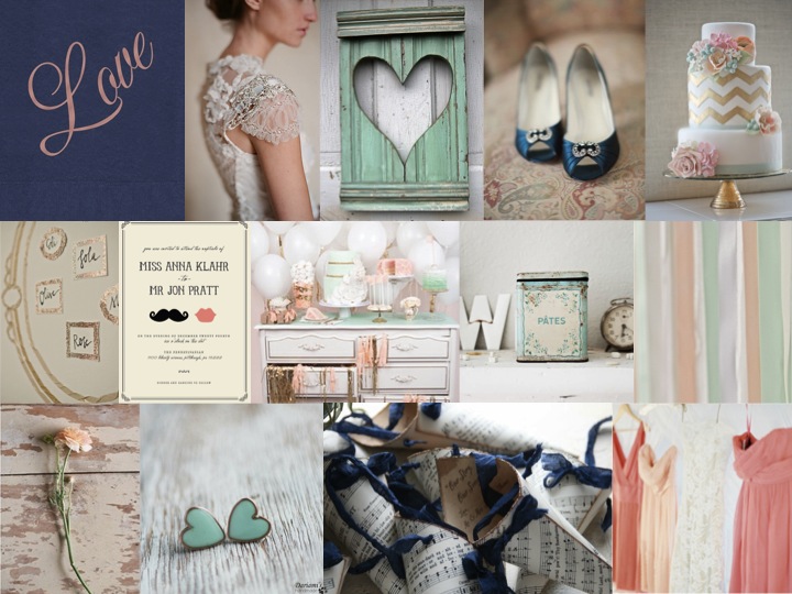
Good morning, everyone! Did you all have lovely weekends? It’s Inspiration Board Monday here on SBB, and I have to say, this might be my new favourite colour combination. I stumbled across it somewhere, and I knew I had to turn it into an inspiration board. There’s something about the way that coral and mint (two of the trendiest colours in weddings right now) work together that I just love, and when you add in navy it just has a whole new depth to it. I would have thought that it might come out a little retro or mod, but (while you could certainly use these colours that way) the board I’ve come up with is all sweet, slightly French shabby chic, with a touch of glam gold and lovely lace. Put your husband-to-be and his groomsmen in navy suits, and carry lush coral bouquets with your girls – the key to this look is knowing which of the colours to combine when, so that it doesn’t look too matchy matchy. Done right, this could make the prettiest of weddings.

Colours: Mint, coral, navy and gold

Top row: Love napkin {The Stationery Studio}; Claire Pettibone dress; heart shutter; blue shoes {Shewanders Photography via Wedding Chicks}; chevron cake {Erica O’Brien Cake Design}
Row 2: Table plan {via 100 Layer Cake}; invitation {Minted}; dessert table {Tracey Kiansky Photography via The White Library}; antique tin {Dreamy Whites}; ribbons {Andi Mans Photography and Design via The Wedding Chicks}
Row 3: Ranunculus {via Wedding Chicks}; mint heart earrings {Dariami on etsy}; confetti cones {Pink Cherry Mama on etsy}; coral bridesmaid dresses {Jose Villa via The Wedding Chicks}.

And don’t forget that you can request your own inspiration board by clicking on the button below:

Pantone Fall 2012 Colour Report

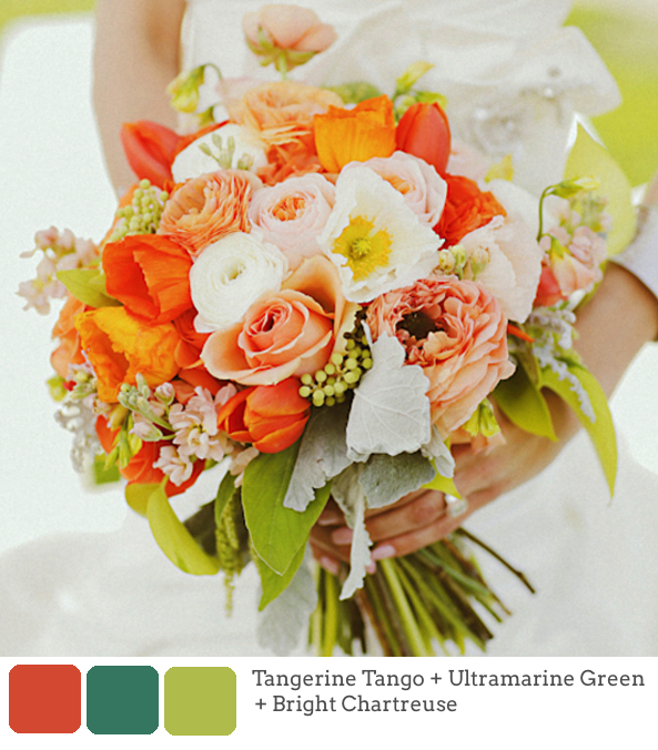
This isn’t quite breaking news, but while I was on hiatus, Pantone released their latest set of colours for autumn 2012, and I wanted to share them with you, as well as a few mini-boards showing how you might combine them into fresh takes on old colour palettes. Tangerine Tango (Pantone’s colour of the year) is still going strong (and I actually prefer these colour pairings for TT than those from spring), but for the less adventurous there are some softer colours as well as some bolds that pack a punch. Chatreuse, for example, can be used sparingly but to great effect. I suspect that of all of them, Rhapsody is the one we’ll see in more weddings this season, but I think (with the Olympics just weeks off now) that Olympian Blue must be my favourite. Which is yours?

 Source

Read More

Inspiration Board: Market Day

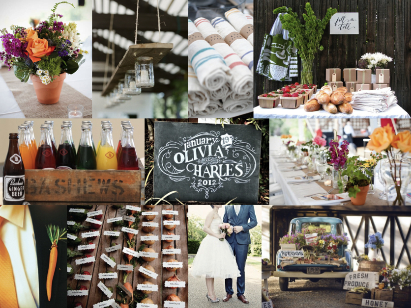
Hello friends! How are you enjoying your Tuesday? Where I am (in Durban) it’s raining like mad… hm, time to head for the English summer again, I think. ;) Big thanks to all of you for the blog, facebook, twitter and email love for the new site – very, very much appreciated! This afternoon I have a fun little inspiration board for you, which was created especially for one of our featured brides whose sister is now taking the plunge. The plan is to have a sort of market feeling, celebrating ‘the abundance of life’. Guests will get to serve themselves from an amazing spread of market-style food – how fun is that? I just love this idea, and I was pleased to find that farmer’s market-style weddings are a growing trend across the pond. There are so many cute things you can do here, and you all already know how much I love including fruit and vegetables in your decor. So here’s my take, using bright colours and rustic natural textures. Mason jar lights are perfect here, as are the adorable vegetable escort cards (and a carrot as a boutonniere? why not?!), kraft paper and chalkboard details, and Bashews soft drinks. I love the idea of creating a whole market display, especially when guests are given brown paper boxes or tote bags, and able to take home produce as their favours. Flowers are mixed and natural, and I like the mix of little jars and potted arrangements. I can just imagine the bride wearing a pretty short dress, like the one shown here – so fun! Hope your sister likes this, Kerri – keep us posted!

Read More

Inspiration Board: Pastel Protea

Happy Monday my friends! Sorry last week was a little quiet – I’m afraid it was just one of those weeks. Anyway, today I have a board that I am SO in love with. And even better, I got to create it for a friend. The lovely Louise came into my dear friend Sven’s life a little while back and he was immediately smitten, so we were all thrilled when they announced their engagement. They’ll be getting married in Natal next year, and are planning a brunch wedding (so fun!). When Louise described what she was after, I immediately knew what she was looking for, since it’s a look that I’d had in the back of my mind for ages, and I think it came together beautifully. It uses soft pink and green, proteas, brown paper (how much do I love the table plan?), chalkboard and watercolour, and I’ve added in a few pretty paper details as well. Isn’t it lovely? Oh, and look out for brunch ideas coming your way this Wednesday if you’re also planning a morning wedding!

Colours: Soft pink, green and neutrals

Top row (l-r): Bride with single bloom protea bouquet (Jose Villa); brown paper escort cards (Katie Stoops); pastel table arrangement (White Room Events/Pobke Photography); chalkboard pancake menu (Green Wedding Shoes/Lauryl Lane/My Bride Story/Birds of a Feather); wish jar (White Room Events/Pobke Photography)
Row 2: Tablescape (White Room Events/Jennifer Sando); watercolour wedding invitation suite (oh my deer); bride and groom with pancakes (Green Wedding Shoes/Lauryl Lane/My Bride Story/Birds of a Feather); papel picado decorations (Erica Velasco)
Row 3: Brown paper menu/favour bag (Nancy Liu Chin via Snippet & Ink); protea bouquet (White Room Events/Jennifer Sando); brown paper table list; doily details (source unknown); bride with bridesmaids (Jose Villa)

Inspiration Board: Once Upon a Time

Good morning, lovelies! Before we get to today’s inspiration board (which I have been saving rather impatiently for you), I have good news and bad news. Let’s start with the good. Last week, I was absolutely thrilled and honoured to be included in a list on the Fair Lady blog of FL’s favourite tweeters! Not only is it always super satisfying to know that people like what I do here, but you guys, I grew UP reading Fair Lady. When I was a little girl, I would read my mother’s old stack cover to cover and my secret teenage fantasy was to work there one day. So this was extra special supery dupery exciting. It rocked. Merci, FL. (And if YOU don’t follow me on Twitter yet, do!)

Now the bad news. Sigh. I regret (and I really do mean regret – remember I’m an editor by trade, so missing a deadline totally cuts me up, especially when it’s one I set myself) to tell you that the new Cap Classique website will not be launching at the beginning of December. Unfortunately, some technical issues that I have no control over have got right in the way, and while the delay is only about 10 days, with Christmas coming, it only makes sense to put it off until January. Which kind of blows, but when I thought about it, I decided it was kind of cool. New year, new site, new everything. I really am disappointed, and sorry to keep you all waiting. I hope you won’t mind waiting just a liiiiiittle bit longer. Although, now that I’ve had to rejig my whole schedule for December, I do have something quite cool up my sleeve, which you’ll hopefully like. So there you go. Please don’t hate me!

And now, before I get all depro about this again, I am going to cheer us all up with some sparkle. YAY! As you know, gorgeous colours mixed in with metallics have been huge news this year, and I think we’ll see lots more of that this season. Here’s my little take on a sort of royal wedding/princessy theme, which includes my current colour obsession (navy) combined with the prettiest powder blue, champagne and then some sparkly metallics. I can’t get enough of it! It’s almost enough to make a grown woman believe in fairytales… ;)

Colours: Navy, powder blue, champagne & gold

Top row (l-r): Princess bride; navy and gold manicure; table setting (Jill La Fleur/Jose Villa); navy bridesmaid’s dress (Kristin Vining); wedding cake with crown (Jose Villa)
Row 2: ‘Believe’ gold letters; blue and gold sequin garments; metal crown; mini Moets
Row 3:‘Once upon a time’ invitations; place setting with pumpkins (Martha Stewart); bride & groom (The Brand Studio); ‘Happily ever after starts here’ sign (Studio Eleven)

Inspiration Board: Dandelion Days

Good morning friends! Hope you had a fab weekend! Mine was good – I had the privilege of spending yesterday with a group of fantastic wedding industry people assisting on a shoot for my friend Louise of (aka @bijouxbride). Lots of hard work, but it was so fun, and I can’t wait to see the pictures. I know there are a lot of people who don’t like inspiration shoots, but for me, they’re a great way to pull together an idea (like a mood board, but on a bigger scale) and I know they’re where I get a lot of the ideas I use in my boards. Plus, they’re great for table settings, which I know brides struggle with sometimes. What do you think? Love ’em or hate ’em?

Anyway, on to today’s board. While it’s gone very cold and grey in London town, I know everyone in South Africa is on the other side of the spring/autumn equation, so I thought I would bring you a lovely spring palette to enjoy. A lot of brides shy away from yellow because it’s such a strong colour, but if canary yellow is too bold and mustard is too yellow, consider a soft pastel lemon. Combined with pale green and grey, it’s fresh and flattering, and it brought to mind for me the pretty gardeny side of the Kate Moss nuptials – a traditional church, lots of little flowergirls in white, wildflowers. Add in yellow shoes and a polka dot dress, plus of course a little hair braid (because we do love braids, don’t we!). And if you like the lovely invitations pictured here by my clever friends at Brancoprata, you can download the template for free right here. Perfect, non?

Colours: Pale yellow, green and soft grey

Top row (l-r): Bride & groom (Jose Villa); yellow shoes (Christine Meintjes); polka dot dress; frosted lemons (A. Hana Design); lemonade
Row 2: Dessert table (Amy Atlas); invitation (Brancoprata); macaroon ring shot (Kim Mendoza Photography); vintage car (Photogen Inc.)
Row 3: Dandelion; bridesmaid (Katelyn James); braided updo; flower girls; pretty church from Kate Moss Wedding (Mario Testino/Vogue)

Inspiration Board: Ascot Opening Day

I’M BACK!! Hello lovely friends, I’m delighted to return to you this fine morning. This last morning of my old life, where I’ll make my last journey to Oxford on the train. (Boy, can I ever not wait to see the back of that train.) From tomorrow, I’ll be starting a new chapter, and Paddington will be just a bear and not the station I spend half my life waiting in. I’m terrified, I’m excited, I’m nervous, I’m relieved. But most of all, I’m ready. And I can’t WAIT for the next part of the journey. In the next few weeks I’ll be starting to introduce some new features to you, I’ll be making some big announcements, and ultimately, I’ll be introducing you to the new website. This morning, as I look back on a great five years of my career, I honestly feel that the best is yet to come.

For today, we have some fabulous inspiration, in the form of a board inspired by one of my FAVOURITE movie scenes. (Well, sort of.) I mean, the black and white Ascot Gavotte scene in My Fair Lady is beautiful, not just because it has Audrey Hepburn being Audrey Hepburn in it, but because all the dresses and set were designed by the incredible Cecil Beaton. (Unfortunately, I hate musicals, so as long as it’s on mute, we’re all okay.) Add the lightest pearly pink, and you have a design that is thoroughly modern and absolutely perfect for an elegant (possibly vineyard) wedding. Don’t you just love it? Smashing. Positively dashing.

Don’t forget to come back later to see more yummy inspiration from our real life bride, Cheryl.

Colours: Black & white, blush pink

Top row (l-r): Parisian stripes ceremony arch (Simple Splendor Photography); blush pink bridesmaids’ dresses (Anastasia Photography); oysters (Flory Photo); ceremony chairs (Adam Barnes Photo)
Row 2: Audrey Hepburn in My Fair Lady; blush pink, black and white invitation suite (sugar paper); crowd from Ascot scene in My Fair Lady
Row 3: Black & white macaroon tower; shoes (Studio Impressions); wedding dress with stripe sash

Inspiration Board: Burlap & Blueberry

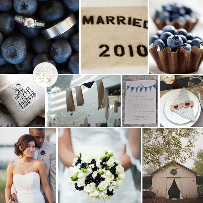
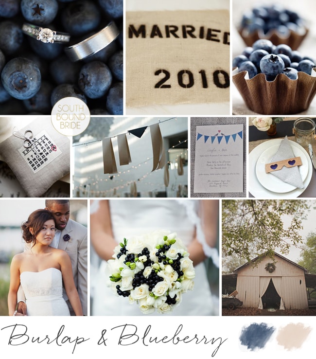
Good morning! How was your weekend? I spent mine on a massive organisation kick – moving into my new office, and trying to implement a system for getting things done. Although the To Do list is massive, it’s actually really empowering to feel more on top of it all! One thing on this weekend’s task list that didn’t take me very long to complete was this little inspiration board, because I’ve been dreaming it up for ages. I am totally smitten with navy at the moment, and while I do adore a nautical wedding, there are so many other ways of using navy as a wedding colour. One of my favourite is to combine it with burlap or hessian for a stylish cross between preppy and rustic that I am just crazy about. And of course blueberries make the perfect country motif. I am dying over the blueberry bouquet below (okay, those are probably choke or elderberries, but they have the right look – your florist may be able to achieve something similar with ivy or similar, and make sure to have them wrap it in twine for the perfect rustic detail) and the blueberry cups – such a sweet dessert, or leave one at each place setting. Printed burlap elements give that extra preppy edge (don’t you just love the date ring pillow?), as do the striped navy napkins. Kraft or corrugated paper also work really well here alongside the burlap. And of course, what would a farm-style celebration be without strings of bunting and fairy lights? (Best news – the bunting invitations come from this free template!) As always, it’s the tiny details that make a big difference – matching burlap rose and boutonniere for the bride and groom, and navy nailpolish for the bridesmaids (where do I find that? sign me up). You could introduce other colours – a soft pink, coral, yellow, or green would all work, but I like the cleanness of this simply stylish palette.

Colours: Navy, white and beige

Top row (l-r): ; Blueberry ring shot (Jamie Delaine); burlap place mat (Amy Karp); blueberry cups
Row 2: Burlap Save the Date ring cushion (Shawn Connell for Christian Oth); navy and burlap garland (Domestic Construction/Max Dworkin); blue bunting love birds invitation (EE photography/Wedding Chicks); striped navy napkin and 3D glasses (Domestic Construction/Max Dworkin)
Row 3: Bride & groom (Jodi Miller Photography); blueberry bouquet (Oasis Flowers/Sakura Photography); barn (Stone Crandall Photography)

Inspiration Board: Burlap & Blueberry

Inspiration Board: Just Peachy

Happy new week, friends! Hope you had a lovely weekend. I spent it catching up with friends and indulging in a little side of rugby – what did you get up to? I wish weekends could last forever, but here we are, back at Monday, *sigh*. On the upside, Monday means pretty inspiration boards, and today’s is exactly that. I love peaches as a motif for a wedding – not only are they symbolic in Chinese culture of marriage and longevity, but in Renaissance art a peach with a leaf attached represented truthfulness and speaking from the heart. Plus, they’re totally pretty and a little bit rustic. Soft peachy pink goes beautifully with a warm coral orange and green, and pair that with brown neutrals like wood, craft paper and even copper, and you have the perfect combination. I just LOVE the idea of these peach pouches at each place setting – a totally sweet and affordable favour – but you could also treat your guests to homemade peach jam in pretty glass jars. For escort cards, try this sweet rustic option of little labels tied to birdcages – the cages can also be used to house gift envelopes from your guests.

{Pssst! Like this? Check out our Rustic Peach & Apricot board as well.}

Colours: Peach pink, coral, white & green

Top row (l-r): Peach pocketoutdoor ceremony area (Jesi Haack);peach jam favours; flowers in copper pot (Simply Bloom Photography)
Row 2: Tie; kraft/brown paper menu and wooden utensils (Austin Gros);folk art wedding invitation; peach shoes (Troy Grover Photography); bouquet with lace accent (Simply Bloom Photography)
Row 3: Bride & groom (Austin Gros);fruit cooler in mason jar; bridesmaids; birdcage escort cards (Jen Huang).