Inspiration Board: Green Light

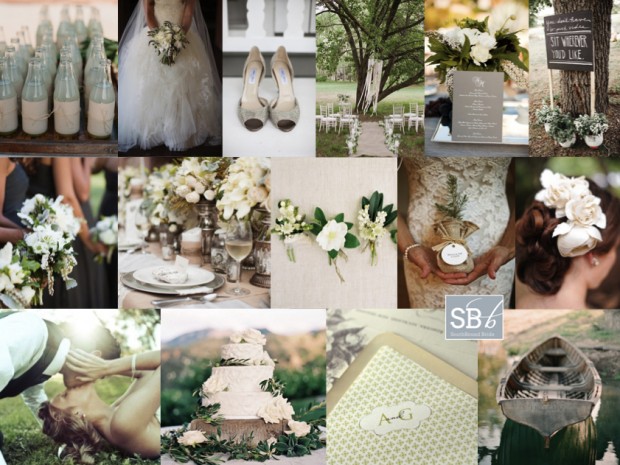
Good morning friends! How was your weekend? Needless to say, mine was Olympic obsessed, but I won’t bore you with more of that! Anyway, today’s board is another reader request, which I actually received a little while back from Lizelle. She didn’t tell me much about her wedding, just that she’s chosen a palette of sage, ivory and pewter, so that was where I started with the colour palette. I’ve landed up going for a kind of romantic country style, that would suit a variety of South African venues (and which always makes for my favourite boards). It’s equal parts whimsical, dreamy and elegant, with the more serious pewter playing off the bashful green, and that lovely romantic ivory making up the trio. Layers of tulle in the wedding dress play off ribbons in the breeze, pale green drinks, and soft flowers, while bridesmaids wear formal pewter dresses, and the table is adorned with pewter or silver vases and mercury glass. Give groomsmen a range of slightly varied boutonnieres (a nice twist on the individual bridesmaids bouquet trend) and invest in a set of beautiful stationery that can be used throughout. This is a look that is classic and effortlessly chic. Hope you like it, Lizelle!

Colours: Sage, ivory and pewter

Top row (l-r): Bottles {C: Mindy Weiss; P: Elizabeth Messina}; wedding dress and bouquet {C: Beth Helmstetter Events; P: Jasmine Star Photography}; shoes {C: Honey Darling Events; P: Melissa Schollaert Photography}; ceremony area {P: Annabella Charles}; centrepiece and menu {C: Beth Helmstetter Events; P: Jasmine Star Photography}; seating sign {P: Nadine Photography}
Row 2: Bridesmaids with bouquets {C: Beth Helmstetter Events; P: Jasmine Star Photography}; green and pewter table setting {S: Tying The Knot Wedding Day Coordination; P: Greer G Photography}; boutonnieres {F: Flowerwild; P: Jose Villa}; sapling favours {P: Alison Conklin}; rose hair piece {C: Sarah Carsten Events; P: Rebekah J Murray}
Row 3: Bride and groom {P: Photographs by Anjuli}; wedding cake with olive leaf decoration {S: Beth Helmstetter Events; C: Susiecakes; P: Steve Steinhardt}; stationery set {Ruby & Willow}; rowing boat {Elizabeth Messina}


Inspiration Board: Olympian Blue

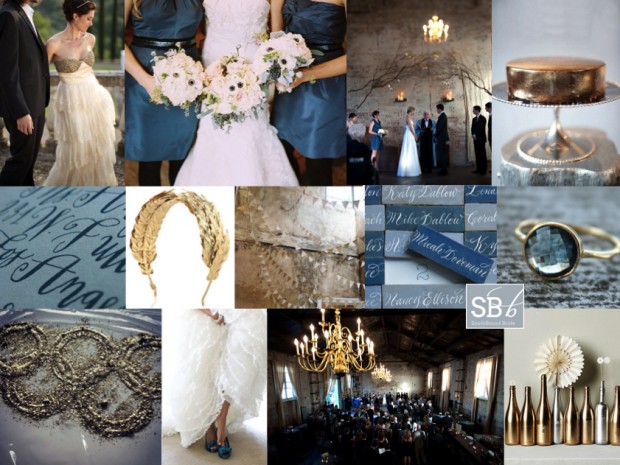
Hooray for Mondays, SouthBound Bride! And it’s no surprise I have the Olympics on my mind today. I was going to do a gold, silver and bronze board, but having just done mixed metallics last week, I thought I would focus on Olympian Blue, one of the beautiful colours from Pantone’s Fall 2012 lineup, mixed in with a bit of shiny gold, for obvious reasons. Hopefully there’ll be at least one gold to South Africa’s name by the time you read this! This blue is lovely and fresh, but it’s also quite intense, so I’ve added a light denimy blue in as well, and gone for a look that’s kind of a cross between urban and rustic, and just a bit Anthropologie. It works beautifully with the BHLDN dress top left, which I have been in love with for the last year. Another detail I absolutely adore is the calligraphed tiles for place cards (no surprise, an innovation from Martha Stewart). And for a final Olympic touch, there’s a pretty laurel-inspired gold headband. Hope you like it, and hope you’re all enjoying the games this week! (To find out more about the Pantone range and see some colour combos, check out this post.)

Colours: Olympian blue, pale blue, grey, gold

Top row (l-r): BHLDN dress {S: Alchemy Fine Events & Invitations; P: Mike Larson Photographers, Inc.}; blue bridesmaids dresses and anemone bouquets {C: Bluebird Events; P: Leo Patrone Photography}; ceremony backdrop {P: Jason Durnin}; gold cake
Row 2: Calligraphy invitation {Sycamore Street Press/Betsy Dunlap}; laurel headband; gold and white bunting; calligraphy tile place cards: topaz ring
Row 3: Olympic rings; blue shoes {C: Jenny Brown; P: Alea Lovely Photo + Video}; reception venue {P: Jason Durnin}; spraypainted bottles.


Inspiration Board: Beach Tinsel

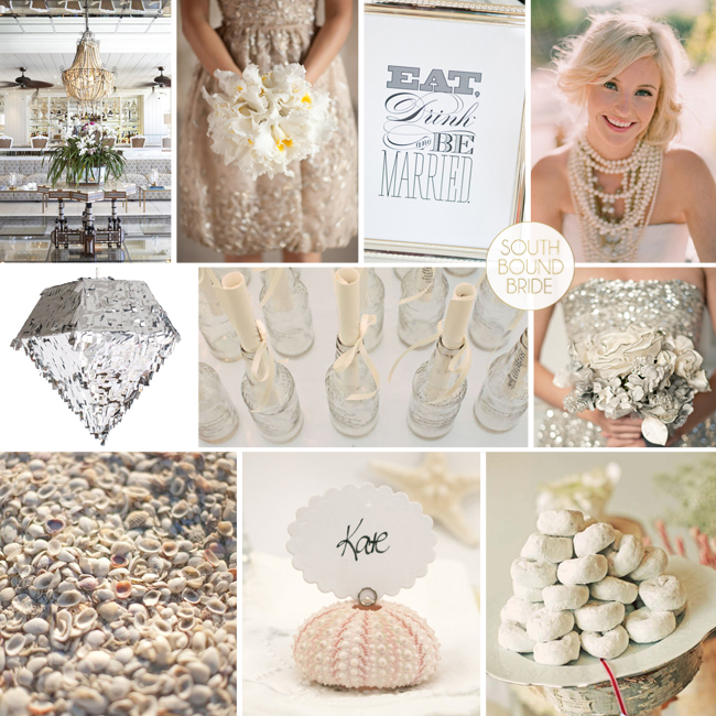
Woohoo, we’re getting our sparkle on today! Reader Tracey sent me a request for help with her summer wedding at the Oyster Box hotel – she and her fiance were leaning towards neutal colours but weren’t yet decided. They’re a young couple, so they also wanted to add a bit of fun to the event, and make their design simple and fresh. I love the Oyster Box as a venue (it’s actually one of my all-time faves) and I thought neutral colours were a great idea as not only will they work perfectly with the hotel’s interiors, they’ll also play up the colours of the beach. Flat neutrals, especially with natural and linen accents, can make for a gorgeous beach-style do. However, with Tracey’s request for fun, I immediately thought of the metallic and shimmer trends we’re seeing at the moment – there’s just something about a few sequins that puts everyone in a good mood. And it’s so easy to bring a bit of New Year’s Eve spirit into your design. Start with a basic palette of lots of clean white, with ivory and cream variations, and a bit of taupe, and then metallics like gold, silver and bronze. Add in fun sparkly accents – shiny bridesmaids dresses, metallic garlands and (my best) a blingy pinata! Pair this with beachy touches like shells and cute ‘message in a bottle’ escort cards. Finally, have fun with the food (this is an easy way to delight your guests, and makes the whole thing a fun experience) – you could have an unusual cake (like donuts) or serve mini ice-cream cones instead of dessert. Tracey can afford to be daring in her wedding attire – I just love the idea of a single (or multiple!) bold statement necklaces. What makes this look easy to pull off is that it’s essentially a classic white wedding with selected over-the-top moments, that add a real punch. And my, but isn’t it pretty? Hope you like your board Tracey – good luck with your planning!

Colours: White, neutrals, metallics

Top row (l-r): Oyster Box foyer; gold sparkle dress {P: Shira Weinberger}; Eat, Drink & Be Married sign {S: La Fete Event Design; P:Jennifer O‘Donnell Photography}; bride with statement necklace look {S: Canvas and Canopy Events; P: Elizabeth Messina}
Row 2: Silver pinata by Confetti System; message in a bottle escort cards {S: Wed Perfect; P: Denise Bovee Photography}; silver sparkle dress {S: Ginny Branch Stelling Styling & Design; P: Harwell Photography}
Row 3: Shells {S: Wed Perfect; P: Denise Bovee Photography}; shell place card {Fairyfolk Weddings on Etsy}; powdered donuts {S: Alchemy Fine Events; P: Justin Lee}: silver accent bouquet {S: Imagine… Weddings and Special Events; F: Couture Flowers; P:The Youngrens}

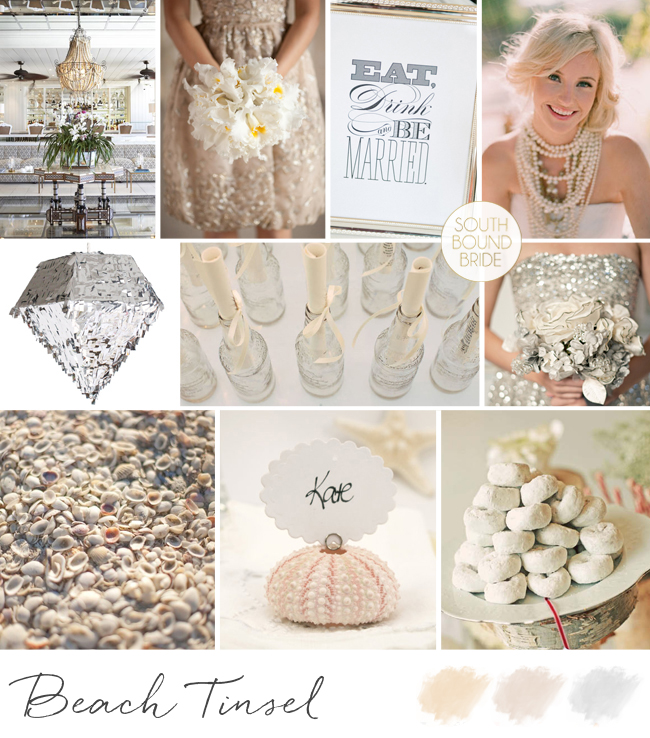
Inspiration Board: Beach Tinsel | SouthBound Bride

Save

Inspiration Board: All Fore Love

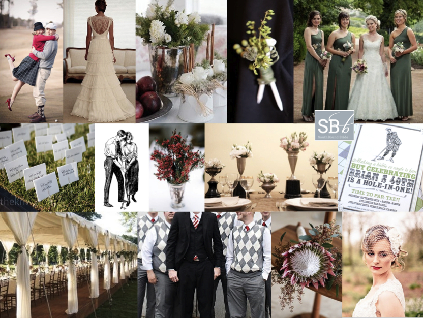
It’s Inspiration Board Monday! And today it’s a reader request. I just love it when you ladies give me a creative challenge, so when I heard from bride Tanja about her vintage golf-themed wedding I couldn’t WAIT to get started! The wedding is set for autumn, so Tanja’s chosen a palette of red, green and dusky pink (which I think is perfect for this theme and time of year). Tanja’s fiance is crazy for golf and they both love old things, so they merged these loves together to create their theme of old world golf, and they’re hosting it at a golf resort as well. Tanja also wanted to include elements like lace and proteas, which grow wild in the area. I started off by looking at lots of golf-themed weddings, and wow, some of them are a liiiittle cheesy. So as with all themes, subtlety is key. My first recommendation is that Tanja and her fiance hire a great designer, because stationery would really tie everything together here. Ask them to use argyle in your colours as a motif throughout, and combine it with vintage golfing imagery or clip art (similar to the birthday invitation below) to create a sort of ‘brand’ for all the paper goods- this is a great way of making an unusual theme work cohesively. You can reflect the argyll in the gents’ attire (how cute are groomsmen in sweater vests?) or just their socks if you’d prefer them to wear suits. You can even give them tee boutonnieres! For the bridesmaids, you can’t go wrong with green dresses, but you could use red or pink instead (or even have each of them in a different colour). For the bride, I love this vintagey lace dress with a birdcage veil (red lipstick is a must!) and statement protea bouquet. Tanja can subtley extend the golfing theme using trays of wheatgrass with little golfing flags for escort cards, and either number her tables like golf holes, or name them after famous courses. But my favourite detail is the use of vintage trophies (golfing or otherwise) as vases throughout the table decor. This is a classy nod to the sport, without resorting to jars full of golfballs or similar! Tanja – I hope you like the board and good luck with your planning journey. I can’t WAIT to see how it turns out!

Colours: Red, green and dusky pink

Top row (l-r): Vintage golf engagement photos {P: Tara Parker Photography}, lace wedding dress {Wanda Borges}, silver vase {Eva Lindh}, tee boutonniere {Ardent Story Photography}; sage green bridesmaids’ dresses {Bernard Bravenboer}
Row 2: Grass flag escort cards; vintage golfing image; red flowers in silver vase {P: Allison C. Photography}; trophy vases {S&P: Brancoprata}; vintage golf invitation {bnute on Etsy}
Row 3: Open long marquee {David Beahm}; groomsmen in argyle sweater vests; protea bouquet {F: Palm Springs Florist/Katie Osgood Photography}; birdcage veil and red lipstick {P: Eden Photography}


Inspiration Board: Gucci Green

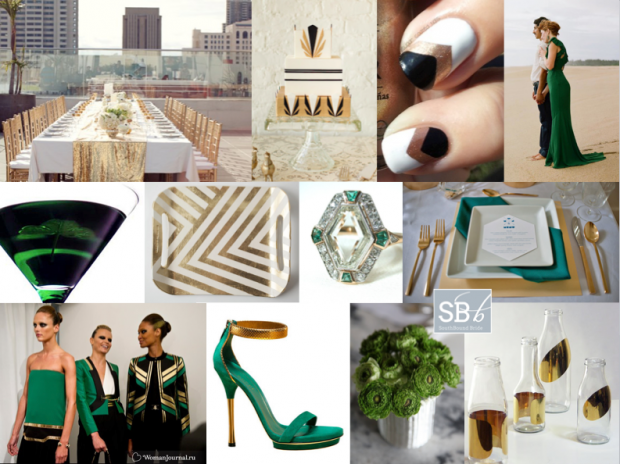
Good morning friends! I felt like doing something a bit different today – a stylish city wedding inspired by the latest catwalk trends. I adore the idea of a rooftop wedding (not enough couples trying this in SA to my mind – just think of the views from the Grand Daddy in Cape Town, for example, or the bar at the Hyde Park Hotel in Johannesburg, and check out two of my favourite Cape Town weddings with city views here and here). This time I’ve looked to Gucci’s Spring/Summer 2012 collection and created a bold palette of emerald green, gold and black (with a touch of geometrical art deco) that would really blow your guests away in the style stakes. It’s so striking. And OMG check out this bride wearing a green Gucci dress – one of the most elegant alternatives to the traditional white dress I have seen. Perfect for swanning around a terrace with your new husband, greeting your guests and drinking Emerald Isle cocktails, no?

Colours: Emerald green, black, gold


Top row (l-r): Rooftop table with gold sequin runner {S: Alchemy Fine Events & Invitations/P: Scott Lawrence}; Art Deco cake {D: Lael Cakes; P:Jen Huang Photography}; chevron manicure; green Gucci wedding dress {P: Q Weddings}
Row 2: Emerald Isle martini; gold chevron tray; emerald and diamond Art Deco ring; green and gold place setting {S: Sweet Emilia Jane; P: Captured by Aimee}
Row 3: Gucci spring/summer 2012; Gucci shoes; green flowers; gold bottles.


Inspiration Board: Village Fete

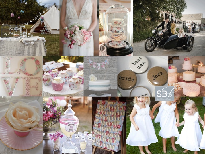
Good morning friends! Today we’re all about pretty country shabby chic style, starting with this inspiration board (and come back later for something extra special!). This is actually a look I’ve seen quite a bit recently in the UK. It’s a really pretty alternative to the vintage look that was everywhere in SA this season, and is all about pastels and mixed floral fabrics (in this case inspired by Cath Kidston style). This board is a request from one of our lovely readers, Jenny, who is getting married in her local church and travelling on to the reception (in a tented marquee in a field) on a motorbike and sidecar – so cute! She’s made loads of bunting using Cath Kidston fabric, and will be serving sandwiches, pastries and cakes at their tea party. It reminds me of a village fete, and Jenny could even consider having some of the games and entertainment you find at a fete – tombola stalls, hay rides, etc. I really like the idea of having a cake table with lots of different cakes and labels for each of them, just as if they were a baking competition, instead of one cake. She could even use Cath Kidston cupcake cases to tie in with her bunting. Other Kidston touches that I love are the mini cake bunting, the escort card board, and the LOVE letters (you could also make these yourself into table numbers). Carry a beautiful rose bouquet (I’m in love with this one, which has a slightly wild, natural touch). Teacups should be a big part of the decor – collect random ones on eBay and place them at each table setting with a rose inside – this doubles as a favour. Another cute favour is the little button badges, which are just adorable. You could also pile teacups up under bell jars or hang them at different levels from the ceiling. Serve a range of teas, as well as lemonade (or better yet, this marital bliss special cocktail) and consider hiring in a specialist coffee machine – I’ve seen how popular these are! Hope you like your board Jenny – good luck with the rest of your planning!

Colour: Pink, blue, green, cream pastels

Top row (l-r): Marquee in field; bouquet {P: Odalys Mendez Photography S: Storybook Wedding Consulting}; teacup decor {P: Allan Zepeda}; motorbike with sidecar {Wild Weddings}
Row 2: LOVE letters; Cath Kidston cupcake cases; cake with bunting {source unknown}; button badge favours; cake table {Cynthia Brown Studio}
Row 3: Teacup with rose; marital bliss cocktail; Cath Kidston escort card board {My Vintage Tea Party}; flower girls {Loverbird Photography}


Inspiration Board: Together in Perfect Harmony

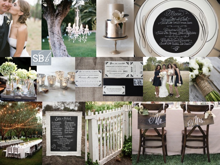
Happy Monday, folks! Hope you had a lovely weekend! Today’s inspiration board is a reader request from Robin, who is planning a black, white and silver garden/farm wedding for April next year. Robin had already chosen her colour scheme and bought many of her decorations, but couldn’t find a suitable venue in her area, so in the end decided to host the reception at her in-law’s farm, where there is a beautiful garden. I’m not sure what sort of decor Robin has already purchased, so in creating the board, I focused on how you might translate an elegant, slightly formal wedding to an outdoor setting. In fact, the two work perfectly together! Robin already told me she wanted long tables (love this idea, especially with strings of lights in the trees – what could be more romantic) and was considering a collection of glass containers with white flowers in them, which I also think is a great idea. The key then is to balance out the rustic (as a nod to the farm) with the formal. One great idea is to hire at least one beautiful chandelier, and hang it from a tree as a focal piece of decor, which really sets the tone. Stationery can be quite traditional, and calligraphy makes a really lovely detail, especially at each place setting as with the menu cards below. I was going to suggest either white dresses or black ones for the bridesmaids until I saw the pic below – what a great idea to let them wear a combination! The bride can also wear a black or silver sash, depending on the style of her dress. Silver touches come from mercury glass (which you can easily DIY) and just LOOK at this silver cake – isn’t it gorgeous! On the rustic side, consider hessian/burlap table cloths or runners, twine-wrapped bouquets, and wooden or chalkboard details. Make use of pretty features of the garden, like a gate that doubles as a place to hang escort cards. Just because the venue has changed, doesn’t mean that your style has to – in fact, in this case, I think the indoor and outdoor elements work perfectly together. Good luck, Robin – hope the rest of your planning goes brilliantly!

Colours: Black, white, silver


Top row (l-r): Bride & groom {P: Jemma Keech Photography}; chandelier in tree {P: Leo Patrone Photography}; silver and white cake {Yummy Cupcakes & Cakes}; place setting
Row 2: Flowers in varied glass containers; mercury glass votives; invitation suite on burlap {D: JK Design; P:Karen McNeil Photography}; black and white bridesmaids’ dresses {P: Alyse French Photography}; twine-wrapped bouquet {F: Gild the Lily Too; P:Alison Mayfield for Christian Oth}
Row 3: Long tables {C: Meredith Commender; P: Stephen Karlisch}; framed chalkboard sign {P: Alyse French Photography}; gate escort card detail {P: Lisa Lefkowitz}; chair back calligraphy signs {C: Amy Kaneko Events P: Jose Villa}.


Inspiration Board: Sand & Stripes

Happy Monday, folks! I’ve been jonesing to do this inspiration board ever since I was myself inspired by this shoot in the latest Sweet Paul magazine (which you should totally check out if you haven’t already). You probably already know I’m a fan of nautical style, but I loved combining that with soft dirty orange and sand, for a wedding that would be equal parts beach rustic and South of France stylishness. Striped dresses for your bridesmaids (and peep toes for you), navy suits for the boys, and wooden tables right on the beach with flowers in soft corals and peaches. I can just imagine a bride in a chic short dress, and isn’t the rope hair accessory darling? (This post contains affiliate links)

Colours: Navy, orange, beige and white

Top row (l-r): Rustic outdoor table {S: Paul Lowe; P: Susanna Blavarg}; sailing boat {S: Green Wedding Shoes; P: Caroline Tran}; starfish; coral peonies {S: Summer Watkins}
Row 2: Navy striped sandals {S: Summer Watkins; P: Jen Huang}; invitation suite; sailor’s knot hairpiece {March & Lilly}
Row 3: Bride & groom; nautical wedding cake {Sweet & Saucy Shop}; navy striped bridesmaid dress

Inspiration Board: Sand & Stripes | SouthBound Bride

Inspiration Board: Polka Promise

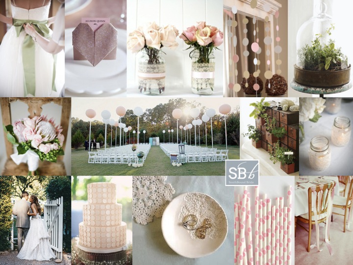
I’ve had lots of requests from real brides recently for pastel pink and green boards – clearly this is one colour combination that isn’t going anywhere! These two colours always give me such a good feeling – they’re so balanced, but at the same time so pretty and fresh. They’re ideal for a (spring or) summer wedding, which is just what real bride Jeani will be having. She wrote to tell me of the elements they’re considering: proteas and herbs, lace, DIY details. They also want to include polka dots as a motif, which I think is super cute! The key to using something like polka dots is not to go overboard, but to use them carefully and then echo them in shape or texture. So I’ve suggested some gorgeous DIY dot garlands (Jeani can use these hanging in the ceremony area, as a backdrop to the cake table or main table, draped from the ceiling – lots of options!). I’ve also suggested a polka dot cake (how sweet and subtle is this one?), pink paper polka straws, and even a dotty dress (look closely at the image bottom left). Then the circles are reflected in elements of the protea and rose bouquet, and the fun balloon accents in the ceremony area. Other fun DIYs that Jeani and her man can try are origami heart place settings, lace-wrapped votives and jars, a pretty lacy ring dish and ribbon-tied chair backs (use this on just the bride and groom’s chairs if you don’t want to spend a fortune on ribbon). Add a pretty sash to a wedding dress, and carry that fresh green into herbs under bell jars and inside found objects like this old fashioned filing drawer. There’s lots here to play with, and it all adds up to handmade summer sweetness! Hope you like it, Jeani!

Colour: Pastel pink, green, cream and beige

Top row (l-r): Dress with sash {Lisa Poggi}; origami heart DIY; lace-wrapped mason jar vases; paper dot garlands; herbs under glass {S: Paul Lowe & Paul Vitale; P: Alexandra Grablewski}
Row 2: Protea bouquet; balloon ceremony area {P: Simply Bloom Photography}; herbs in drawers {S: Paul Lowe & Paul Vitale; P: Alexandra Grablewski}; lace-wrapped votives
Row 3: Bride & groom; polka dot cake; DIY lace ring dish; paper polka dot straws; ribbon chair backs {P: Rebecca Wedding Photography}.

Inspiration Board: Cape Dutch

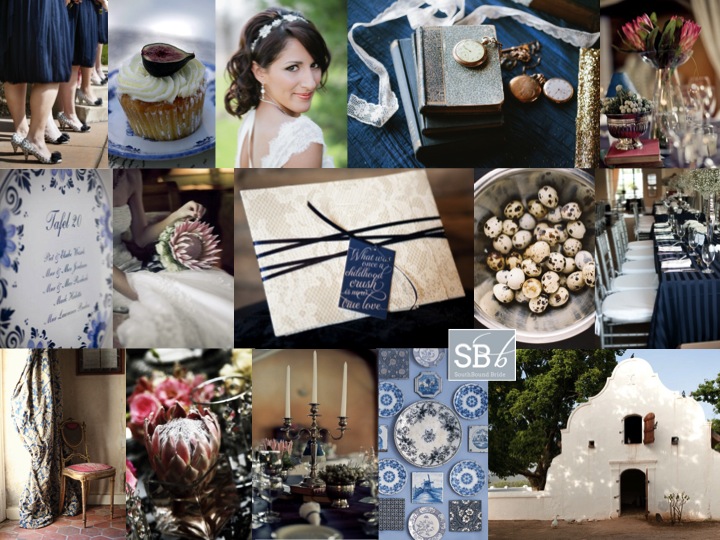
Oh I do love Inspiration Board Monday. These babies are one of my favourite things about running the site, and I’ve been getting lots of requests from you for boards for your weddings – keep ’em coming! Today’s scheme is one which is HUGE news in the South African wedding scene, and an awesome next step for brides who have loved the Victorian country vintage look of the last two years but want something slightly fresher. With this look, you can still use your proteas, still use your vintage touches, but instead of sticking to soft pinks and neutrals, you combine it with navy blue. My prediction is that you’ll see a lot of this colour next season. It reminds me a little of the Dutch still life themed tables which I have seen a few times recently, especially when combined with Delft pottery in blue and white. As I mentioned in my Love List this weekend, the look is particularly apt for the South African market, what with having so many wedding venues that include Cape Dutch architecture. Enjoy!

Colours: Navy, white, pink and neutrals

Top row (l-r): Bridesmaids’ dresses {S: Amy Bridges Events; Verite Photography}; cupcake; bride {S: Kirkbrides; P: Arielle Doneson Photography}; books and watches {S: Kirkbrides; P: Arielle Doneson Photography}; protea decor {P: Love Made Visible}
Row 2: Delft table plan {S: Aleit; P: Glee Photography}; protea bouquet {P: Love Made Visible}; lace and navy invitation {D: The Paper Guppy; S: Revel & Bloom; P: Trulife Photography}; quails eggs {S: Canvas and Canopy; P: Braedon Photography}; navy tables {S: Engaging Affairs; P: Liga Photography}
Row 3: Curtain and chair {P: Exhibit Emotions}; protea; table decor with candelabra {P: Love Made Visible}; Delft plates; Cape Dutch homestead {Babylonstoren}.