Inspiration Board: Pretty as a Peacock

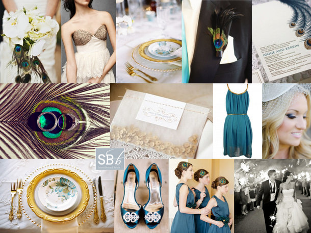
Afternoon, folks! We’re rounding off a pretty awesome week here on SBB with one more piece of pretty and awesome. I’ve been getting tons of requests for inspiration boards from all of you, so I’m working double time to try and create as many of them as I can. Reader Kristin has been waiting a little while for hers, but I hope it will be worth the wait! Kristin is getting married in a hall in summer, and she’s looking for turquoise accents to classic black and white, with peacock feathers and a general air of chic. Initially I was just going to send Kristin over to a board I created right at the very beginning of the blog (you can find it here), which was when the peacock trend was taking off. But then I thought about it, and I thought maybe we could bring the peacock theme a little more up to date. One option would be to go for a very art deco look – peacock was a key motif during the period after all – but instead I decided to add a bit of glitter to the teal, black and white palette – a look that’s very of the moment. The focus is less on actual peacock feathers – although they’re included in select spots: a boutonniere, with the bouquet, and on the bridesmaids’ headpieces – and more on beautiful peacock imagery. I am so in love with the place settings using peacock plates, gold cutlery and an ornate charger – if hiring this isn’t an option, consider a custom printed menu that fits inside a plain white plate, to give you a similar visual effect. I also adore the letterpress invitations pictured here – stationery is a great way to ‘brand’ your wedding in a sophisticated way. Add a bit of glittery texture – if not on the wedding dress (although I always seem to go back to this gorgeous wedding dress!) then maybe on one bridesmaid’s dress, and how cute is the little packet of sequin confetti? Teal/turquoise shoes and BM dresses are a must, but beyond that I’d stick to classic black and white. And there you have it. Hope you like your board, Kristin!

Colours: Turquoise, black, white & gold

Top row (l-r): Bouquet with peacock feathers {P: Jared Rey Photography; C: Gretchen Rose Events}; BHLDN wedding dress; peacock place setting {P: Ryan Ray Photography; D: Razzle Dazzle Event Decorating}; peacock boutonniere {P: Abbey Hepner Photography; C: GuGuLy Event Planning}; letterpress peacock feather invitation {Bespoke Letterpress}
Row 2: Feather with rings {Stacy Reeves}; sequin confetti {P: Greg Blomberg; D: Bows and Arrows}; teal bridesmaid dress; bride {P: Chrystal Cienfuegos Photography}
Row 3: Peacock plate place setting {P: Ryan Ray Photography; D: Razzle Dazzle Event Decorating}; teal shoes {P: Ryan Ray Photography; D: Razzle Dazzle Event Decorating}; teal bridesmaid dresses {P: Elaine Palladino Photography}; bride and groom with sparklers {P: Amy and Stuart}

 

Pantone Spring 2013 Colour Report

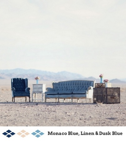
It’s my favourite time of year again – Pantone have just released their latest spring fashion palette, and man, is it a good one! I absolutely love every one of these pretty, preppy colours, from punchy Poppy Red or Lemon Zest to cool Monaco Blue (best name ever) and Linen, which pretty much go with everything. Greyed Jade and African Violet are lovely soft versions of purple and green, and Tender Shoots and Nectarine offer chilled out alternatives to chartreuse and coral. I also love emerald and dusky blue – lovely, cool colours you just want to dive on into. There are SO many combinations of these colours that would look amazing at a wedding, but I’ve put together a few mini palettes to get you started. Which is your favourite?

Read More

Inspiration Board: Country Elegance

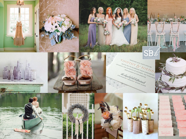
There’s nothing I love better than when I get a request for an inspiration board using a fresh theme or colour combination, and this might be one of my all-time favourites! When reader Vanessa (who is getting married all the way over in the Rocky Mountains of Canada – you don’t have to be in South Africa to request a board!) wrote in with her coral, green, purple and grey colour scheme I immediately knew she was on to a winner. She and her husband-to-be have a theme of ‘simple elegance, wedding in the woods’ – doesn’t it sound beautiful! They’ll be using burlap and lace accents, and combined with these colours, I think that will be beautiful. I would really let the colour combo speak for itself wherever possible – in mismatched bridesmaid dresses, florals, and stationery – either in a four colour display or in mini combinations of one or two of the shades. Add classic touches for elegance – beautiful chairs, anemones, a lavender wreath. Simple tables with burlap and lace runners (and maybe a single sprig of lace-tied lavender at each place setting) complete the look. Hope you like your board, Vanessa – I loved putting it together!

Colours: Mint, coral, lavender & grey

Top row (l-r): Dress {S: Joy Thigpen for Once Wed}; bouquet {P: Leo Patrone Photography; C: Bluebird Events}; bridesmaids {P: Paula O’Hara Photography; D: Laurens Norton}; table setting {P: Elizabeth Messina; S: Canvas and Canopy Events}
Row 2: Purple bottles {Dreamy Whites}; coral shoes {P: Cameron + Kelly Studios; C: Peak Events/KD Event Designs}; coral and grey letterpress invitations {Coral Pheasant}; lavender wedding cake {D: Bash, Please C: Susie Cakes; P: Amy and Stuart Photography}
Row 3: Couple in row boat {P: {oh, darling!}}; lavender wreath {P: Paula O’Hara Photography D: Laurens Norton}; coral, white and purple flowers {P: Summer Street Photography; F: Dogwood Floral Design}; pods in bark vases {Jaden Rai Inspired on Etsy}; coral ombre escort cards {P: onelove photography; S: La Boheme Events; D: Prim and Pixie}.


Inspiration Board: Rustic Tangerine

Hello lovelies – did you enjoy our DIY post today? (Don’t worry though, I’m not leaving you short on weddings this week – I have a stunner for you tomorrow!) Today there’s just enough time for one last little bit of inspiration. This one’s a reader request from the lovely Dee, who is getting married in summer in Zimbabwe. She’s planning the most gorgeous rustic combo of orange and burlap and was looking for suggestions for simple but elegant table decor. I think Dee’s made a lovely choice of colour, and just because orange makes a statement doesn’t mean she needs to sacrifice on elegance – if anything, tangerine is this year’s hottest shade, and one that instantly creates warmth. I’d suggest that Dee focus on just using orange in her florals, so that it pops against the burlap and other decorations, and beautiful flowers always keep things classy. Start with lush bouquets for bride and bridesmaids, and on the tables make use of Consol mason jars – simple, easy, effective. Dee could also add in some found vintage objects, and other rustic textures like chicken wire or wood to add interest. A great place to add detail here is in the place settings – I love the menu printed on to a napkin and the silverware tied with twine, and basic kraft paper luggage tags make a very effective name tag and escort card. Or Dee could make these cute little hearts from hessian and add one to each place setting. A ‘naked’ cake, interesting (church) seating at an outdoor ceremony and a curtain of fairy lights round out the decor. For bridesmaids, I’d stick to neutrals, and consider long grey dresses which not only will make the orange bouquets pop, but will also add to the general air of rustic elegance. Hope you like your board, Dee!

Colours: Tangerine, green and neutrals

Top row (l-r): Bouquet {F: Blossom Sweet; S: Forevermore Events; P: Gideon Phototography}; table flowers in mason jars with burlap runner {F: A Modern Touch; P: The Studio Nouveau}; escort card luggage tags {S: Hey Gorgeous Events; P: Tonya Peterson Photography}; scale {S: The Stylish Soiree; P: Meg Perotti}; bride and groom {P: Half Orange Photography}
Row 2: Un-iced cake {C: Sedona Cake Couture; P: Sedona Bride}; tangerine boutonnieres {F: Kate Foley Designs; P: EE Photography}; invitation with burlap tie {Invitations by Alecia}; church seating {P: Jose Villa}; place setting {P: J. Cogliandro Photography; D: Atheneum Creative}
Row 3: Table decor {F: Roost Flowers; P: Andi Grant Photography}; fairy lights {Mastin Studio via Apple Brides}; burlap heart {P: Tanja Lippert Photography}; wire bell jars {P: McGowan Images}; bridesmaid {F: The Bride’s Cafe; P: Amelia Johnson Photography}.


Inspiration Board: Spring Pastels

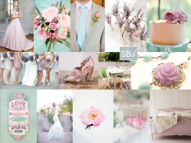
Good morning, friends! I hope you had a great weekend, and for those of you in SA, I know you will have been celebrating the official start of spring. I’ll try to ignore the fact that it means the end of summer for me here in the UK, and concentrate on a palette that is just perfect for a romantic spring wedding. It’s been a while since I played with lavender, and here I’ve paired it with one of last year’s hottest couples: aqua and rose. Don’t they make a lovely threesome? The purple really adds depth, and I love the little touch of vintage here as well. I’m imagining this in a garden, or at a beautiful farm, with clean white standing out against the soft colours. Dreamy.

Colours: Lavender, pink, aqua and white

Top row (l-r): Ian Stuart wedding dress; pink rose bouquet {F: Michele Tallent & Co.; P: Kate Connolly Photography}; aqua tie {F: Michele Tallent & Co.; P: Kate Connolly Photography}; lavender in vintage bottles {P: KT Merry; C: Sara Jean Events}; cake {P: Closer to Love Photography; C: Creamery}
Row 2: Mismatched bridesmaids {P: White Linen Photographers; F: Flowers by Antonella}; pink ribbon shoes {P: Elizabeth Messina; S: Catherine Sheppard of The Life Styled}; table in lavender field {P: KT Merry; C: Sara Jean Events}; necklace {Sora Designs on Etsy}
Row 3: ‘Love is a doing word’ {Karl Kwasny}; bride {P: Bumble & Bloom}; rose {P: Simply Bloom Photography, LLC; S: Simply Charming Socials}; pink tea glasses {P: Elisabeth Millay Photography}; lavender vintage bed.


Inspiration Board: La Boheme

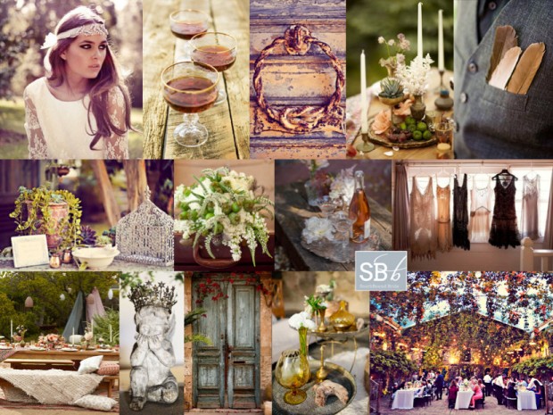
Good morning, wedding belles! Sorry for the late start this Monday, but I’m sure you’ll grant me a bank holiday lie-in. Anyway, I’m super excited about today’s board, which was a request from lovely reader Cara. It just makes my day when I get unusual themes and ideas for inspiration board requests, and ever since I read Cara’s email I’ve been dying to put this one together. Cara and her fiancé are planning a French bohemian style for their Johannesburg wedding. They hadn’t chosen colours yet, but were looking for something rustic, hippy and down to earth, but classy. I also didn’t start out with a colour scheme, but this evolved into a palette of rust, copper and green, and I think it has just the right amount of French country boho charm (although, as an alternative to neutrals, I’d recommend purple, including lots of lovely lavender). A headband (or a crown of flowers) for the bride is a must, and bridesmaids should be put in a range of lacey dresses with mismatched accessories (matching bridesmaids is a definite no here). Flowers are rustic and slightly wild, and I’d probably incorporate fruits as well, like figs and grapes, into the mix. Heavy urns with overflowing greenery, whimsical adornments like feathers (love how these just sit in the groom’s pocket instead of a boutonniere), long tables, rugs and scatter cushions. To some degree, anything goes. Hope you like this Cara – I am sure it’ll be absolutely beautiful!

Colours: Copper, rust and green

Top row (l-r): Boho bride {Johanna Johnson}; glasses {S: Jessica Sloane of lovebird style; P: Brooke Boling Photography}; door handle {P: Tamiz Photography}; centrepiece {P: Scott Clark Photo}; feathers in place of boutonniere {P: Nancy Neil}
Row 2: Decor {P: Tamiz Photography}; bouquet {F: Panacea Event Floral Design; P: Chloe of Mike Larson Inc}; champagne on tray {S: Davia Lee Events; P: Danielle Capito Photography }; bridesmaids’ dresses {P: Josh Goleman}
Row 3: Tables {Scott Clark Photo}; cherub with crown {P: Braedon Photography}; rustic door {via trekearth.com)}; table decor {D: Lace and Likes; P: Swoon by Katie}; wedding reception {P: Tamiz Photography}


Inspiration Board: Love Comes Softly

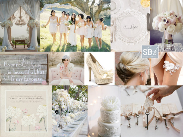
I’m sneaking in a last bit of inspiration before the weekend! This super soft and romantic board is another reader request, this time for Yvonne, who is getting married at Zorgvliet wine farm in summer. She loves whites, creams and soft colours, as well as classic elements like lace and pearls. And I have to say, I think the results are just beautiful! I’ve taken my inspiration from the palette of the invitation I chose (bottom left), and used a majority of whites and creams with just a little hint of the palest blush creeping in. This would be a great wedding to wear a blush dress, in fact, as it would stand out just that little bit against the white on white. I’ve included lots of lovely lace – in the cake detailing, the bride’s accessories, the place setting (just can’t get tired of this glass plate and doily combo – it’s so simple and affordable, but definitely has the wow factor), even that stunning lace-wrapped branch (which was used as a ceremony arch – amazing, no?). Other elements are classic – chandeliers, candelabras, peonies, tall white table arrangements, a chic updo. And then there’s that sweet little touch with the vintage key escort cards. All in all, it wraps up very, very pretty. Hope you like it, Yvonne!

Colours: White, cream & blush

Top row (l-r): Pavillion with chandeliers {Turtle Pond Photography}; bride with bridesmaids and lace branch detail {C: Joy Thigpen; P: Jose Villa}; place setting with doily; bouquet {F: Studio Blush; P: Katie Slater Photography}
Row 2: Wooden sign {Sweet Rose Studio}; blush Claire Pettibone dress {S: Be Inspired PR; P: This Modern Romance}; lace shoes; classic twist updo {}; lace garter
Row 3: Invitation {I: Momental Designs; P: Amelia Johnson Photography; S: Dana FitzGerald}; table decor {F: Karen Tran; P: Pam Scott}; lace detail cake {Call Me Cupcake}; vintage key escort cards {Kate Headley}.


Inspiration Board: And It Was All Yellow

Monday, Monday, can’t trust that day… But you can trust that I’ll be brightening up your Monday with a brand new inspiration board on the blog! And this time it’s even brighter than usual, with a yellow-themed board created just for reader Bronwyn. She’s having a summer wedding in Johannesburg, and wants a modern theme for her big day. She’s looking for something clean cut, including square tables, as well as a few quirky ideas. I just loved putting this one together! Yellow is a bold colour choice, but I can’t emphasise enough what a happy colour it is, and I really think that it gets everything off to a wonderful start. With Bronwyn’s ideas as a starting point, I immediately thought of two elements. The first is chevron – the pattern you’ll see under the ring and on the runner below. Chevron is huge in design at the moment, partly because it has links to Art Deco and the 1920s trend, but also because it’s a great balance of clean cut and preppy with a little retro twist to it. And it is just sooo pretty! So I would definitely use chevron as a key motif for this wedding – in stationery, on table runners, etc. There are tons of chevron ideas to play with – just tap it into Pinterest to see a selection. The second element I thought would be great is a focus on typography, which like Bronwyn’s specification, is also modern and clean cut (and brings in the black and white part of the colour palette beautifully). Again, there are lots of ideas around, but at the wedding I’ve included below, the couple really went to town, having hanging ‘banners’ above the reception space with absolutely gorgeous type. You could also type up quotes or meaningful words in your chosen font and frame them to create an installation on one wall at the reception. Add in a few industrial elements (naked lighbulbs, for example, or the quirky but very cool clip escort card idea), use square white vases on the tables, and bring in bold pops of yellow in your flowers (love the tulip bouquet), shoes, bridesmaid dresses, and even your veil. What a gorgeous wedding – I for one can’t wait to see how it all turns out. Hope you like your board, Bronwyn!

Colours: Yellow, black and white

Top row (l-r): Ring {P: Gabe Aceves Photography}; yellow shoes {P: Jennifer Longaway}; reception space with typography accents {P: Erica Loeks}; tulip bouquet{P: Yolande Marx Photography}
Row 2: Naked bulb strings {P: Belathee Photography}; invitation {Minted}; typography banners {P: Erica Loeks}; bright yellow bridesmaid dresses {P: Jennifer Weems Photography}
Row 3: Yellow birdcage veil {P: Chad Cress; Veil: Jade Rose Designs}; yellow flowers in white, square vases; chevron runners; clip escort cards {P: Lara Robby Photography}.


Inspiration Board: Watermelon Sunshine

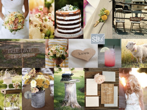
Board #2 for today! To be honest with you, readers, this board was as much a surprise to me as anything. When reader Tanya mailed me to ask for an inspiration board for her vintage rustic wedding at Groenrivier, my first thought was that I’d probably done one like this before. Then, when I went to look back through my archive, I realised that when I’d put pink and yellow together before, it had been in a beachy way, but I’d never thought of pairing the two colours for a rustic board. Of course, once I did I realised they’re an absolutely perfect combo for a rustic summer wedding. Yellow is one of those colours that always makes people happy, and it reflects the sunny mood of a farm or other rustic setting. Pink adds in softness, and stops the yellow from being a bit overwhelming. The end result is glad of heart and full of romance. Isn’t it lovely? Well done for picking it, Tanya – I’ve definitely learnt something new myself! Hope you like the board, and good luck with the rest of your planning!

Colours: Pink and yellow

Top row (l-r): Bouquet {P: Gresham Photography}; flowers close up {P: Caroline and Evan Photography }; naked cake {P: Meredith Carlson Photography; C: Labor of Love Bakery}; billy button boutonniere {C: A Day in May; P: Kai Heeringa Photography}; vintage chairs parking sign {P: Sunday Romance Photography }
Row 2: True love this way sign; bridesmaid in yellow stripes {P: Rebekah J Murray}; kraft love badge {Britt Croft Photography}; pink cocktail in mason jar {P: Troy Grover Photography }; sheepy {S: Captivating Events by Megan; P: Mirelle Carmichael Photography}
Row 3: Vintage dresser with cake & flowers {S: A Stunning Affair ; P: Krista Mason Photography}; flowers in watering can {F: The Flower Post; P: Simply Bloom Photography }; vintage typewriter on tree stump {P: Kina Wicks}; wood effect invitations {P: Jose Villa}; bride and groom {Stacey Ramsey}


Inspiration Board: Neon Brights

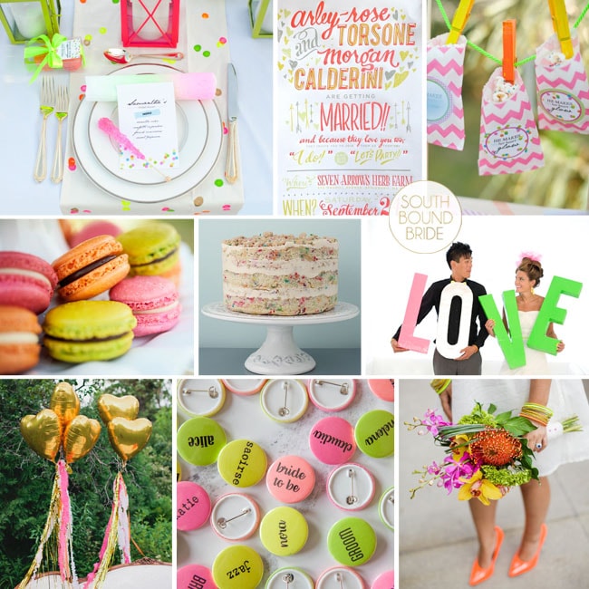
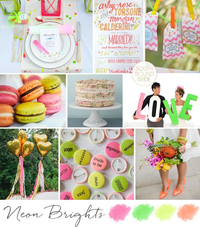
Today’s board is one I never in a million years would have thought I’d be doing. Neon. You know when neon was last cool? About 1991. In 1991, I had just started high school, and my dear mom hadn’t yet taught me that those of us cursed with curly hair could sort it out with a hairdryer (straighteners wouldn’t even be invented for another half a decade – God, I’m old); so on a good day, I looked a bit like Baby in Dirty Dancing and on a bad day, like Sideshow Bob. Which is appropriate, because I was also doing the Bartman, dressing in little minis we referred to as ‘Roxette dresses’, listening to Technotronic and perving over Richard Snell. Who was a cricketer. Happily, I can tell you I haven’t done any of those things since 1992 (sorry, Richard, wherever you are). And yet, here I am, reviving neon. Well, okay, I am not the one who’s revived it. Blame Fashion, because neon is definitely back. And I’ve surprised myself by liking some of the neon inspiration that’s been popping up in Wedding World recently, so I thought I would challenge myself to see if I could imagine it into a wedding. Result? I’m a convert. I think the key (as always) is a bit of moderation – neons look amazing when they stand out against a very white white, and bold mod graphic elements like black and white stripes or gold. It takes them from 80s throwback to Kate Spadey chic, and actually makes for a very stylish palette. The other thing I liked was the use of all the four acids – green, orange, pink and yellow – somehow bringing all four of them into the mix works better for me than just one or two. Put your bridesmaids in bold stripes with bright shoes and nail polish, invest in great stationery and unexpected, colourful flowers, use some bold graphic elements on your tables and then… leave everything else clean, bright and white. Perfect for a fun, city-chic wedding, and ideal with a short 1960s-style dress. So, what do you think? Would you ever consider neon for your wedding?

Colours: Neon orange, yellow, green & pink and white

Top row (l-r): Place setting {S: A Styled Fete; P: Carly Jones; Printables: Anders Ruff}; neon letterpress invitation {Ladyfingers Letterpress}; popcorn bags {S: A Styled Fete; P: Carly Jones; Printables: Anders Ruff}
Row 2: Macaroons {S: A Styled Fete; P: Carly Jones}; funfetti cake {found via b.loved}; bride & groom with LOVE sign {Sweet Tea Photography}
Row 3: Gold balloons {S: Somewhere Splendid; P: Canary Grey Photography}; badges {Wedding in a Teacup}; neon bouquet {S: Pretty Little Details; P: Sarah Postma Photography}

Inspiration Board: Neon Brights | SouthBound Bride