Inspiration Board: Protea Glitz

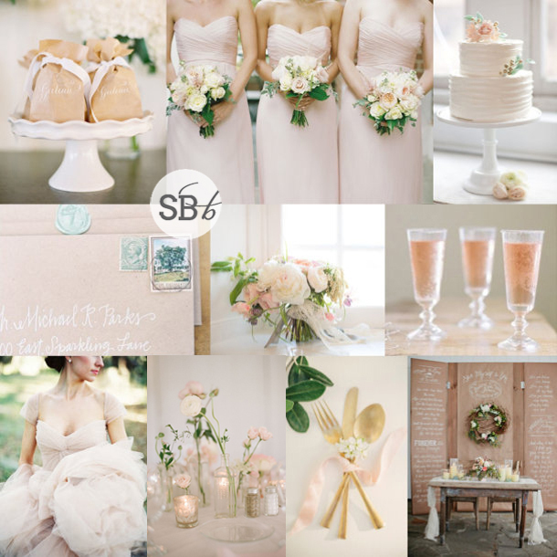
Some boards take me a while to put together, but some are so clear in my mind, it’s as if they’ve always existed. In fact, I had to go back and check my archives to be sure I hadn’t done this one before, because the concept of proteas + gold glitter is already such a favourite of mine. It’s like Joey eating Rachel’s beef trifle in Friends – to paraphrase: “What’s not to like? Proteas, good. Gold, good. Sequins, gooood!” It combines my favourite current wedding looks with our perennial South African favourite flower, and is as romantic as it is modern. And unlike beef, custard and jam, some ingredients really do just go together.

Colours: Blush, rose, gold & white

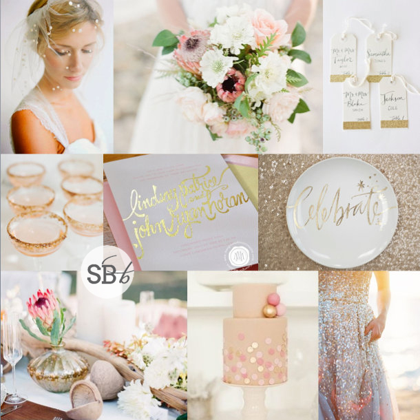
Top row: Bride with polka dot veil {Ali Harper Photography/Ginny Branch}; protea bouquet {Lavender & Twine/Twine Events}; glitter name cards {Rachel Carl on Etsy}
Row 2: Glitter cocktails {Rebecca Hansen Weddings/Style Me Pretty}; gold calligraphy invitation {Margot Madison on Etsy}; plate on sequin background {Justin Marantz/Julie Song}
Row 3: Protea centrepiece {Caroline Tran/Utterly Engaged Magazine/Propel}; confetti cake {Jen Huang/Sweet & Saucy Shop}; sequin wedding dress {Jeremiah and Rachel Photography/BHLDN}


Inspiration Board: Pomegranate & Brass

Afternoon friends, I hope you’re enjoying a leisurely day off! With Easter being all about spring in the Northern Hemisphere, I can’t help but always be reminded that it’s also officially autumn in South Africa, so I thought it was about time for some pretty cold weather palette inspiration. As you’ve probably noticed by now, unusual metallics are on trend at the moment, including lovely, opulent brass. I thought it would be perfect with a deep pomegranate red, but to keep things multidimensional, I also added in a touch of soft peach. I really like how it all comes together – an updated take on traditional autumn hues.

Colours: Scarlet, peach & brass

Top row (l-r): Pomegranate escort cards {Duet Weddings/Lauren Ross}; brass candlesticks {Lani Elias/Ashley Nicole}; autumn bouquet {Kari Crowe Photography/Kate Foley Designs}; red bridesmaid dresses {Ruddock Photography/Bill Levkoff}
Row 2: Invitations {Lani Elias/Ashley Nicole}; pomegranate cocktails {Vela Images/On My Hand}; pomegranate cake {DianaMcGregor Photography/Timeless Love Events}; pomegranates {Debbie Lourens}
Row 3: Peach wedding dress {Sareh Nouri}; table setting {Catherine Marciniak/Style Perfect Weddings and Events}; roses in brass candleholder {Aralani Photography}

Inspiration Board: Pomegranate & Brass | SouthBound Bride

Inspiration Board: Pretty Preppy

And we’re back – I couldn’t let Monday go by without some inspiration board loveliness, could I? :) Today’s combo has been my new little colour crush for a few weeks now, because seriously, how amazing do grey and navy look together? It’s so chic. I especially love the mix of a dark slate grey with a softer, bluer grey, and then sophisticated navy (plus, of course, lots of crisp white). If you like a country club chic look, this is absolutely perfect, and of course you can also inject a few softer colours like peach or coral if you like. But I actually like it just like this – it’s like a sophisticated, on-trend take on the navy and white stripes that I have been loving over the last couple of years. What do you think?

Colours: Slate grey, dove grey, navy & white

Pretty Preppy

Top row (l-r): Invitation suite {Beaux Arts Photographie}; bride {Sonya Khegay}; bridesmaids {Brett Heidebrecht}
Row 2: Grey suit {Loren Routhier}; bridesmaids {Perez Photography/The French Connection}; place setting {Lizelle Lotter}; cake {Brooke Allison Photography}
Row 3: Bride & groom {The McCartneys Photography}; bouquet {Kali Leenstra/Katy Grifiths/Flora Nova Design}; cocktails {Lizelle Lotter}.


Colour Story: Kraft & Blush

We love us some colour inspiration here on SBB, and so after this morning’s inspiration board I thought it was time for a wee colour story this afternoon. As in small, not actual wee, since a wee coloured wedding would be weird. Obvs. Anyway, so I took my starting point from a board I created a little while ago that proved to be soopa popular both on the site and social media – I guess the love of blush isn’t going anywhere soon! Here’s the original board:

Kraft & Blush

Full credits here

For me, I love how the soft colour brings sophistication to kraft/brown paper (especially with some calligraphy), which otherwise is usually associated with more rustic weddings. And it’s also quite an easy wedding palette to work with in that you’ll find a lot of blush, white and kraft details available in the shops at the moment (which always helps a lot). Whether you’re donning a pretty blush gown or putting your bridesmaids in this flattering shade, there are lots of stunning options.

Read More

Inspiration Board: Milk & Honey

Good morning darlin’s – how was your weekend? Mine was super chilled, mostly working away behind the scenes and catching up on some zzzzs! On the technical side, you may notice (I hope!) that SBB is sooopa fast today, which is down to some upgrades I have been making to ensure the site is at its very best for you all. And while it’s always a hassle to migrate to a new server, it’s a tribute to the fact that there are now so many of you visiting SBB on a daily basis that the previous one couldn’t cope. I am so grateful for you all! And so excited for what I have planned for this year – it feels like everything is moving organically in the best of directions. ANYWAY, enough of that, it’s time for our weekly inspiration. Today I thought I would take the concept of milk and honey for a wedding, updating the bee motif that we were seeing a bit of a couple of years ago, and bringing it to a really warm, rustic wedding concept that would be absolutely PERFECT for a brunch wedding in the countryside. Can’t you just imagine it? Rays of morning sun peeking out from behind the clouds as you promise your love to each other, followed by a breakfast of pancakes and butter and honey at long open air tables, with milk white daisies forming your bouquet. Morning weddings have never been so pretty.

Colours: Off-white, honey yellow, taupe and gingerbread

Top row (l-r): Milk & honeycomb {Sunday Suppers}; outdoor table {Aaron Delesie/Beth Helmstetter Events}; honey favours {This Love of Yours Photography/Engaged & Inspired}; wedding dress {Jane Allen Photography/Scout & Charm}
Row 2: Bridesmaids; daisy bouquet {Jemma Keech}; bee stationery {Brooke Boling/Lauren Ledbetter}
Row 3: Honey cake {Love Me Do Photography}; honey dipper favours {Brancoprata}; milk vases; bride with flower crown {Elizabeth Messina}

Inspiration Board: Milk & Honey


Inspiration Board: Teal & Oatmeal

Hang on lovelies, does anyone even know how it got to be the last day of March? Eek. As usual, time is running away from me – after spending the whole of last week buried in tax and accounts, I have spent the weekend catching up with email (a couple of hundred down, several hundred to go…) and getting ready to share some more seriously lovely weddings with you all this week. But first, it’s Monday, and you know what that means! Yep – it means another inspiration board. And I have to say, I am absolutely loving the colour combination on this one. A soft teal – almost a greyed jade – and beautiful neutral oatmealy taupe. And guys, it works sooo well, right? I love the slightly boho vibe to this board – it would work for a country wedding, a farm wedding, and definitely for a beach wedding. Beautiful.

Colours: Teal, oatmeal, white and emerald

Top row (l-r): Boho bride {Adrian Michael}; flowing dress {Jose Villa/Kelly Oshiro Design}; door {Tec Petaja}
Row 2: Stationery suite {Rylee Hitchner/Sarah Robins Powell}; centrepiece {Esther Sun Photography/At Your Door Events}; bridesmaid dress {Elizabeth Messina/Ruche}; door seating plan {Clary Pfeiffer/Eventity Inc.}
Row 3: Flowers in urn; boutonnieres {The Nichols/The Nouveau Romantics}; bouquet {Tanja Lippert Photography/Blooms by Martha Andrews}; wedding dress {Jessica Lorren Organic Photography}

Teal & Oatmeal Inspiration Board | SouthBound Bride


Inspiration Board: Mercury Rising

Don’t get me wrong – I absolutely love bright colours as part of a wedding design, but don’t be afraid to use moody neutrals too. Today’s inspiration board is a mix of soft whites, dark greens, greys and blacks, and a shimmery touch of silvery mercury glass. It’s very classic (as all white weddings are) but it has that extra element of interest and shine. Taking an unusual metallic element like mercury or gold leaf, or copper or rose gold, or even steel is a great way to add a special touch to your wedding design without being too obvious and themey, and it’s a slightly more up-to-date twist on all the sequins and glitter and sparkle that have been trending over the last season. And we always love an up-to-date twist, right? ;)

Colours: Silver, grey, black, green, white

Top row (l-r): Wedding dress; mercury glass table setting {Heather Kincaid Photographer/Gianna and Company}; silver wedding cake; aisle
Row 2: Stamped invitations {Jolie Jolie Design}; table setting; shoes
Row 3: Centrepiece {Brooke Schultz}; bride {Rylee Hitchner/Joy Thigpen}; wedding car with wreath {A Bryan Photo}; mercury glass with chalkboard.


Inspiration Board: Navy, Peach & Apricot

Hello lovelies! I’m back from an AMAZING weekend in Plett with two of my best girls from high school – we had the perfect weather, and such an amazing time chilling and laughing until we cried. But it’s back to work today, and that means inspiration boards here on SBB. Today I’ve chosen a warm but formal combination of navy, peach and coral/apricot – I absolutely LOVE how these colours work together. If you were thinking of navy and pink, this is a lovely, modern alternative, and having both peach and apricot together adds that extra depth and dimension. What do you think?

Colours: Navy blue, peach and coral

Top row (l-r): Bride & bridesmaids {Lane Dittoe Photographer/Galas by Gerry}; cake with ruffle rose {Kristen Ellis/Mindy Weiss}; peach biscuits {}
Row 2: Peach place setting {Rebecca Thuss}; calligraphy envelope {Antiquaria,}; paint
Row 3: Peach bellinis {Pictilio}; stripey straws; shoes & bouquet {Dana Cubbage}; navy suit {Shannon Lee}.


Inspiration Board: Kraft & Blush

Hello my lovelies, how was your weekend? Today I’m indulging two of my wedding loves, those for kraft paper details and the softest shade of blush. Kraft (or brown paper) used to be one of those details that was really only associated with rustic or casual weddings, whereas what I wanted to show here is that it can actually be adapted for romantic, sophisticated celebrations as well (win for the budget). The little calligraphed packages are my favourite detail (calligraphy just makes everything pretty, fact) and I thought it went perfectly with the soft pink with the tiniest touch of gold. Not to mention the gorgeous kraft paper wall hangings and adorable frothy flowers. The prettiest way to start off our week!

Colours: Blush pink, white, beige and green

Top row (l-r): Kraft wrapped favours {Jose Villa/Beth Helmstetter/Laura Hooper}; bridesmaids {Nancy Ray/Rebecca Rose Events}; cake {KT Merry/Nine Cakes/Rock Paper Scissors Events}
Row 2: Envelopes with white calligraphy {Landon Jacob/Jessica Rourke/Lady Letterpress}; bouquet {Megan Dandeles Photography/mStarr Event Styling & Design}; rosé champagne
Row 3: Blush wedding dress {Adam Barnes/Katie Stoops}; table setting {Elizabeth Messina}; gold cutlery {Kate Grewal Photography}; kraft backdrop {Kristyn Hogan/Cedarwood Weddings}.


Inspiration Board: Wedgwood & Wildflower

Happy Monday, lovelies! It’s time for our weekly inspiration board, and today I am singin’ the blues. But the good kind. The kind that makes me think 2014 is the year that Something Blue becomes more than part of a motto for the bride. Now, don’t get me wrong, blue goes beautifully with many other colours, but lately I find myself drawn to the cool freshness that an all-blue palette can bring, especially when it combines a couple of interesting shades. It’s preppy and formal enough for a wedding, but bright and interesting too. I fell in love with the bouquet in this board from the second I saw it, and I adore how it mixes casual and formal, as well as two shades of blue with classic white. I thought it would make a great palette, but it wasn’t until I came across some lovely Wedgwood details that it came together – again, it’s the mix of formal and classic with a laid-back modern aspect that makes this so winning in my book! It really is the best of both worlds.

Colours: Cornflower blue, baby blue & white

Top row (l-r): Bouquet {Lisa Vorce/Kate Holt/Jose Villa}; bride {Virgil Bunao/Ooh Events}; monogram handkerchief {Bella Grace Studios/Allure Events}; shoes {Graham Terhune Photography}
Row 2: Wedgwood cookies; bridesmaids {Emily Steffen}; dress with monogram embroidery
Row 3: Invitation suite; wedding table {Carmen & Ingo/Doreen Winking}; flowers.