Inspiration Board: A Preppy Romance

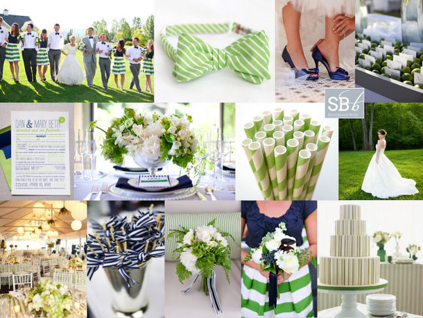
Happy Monday, folks! The inspiration board requests have been flooding in lately, and I’ve been having so much fun turning your ideas into collages. This week I’m featuring two reader request boards that couldn’t be more different (look out for the other on Friday afternoon), starting with this piece of East Coast summery goodness. Philani wrote to tell me about her colour scheme of ‘new leaf green’ (isn’t that the sweetest way of describing it?) and white with touches of bright blue (I’ve gone for a sort of royal blue here, but this could be lightened up as far as aqua if Philani prefers). She described her style as ‘plain but elegant, kind of less is more’, which together with her colour choice immediately made me think of preppy style. Think Jackie O. – simple elegance is what this whole look is about. Stripes are a key component, as are fabrics like cotton and grosgrain, and the look is surprisingly easy to put together, especially if Philani focuses on relatively clean tables with bright green flowers and punches of blue in the napkins or stationery. I adore these bridesmaids in tops and striped skirts, and groomsmen in bowties are a must! For the bride, a relaxed but formal dress – maybe a full skirt with pockets – would be ideal. Serve signature cocktails with striped paper straws on the lawn, and don’t forget lots of lovely ribbon! Hope you like your board, Philani!

Colours: Apple green, royal blue and white

Top row (l-r): Wedding party {P: Jacque Lynn Photography; D: Events by LMG}; green striped bowtie; blue shoes {P: Elizabeth Scott Photography}; escort cards in bed of limes {P: Mishelle Lamarand Photography; D: La Fete}
Row 2: Blue and green love story invitation {D: Hello Tenfold}; blue and green table arrangement {P: Studio 28 Photography; D: The Green Ribbon Party Planning Co.}; green paper straws; wedding dress with pockets {P: Crystal Genes Photography}
Row 3: Room decor {P: Sarah Rhoads Photographers; C: Party Resources}; cocktail sticks with ribbon {P: Love Life Images; D: Simply Chic Events}; green bouquet with blue ribbon {P: Studio 28 Photography; D: The Green Ribbon Party Planning Co.}; bridesmaid with green striped skirt and blue top {P: Jacque Lynn Photography; D: Events by LMG}; green striped cake {P: Mary Ellen Bartley; C: Bijoux Doux Specialty Cakes}


Inspiration Board: Green Light

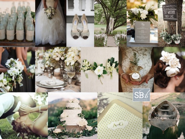
Good morning friends! How was your weekend? Needless to say, mine was Olympic obsessed, but I won’t bore you with more of that! Anyway, today’s board is another reader request, which I actually received a little while back from Lizelle. She didn’t tell me much about her wedding, just that she’s chosen a palette of sage, ivory and pewter, so that was where I started with the colour palette. I’ve landed up going for a kind of romantic country style, that would suit a variety of South African venues (and which always makes for my favourite boards). It’s equal parts whimsical, dreamy and elegant, with the more serious pewter playing off the bashful green, and that lovely romantic ivory making up the trio. Layers of tulle in the wedding dress play off ribbons in the breeze, pale green drinks, and soft flowers, while bridesmaids wear formal pewter dresses, and the table is adorned with pewter or silver vases and mercury glass. Give groomsmen a range of slightly varied boutonnieres (a nice twist on the individual bridesmaids bouquet trend) and invest in a set of beautiful stationery that can be used throughout. This is a look that is classic and effortlessly chic. Hope you like it, Lizelle!

Colours: Sage, ivory and pewter

Top row (l-r): Bottles {C: Mindy Weiss; P: Elizabeth Messina}; wedding dress and bouquet {C: Beth Helmstetter Events; P: Jasmine Star Photography}; shoes {C: Honey Darling Events; P: Melissa Schollaert Photography}; ceremony area {P: Annabella Charles}; centrepiece and menu {C: Beth Helmstetter Events; P: Jasmine Star Photography}; seating sign {P: Nadine Photography}
Row 2: Bridesmaids with bouquets {C: Beth Helmstetter Events; P: Jasmine Star Photography}; green and pewter table setting {S: Tying The Knot Wedding Day Coordination; P: Greer G Photography}; boutonnieres {F: Flowerwild; P: Jose Villa}; sapling favours {P: Alison Conklin}; rose hair piece {C: Sarah Carsten Events; P: Rebekah J Murray}
Row 3: Bride and groom {P: Photographs by Anjuli}; wedding cake with olive leaf decoration {S: Beth Helmstetter Events; C: Susiecakes; P: Steve Steinhardt}; stationery set {Ruby & Willow}; rowing boat {Elizabeth Messina}


Inspiration Board: All Fore Love

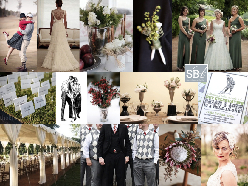
It’s Inspiration Board Monday! And today it’s a reader request. I just love it when you ladies give me a creative challenge, so when I heard from bride Tanja about her vintage golf-themed wedding I couldn’t WAIT to get started! The wedding is set for autumn, so Tanja’s chosen a palette of red, green and dusky pink (which I think is perfect for this theme and time of year). Tanja’s fiance is crazy for golf and they both love old things, so they merged these loves together to create their theme of old world golf, and they’re hosting it at a golf resort as well. Tanja also wanted to include elements like lace and proteas, which grow wild in the area. I started off by looking at lots of golf-themed weddings, and wow, some of them are a liiiittle cheesy. So as with all themes, subtlety is key. My first recommendation is that Tanja and her fiance hire a great designer, because stationery would really tie everything together here. Ask them to use argyle in your colours as a motif throughout, and combine it with vintage golfing imagery or clip art (similar to the birthday invitation below) to create a sort of ‘brand’ for all the paper goods- this is a great way of making an unusual theme work cohesively. You can reflect the argyll in the gents’ attire (how cute are groomsmen in sweater vests?) or just their socks if you’d prefer them to wear suits. You can even give them tee boutonnieres! For the bridesmaids, you can’t go wrong with green dresses, but you could use red or pink instead (or even have each of them in a different colour). For the bride, I love this vintagey lace dress with a birdcage veil (red lipstick is a must!) and statement protea bouquet. Tanja can subtley extend the golfing theme using trays of wheatgrass with little golfing flags for escort cards, and either number her tables like golf holes, or name them after famous courses. But my favourite detail is the use of vintage trophies (golfing or otherwise) as vases throughout the table decor. This is a classy nod to the sport, without resorting to jars full of golfballs or similar! Tanja – I hope you like the board and good luck with your planning journey. I can’t WAIT to see how it turns out!

Colours: Red, green and dusky pink

Top row (l-r): Vintage golf engagement photos {P: Tara Parker Photography}, lace wedding dress {Wanda Borges}, silver vase {Eva Lindh}, tee boutonniere {Ardent Story Photography}; sage green bridesmaids’ dresses {Bernard Bravenboer}
Row 2: Grass flag escort cards; vintage golfing image; red flowers in silver vase {P: Allison C. Photography}; trophy vases {S&P: Brancoprata}; vintage golf invitation {bnute on Etsy}
Row 3: Open long marquee {David Beahm}; groomsmen in argyle sweater vests; protea bouquet {F: Palm Springs Florist/Katie Osgood Photography}; birdcage veil and red lipstick {P: Eden Photography}


Inspiration Board: Gucci Green

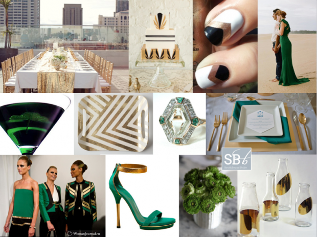
Good morning friends! I felt like doing something a bit different today – a stylish city wedding inspired by the latest catwalk trends. I adore the idea of a rooftop wedding (not enough couples trying this in SA to my mind – just think of the views from the Grand Daddy in Cape Town, for example, or the bar at the Hyde Park Hotel in Johannesburg, and check out two of my favourite Cape Town weddings with city views here and here). This time I’ve looked to Gucci’s Spring/Summer 2012 collection and created a bold palette of emerald green, gold and black (with a touch of geometrical art deco) that would really blow your guests away in the style stakes. It’s so striking. And OMG check out this bride wearing a green Gucci dress – one of the most elegant alternatives to the traditional white dress I have seen. Perfect for swanning around a terrace with your new husband, greeting your guests and drinking Emerald Isle cocktails, no?

Colours: Emerald green, black, gold


Top row (l-r): Rooftop table with gold sequin runner {S: Alchemy Fine Events & Invitations/P: Scott Lawrence}; Art Deco cake {D: Lael Cakes; P:Jen Huang Photography}; chevron manicure; green Gucci wedding dress {P: Q Weddings}
Row 2: Emerald Isle martini; gold chevron tray; emerald and diamond Art Deco ring; green and gold place setting {S: Sweet Emilia Jane; P: Captured by Aimee}
Row 3: Gucci spring/summer 2012; Gucci shoes; green flowers; gold bottles.


Inspiration Board: Polka Promise

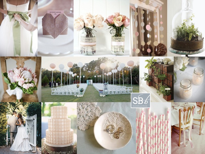
I’ve had lots of requests from real brides recently for pastel pink and green boards – clearly this is one colour combination that isn’t going anywhere! These two colours always give me such a good feeling – they’re so balanced, but at the same time so pretty and fresh. They’re ideal for a (spring or) summer wedding, which is just what real bride Jeani will be having. She wrote to tell me of the elements they’re considering: proteas and herbs, lace, DIY details. They also want to include polka dots as a motif, which I think is super cute! The key to using something like polka dots is not to go overboard, but to use them carefully and then echo them in shape or texture. So I’ve suggested some gorgeous DIY dot garlands (Jeani can use these hanging in the ceremony area, as a backdrop to the cake table or main table, draped from the ceiling – lots of options!). I’ve also suggested a polka dot cake (how sweet and subtle is this one?), pink paper polka straws, and even a dotty dress (look closely at the image bottom left). Then the circles are reflected in elements of the protea and rose bouquet, and the fun balloon accents in the ceremony area. Other fun DIYs that Jeani and her man can try are origami heart place settings, lace-wrapped votives and jars, a pretty lacy ring dish and ribbon-tied chair backs (use this on just the bride and groom’s chairs if you don’t want to spend a fortune on ribbon). Add a pretty sash to a wedding dress, and carry that fresh green into herbs under bell jars and inside found objects like this old fashioned filing drawer. There’s lots here to play with, and it all adds up to handmade summer sweetness! Hope you like it, Jeani!

Colour: Pastel pink, green, cream and beige

Top row (l-r): Dress with sash {Lisa Poggi}; origami heart DIY; lace-wrapped mason jar vases; paper dot garlands; herbs under glass {S: Paul Lowe & Paul Vitale; P: Alexandra Grablewski}
Row 2: Protea bouquet; balloon ceremony area {P: Simply Bloom Photography}; herbs in drawers {S: Paul Lowe & Paul Vitale; P: Alexandra Grablewski}; lace-wrapped votives
Row 3: Bride & groom; polka dot cake; DIY lace ring dish; paper polka dot straws; ribbon chair backs {P: Rebecca Wedding Photography}.

Inspiration Board: Peach Blossom

So, it’s Sunday as I write this, and I’m somewhere over the Karoo (probably) looking out from my aeroplane window and taking advantage of the Mango onboard Wifi. That’s a first for me – I have to say, internet has been my bugbear out here in SA (don’t even ask me how much I have spent on data), so it’s kind of cool to be experiencing an internet connection-related innovation before I leave SA. But apart from that, I’m feeling very sad today, as I have had to wave goodbye to my mom and dad (and our two delicious doggies) in Durban, on my way back to London via Cape Town. Never an easy thing to do, but worse when I’ve had such a long time out here rather than it just being the usual quick holiday. Still, what’s bound to be a big dose of homesickness that I’ve brought on myself was totally worth it. So Mom, if you’re reading this (and bless you, I know you do), thanks for a wonderful stay, and love you and my Dad and the little dudes lots xxx

OKAY, enough of the ugly-cry-inducing stuff. It’s time for prettiness! Today we’re working with a peach palette, and I have to say that I am absolutely LOVING this colour at the moment. It’s a slightly safer version of coral (which was one of last year’s breakout colours for me), but more unusual than pink and still works with most of the same colours. Bright oranges are everywhere (is peach even orange? pink? I don’t know) but not everyone can pull them off – this is the perfect way to make your wedding look contemporary and classic at the same time. One of my favourite combos is soft pastel peach with a flat foresty green – which I also think is perfect for this time of year without being too self consciously ‘autumn’. I also love the inclusion of lush blooms, handmade details and black wrought iron (inspired by the gorgeous shoot bottom left), as well as the pretty handfasting ribbons. What do you think? And don’t forget, I take requests for custom inspiration boards – find the link at the end of this post.

Colours: Peach, green, black, cream and gold

Top row (l-r): Peach centrepiece with medicine bottles {White Room Events/Pobke Photography}; peach bridesmaids dresses {White Room Events/Pobke Photography}; embroidery; hanging lanterns {Rebecca Reategui}
Row 2: Handfasting ribbons {Shannon Leahy Events/Larissa Cleveland}; blossoms; wrought iron ceremony chairs {Bliss Event Productions/John & Joseph Photography Inc.}
Row 3: Ballet wedding shoot {Ashley Baber Weddings/Aaron Watson Photography}; menu and place setting {Rebecca Reategui}; Vivienne Westwood shoes; peach centrepiece with suitcase {White Room Events/Pobke Photography}.

Inspiration Board: Mint to Be

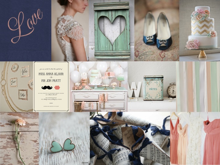
Good morning, everyone! Did you all have lovely weekends? It’s Inspiration Board Monday here on SBB, and I have to say, this might be my new favourite colour combination. I stumbled across it somewhere, and I knew I had to turn it into an inspiration board. There’s something about the way that coral and mint (two of the trendiest colours in weddings right now) work together that I just love, and when you add in navy it just has a whole new depth to it. I would have thought that it might come out a little retro or mod, but (while you could certainly use these colours that way) the board I’ve come up with is all sweet, slightly French shabby chic, with a touch of glam gold and lovely lace. Put your husband-to-be and his groomsmen in navy suits, and carry lush coral bouquets with your girls – the key to this look is knowing which of the colours to combine when, so that it doesn’t look too matchy matchy. Done right, this could make the prettiest of weddings.

Colours: Mint, coral, navy and gold

Top row: Love napkin {The Stationery Studio}; Claire Pettibone dress; heart shutter; blue shoes {Shewanders Photography via Wedding Chicks}; chevron cake {Erica O’Brien Cake Design}
Row 2: Table plan {via 100 Layer Cake}; invitation {Minted}; dessert table {Tracey Kiansky Photography via The White Library}; antique tin {Dreamy Whites}; ribbons {Andi Mans Photography and Design via The Wedding Chicks}
Row 3: Ranunculus {via Wedding Chicks}; mint heart earrings {Dariami on etsy}; confetti cones {Pink Cherry Mama on etsy}; coral bridesmaid dresses {Jose Villa via The Wedding Chicks}.

And don’t forget that you can request your own inspiration board by clicking on the button below:

Inspiration Board: Dandelion Days

Good morning friends! Hope you had a fab weekend! Mine was good – I had the privilege of spending yesterday with a group of fantastic wedding industry people assisting on a shoot for my friend Louise of (aka @bijouxbride). Lots of hard work, but it was so fun, and I can’t wait to see the pictures. I know there are a lot of people who don’t like inspiration shoots, but for me, they’re a great way to pull together an idea (like a mood board, but on a bigger scale) and I know they’re where I get a lot of the ideas I use in my boards. Plus, they’re great for table settings, which I know brides struggle with sometimes. What do you think? Love ’em or hate ’em?

Anyway, on to today’s board. While it’s gone very cold and grey in London town, I know everyone in South Africa is on the other side of the spring/autumn equation, so I thought I would bring you a lovely spring palette to enjoy. A lot of brides shy away from yellow because it’s such a strong colour, but if canary yellow is too bold and mustard is too yellow, consider a soft pastel lemon. Combined with pale green and grey, it’s fresh and flattering, and it brought to mind for me the pretty gardeny side of the Kate Moss nuptials – a traditional church, lots of little flowergirls in white, wildflowers. Add in yellow shoes and a polka dot dress, plus of course a little hair braid (because we do love braids, don’t we!). And if you like the lovely invitations pictured here by my clever friends at Brancoprata, you can download the template for free right here. Perfect, non?

Colours: Pale yellow, green and soft grey

Top row (l-r): Bride & groom (Jose Villa); yellow shoes (Christine Meintjes); polka dot dress; frosted lemons (A. Hana Design); lemonade
Row 2: Dessert table (Amy Atlas); invitation (Brancoprata); macaroon ring shot (Kim Mendoza Photography); vintage car (Photogen Inc.)
Row 3: Dandelion; bridesmaid (Katelyn James); braided updo; flower girls; pretty church from Kate Moss Wedding (Mario Testino/Vogue)

Inspiration Board: Just Peachy

Happy new week, friends! Hope you had a lovely weekend. I spent it catching up with friends and indulging in a little side of rugby – what did you get up to? I wish weekends could last forever, but here we are, back at Monday, *sigh*. On the upside, Monday means pretty inspiration boards, and today’s is exactly that. I love peaches as a motif for a wedding – not only are they symbolic in Chinese culture of marriage and longevity, but in Renaissance art a peach with a leaf attached represented truthfulness and speaking from the heart. Plus, they’re totally pretty and a little bit rustic. Soft peachy pink goes beautifully with a warm coral orange and green, and pair that with brown neutrals like wood, craft paper and even copper, and you have the perfect combination. I just LOVE the idea of these peach pouches at each place setting – a totally sweet and affordable favour – but you could also treat your guests to homemade peach jam in pretty glass jars. For escort cards, try this sweet rustic option of little labels tied to birdcages – the cages can also be used to house gift envelopes from your guests.

{Pssst! Like this? Check out our Rustic Peach & Apricot board as well.}

Colours: Peach pink, coral, white & green

Top row (l-r): Peach pocketoutdoor ceremony area (Jesi Haack);peach jam favours; flowers in copper pot (Simply Bloom Photography)
Row 2: Tie; kraft/brown paper menu and wooden utensils (Austin Gros);folk art wedding invitation; peach shoes (Troy Grover Photography); bouquet with lace accent (Simply Bloom Photography)
Row 3: Bride & groom (Austin Gros);fruit cooler in mason jar; bridesmaids; birdcage escort cards (Jen Huang).

Inspiration Board {1 Theme 3 Ways}: Vintage Safari

This week we’re featuring three safari-themed inspiration boards to show how a single theme can be interpreted in a number of different ways. Which one is your favourite?

**************************************************************

Thursday, hooray! Almost the end of the week. You’ll have noticed by now that the blog schedule’s been shaken up a bit what with 3 inspiration boards due to appear this week and then the unexpected quiet day on Tuesday. But whatever, let’s just go with it. So today I have the next in our inspiration board series, and the latest trend roundup due this afternoon. And tomorrow is going to be jam packed, so be sure to keep checking back!

I’m really excited about today’s board, because it’s a reader request as well as the second variation on the safari theme I’m featuring this week. Simone contacted me to help with ideas for her game farm wedding. She didn’t want the ‘typical’ safari decor, with animal prints and Big Five table decorations, but preferred vintage decor and softer colours. (It should go without saying that this is a style reference to Sydney Pollack’s Out of Africa, rather than suggesting any kind of glorification of colonialism, obviously.) You’ll remember a few weeks back we touched on this as part of the Blog Around the World post, and Alicia put together that look so perfectly that I couldn’t help using a few of her images again (click here and follow round all the blogs to get all the pictures) but I combined them with a palette of sage green and soft coral which I hope Simone will love. It’s inevitable that there are going to be lots of brown neutrals in a bushveld environment, and these colours lighten and modernise things up a little and complement them perfectly. The real key to this look is in the interplay between wild natural surroundings and classic fine dining elements, so for table settings you’ll want patterned crockery, crystal glasses, silverware (I love the idea of using old silver to contain flowers) and pressed linen. The really fun part is in including lots of found vintage objects – gramophones, compasses, storm lanterns, binoculars, and of course old suitcases (which you can use as props in a number of ways). Scout around your friends and family’s homes to begin with – you may find some gems! I’d have the bridesmaids in floaty, slightly vintage green dresses, and the bride in a gorgeous vintagey gown (birdcage veil is a must!). Fill your table with lush white blooms and pops of coral, and a few succulents. And don’t forget the cocktails! This is the perfect place to serve a classic (and delicious) G&T.

Colours: Sage, coral, white, beige and bronze

Top row (l-r): Bouquet; bride with giraffes (Fancy Fin Photography); bride with binoculars (Fancy Fin Photography); safari tent
Row 2: Out of Africa book cover; cocktail; compass escort cards; table setting (Jose Villa); hurricane lamp with jewellery (Fancy Fin Photography)
Row 3: Bridesmaid dress (Nadine Photography); gramophone (Justin & Mary); flowers (Jose Villa); boma reception; vintage suitcases.