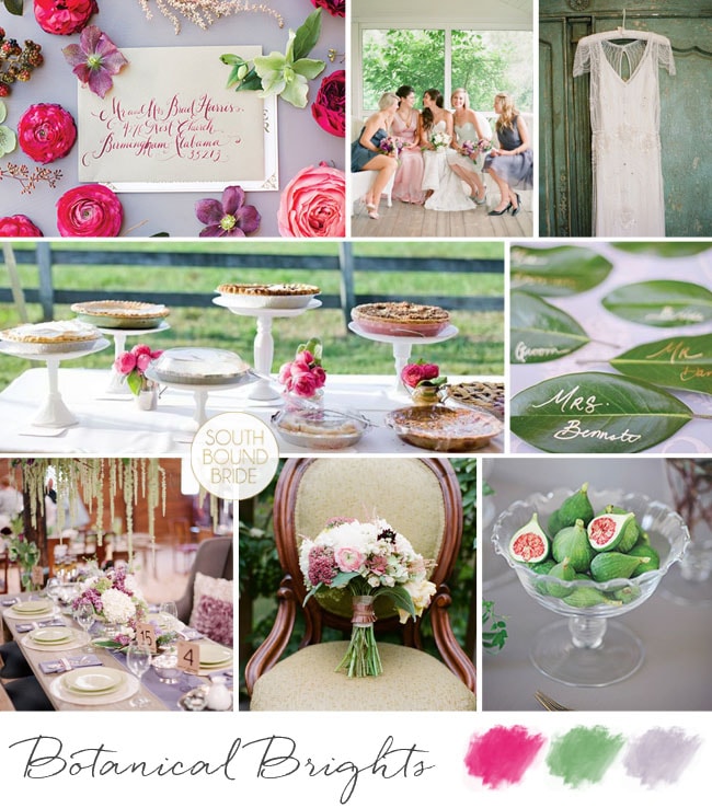
Happy Saturday, lovelies! Here’s our last inspiration board for the week, and while the rest have been reader requests, this one’s just for me :) One of my biggest sources of inspiration is the amazing online magazine Magnolia Rouge, and in the last issue, one of my favourites was a gorgeous bouquet recipe photographed by Annabella Charles. I absolutely loved the mix of cool green, soft pinks and purples and a pop of bright fuschia, as well as the botanical feel of the bouquet and the feature. Botanicals are a big design trend in weddings this year (more on that soon) but while most botanical looks feature muted colours, I was inspired to create a board that incorporated both the delicate botanical look and that beautiful dash of bright colour. I love it – hope you do too!
Well, I promised you folks a week of inspiration, and that’s exactly what we’re delivering! After this morning’s colourful wedding, this afternoon we’re concentrating on just the one colour – the only colour this year dahling, Pantone’s 2013 colour of the year, emerald green. Reader Heather wrote to ask for an emerald board for her spring wedding in New Orleans. As it’s a destination, Heather and her fiance plan to incorporate maps and a travel motif, but they want to keep things simple and elegant. So I’ve kept travel details to a minimum, with a map guest book and other subtle touches – a little globe, postcard-style escort card tags, antique map boutonnieres for the guys and super sweet vintagey favour bags. Combined with lace and the deep emerald shade, it creates the sort of vintage feel Heather wanted, and has a nod to travel without feeling themey. Flowers are kept simple white with prominent foliage, as are the boutonnieres, and the bridesmaids wear emerald dresses with emerald shoes for the bride. For the tables, a lace runner is perfectly pretty, with a variety of small arrangements in different vases. It works, doesn’t it? Yay for emerald. Hope you like your board, Heather!
PS Photographers, if you really want to be inspired, come back in an hour when I’ll be giving you a sneak peek of what’s to come on our EdWed shoot! It’s GOOD. :)
Good morning, friends! Who’s ready for an inspiration-filled week? Well, I hope you are, because this week we have not one but FIVE reader requested inspiration boards to share with you. That’s a different board every day, and five different looks to fall in love with. And that’s alongside our usual raft of loveliness, so get ready to get in trouble with your IT department for stopping by SBB at least twice a day! ;) (Of course, if that’s a problem, you can always subscribe via email.) So let’s get started! Today’s board is for reader Ashley, who’s planning an autumn wedding at a lake house in Minnesota. How romantic does that sound? And romantic is the right word for the palette she’s chosen (LOVE): navy, mint and blush. Most autumn palettes are warm, but this combination of cool shades makes me think of those first chilly mornings by the water (how I miss my river runs!). Ashley’s theme for her wedding is ‘happy, love, best friends’ and she wants a mix of classic, vintage and casual comfy. I think we’ve struck the right balance here and I love the typographic elements – the invitation using the ‘today I marry my best friend’ quote and the thank you card at each guest place. The final result is soft but a little preppy, and very very pretty. Hope you like your board, Ashley!
It’s inspiration board day, and I have a little feeling you guys are going to looooove this one. First off, mint and peach are pretty much a combination made in colour palette heaven, and they just happen to be what I think will turn out to be the colours of the year. Peach brings warmth (but gentle, like) and mint brings cool with a hint of sweetness, like a sip of ice-cold lemonade on a sunny day. Reader Tam wrote in to tell me about her wedding using these colours, and she used words like ‘relaxed’, ‘romantic’, ‘elegant’ and ‘less is more’. With beautifully rustic Rockhaven as her summer venue, I immediately pictured a wedding that was soft and flowey (for want of a better word!) – very much Beth Helmsetter/Style Me Pretty/Jose Villa. Flowers are important, and I adore both the bouquet and the table arrangement on this board (notice how apart from the lemonade, the flowers do most of the work on this table – gorgeous cutlery, crockery and other details become a bonus rather than the main event). Bridesmaids wear long, loose dresses in peach, with a garland for the flower girls (who I’d put in simple white cotton dresses and leave barefoot). Guests are served cool cocktails and iced biscuits, before having their photos taken in front of a pretty mint ribbon backdrop in the gardens during cocktail hour. For the stationery, I’d definitely make use of the current trend for hand-painted watercolour – less is definitely more in this stunning suite. The concepts are simple, the execution is perfect, and it all adds up to a shedload of pretty. Hope you like your board, Tam!
Good morning, lovelies! I hope you had a fantastic weekend. I’m back from Abu Dhabi, feeling chilled out and even a little tanned, and ready for the week ahead. I’m still catching up from my jetsetting, and getting used to being four hours back again. But that aside, travel is just my best thing, and appropriately, today’s inspiration board is all about travel! Today we have another reader request, from German reader Esther. Now how’s this for an international tale of love – Esther and her Swiss fiance met in Buenos Aires (how ironic, when their home countries are so close together!) and they’ve decided to get married in Cape Town, which I obviously think is the best idea ever. Esther loves a bit of old fashioned elegance, and she wants to bring both Brazil and Africa into their design. She adores succulents (and succulent green) and would like to accent this with orange from pincushion proteas as a tribute to South Africa. Love this! I’d work with a neutral white backdrop, with bridesmaids in soft green and bold bouquets (but otherwise keeping the orange fairly soft). I’d also incorporate the elegant vintage with a travel theme, including maps, a globe ‘guest book’ and postcard escort cards. There are some really lovely Argentine traditions Esther can include – first off, the cake pull (where ribbons are baked into the cake, one with a ring attached, and all the single women pull them out in order to find out who will be married next), cocktails (although I’ve borrowed the pictured peach caipirinhas from neighbouring Brazil), a tango first dance and carnival carioca (where, late at night, guests don hats and props and have their own little carnival on the dancefloor – a perfect double use for your photobooth props!). It adds up to a sophisticated personal tribute to the couple’s history, rather than a theme party. Hope you like your board, Esther, and welcome to our beautiful country!
Happy Monday lovelies! As you read this, I’ll be arriving in sunny Abu Dhabi – how exciting! It’s been ages since I travelled anywhere (or saw the sun!) and I can’t wait. So forgive me if I’m not on email/Facebook much this week – although the blog will continue as usual, starting with this lovely inspiration board for a lovely reader who has chosen emerald and grey as her wedding colours. I’m so excited to see you guys embracing the colour of the year! I’ve been seeing everything from emerald and aqua to emerald and gold all over the place this fortnight, but not so many grey pairings. Since I didn’t know anything else about the wedding design, I thought it would be good to show how you don’t always need to use blocks of what is in fact a very strong colour in order to use it. For this palette, you’ll find emerald in some of the stationery, in the frame of a window used for table names, and in the groomsmen’s ties, but all the rest of the emerald comes from more organic sources like glass and foliage. A touch of rosemary on a pretty grey napkin, a bit of greenery at the back of a chair, a beautiful bouquet. Everything else is white and grey, and I think it looks so elegant, don’t you? If you’d like to make a statement, I love the idea of the bride putting on a second, emerald dress later at the reception, but actually I think this is quite a simple look to get right. Although my love for calligraphy is clearly going strong! Hope you like it friends! Will any of you be using 2013’s colour of the year in your palette? (If you’d like more emerald ideas, click here.)
Well, I didn’t see this one coming. After two years of warm colours – honeysuckle pink and tangerine tango orange specifically – Pantone’s just named Emerald as its colour of the year. It’s dramatic, it’s rich, it’s formal, it’s a little bit old school… and it has totally grown on me. Seriously, when I thought about it, it totally made sense. In the last year I’ve seen a couple of emerald wedding dresses, and every time it has caught my attention. Then I featured this engagement shoot, with the most gorgeous green Gucci dress. And this graphic Gucci and gold inspiration board:
Hidey ho, neighbours. How was your weekend? Mine has been absolutely chokka with work, and a separate project I have on this November which has really been taking me back in time a bit to a year I spent teaching English in Milan… really wishing I could just jump on a plane and spend some time in my second favourite country again! Anyway, we’re transporting ourselves somewhere else completely today, to tropical Colombia, where lucky reader Clara will be getting married at a restaurant venue. She’s chosen mint/aqua, coral, gold, ivory and white, and I have to say, I don’t think she could have picked a more perfect palette. It’s just the right mix of tropical, modern and romantic. My first find was the stationery set below, which I am completely in love with, and which I think completely gets across the location and the colour scheme. I also love the idea of adding in some fun tropical touches, like coral bands on the napkins and this cute enamel statement octopus ring – maybe a fun accessory for the bridesmaids, in their coral sundresses. Clara also likes shabby chic and lace, and while it’s not always easy to mix this with tropical, I’d do it using pretty tea glasses with coral roses, a fringe garland (why not include lace in this?) and a ruffly dress. The flowers are also a lovely mix between classic and tropical, and I love the bold use of a flash of gold. For the tables, I’d keep things simple – maybe using a nice print (chevron or stripes always work well) in the mint or aqua shade, with gold cutlery and glassware (or just keeping to simple white tables with beautiful stationery accents at each setting for a more sober look). Clara also asked about using flowers for the church and the restaurant and I think she has a few options, depending on the size of the party. If it’s intimate, I’d use smaller arrangements in the church placed at different heights, and then re-use these along the table (even bridesmaids’ bouquets can be placed in vases and double up as reception flowers). Or, if you’re going for big statement pieces in the church, place these standing or on stands around the reception and keep table flowers more simple. Finally, you could keep things very simple in the church – maybe forsaking flowers completely and using lots of candles, for example, and save the flowers for the reception. There are no hard and fast rules – do whatever your budget and wedding size allow. Hope you like your board, Clara, and good luck with the rest of your planning!
Time for our second inspiration board of the week, and it’s another in your new favourite colour combo of pink and green. Who can blame you ladies for loving it though – it’s the perfect combination of pretty and calming. For this board, bride-to-be Lana asked for inspiration for her game farm wedding – she wanted it country, romantic, vintage and South African. This is such a classic look, and I’ve tried to add some chic homegrown touches to the basic country vintage palette. For example, pretty tin cups with a sophisticated silhouette, a hand-drawn invitation, Skinny La Minx fabric napkins, and of course proteas. For the vintage touch, I love these crocheted cap sleeves and lace chair covers, soft pink bridesmaids dresses and roses. Add in some mismatched containers with pink and green flowers and succulents on the tables to add a country green touch, and you have the prettiest of South African weddings! Hope you like your board Lana – and thanks for your patience!
If there’s one colour palette that seems to be winning out for the next South African season (judging by your emails, anyway), it’s a combination of soft pink and pastel green. And who can blame you ladies for picking it? It’s classically romantic, feminine and fresh – everything that a sunny spring or summer wedding aims to be. Lovely reader Riette, who’s getting married at the gorgeous De Uijlnes, has been waiting patiently for her SBB board, and here it is: a rustic and romantic summer farm wedding. Riette asked for some DIY touches and at first glance this may not seem particularly DIY since I haven’t gone for a handmade/craft look (see here for an example of this in the same colours) – however, many of the elements I’ve included can actually be easily DIYed. For example, those frosted fruits make an amazing feature, but can be created in your own kitchen (tutorial here) and birch bark vases and stands are another easy DIY. Buy plain brown card and a white gel pen for lovely place cards (or buy a simple calligraphy font online and print on brown paper if you’re not confident about your handwriting). Coloured pink glass makes a big impact (if you can’t afford to hire coloured wine glasses for every guest, you’ll still get a lot of mileage out of coloured glass candlesticks or vases) and so do delicate delights like pretty pink cupcakes and pink lemonade. But my favourite element is the blush pink wedding dress – many beautiful blush options are on the market now, and it makes a real impact without being matchy matchy with your decor. This elegantly rustic combo will look classic for years to come. Hope you like your board, Riette!