Inspiration Board: Once Upon a Time

Good morning, lovelies! Before we get to today’s inspiration board (which I have been saving rather impatiently for you), I have good news and bad news. Let’s start with the good. Last week, I was absolutely thrilled and honoured to be included in a list on the Fair Lady blog of FL’s favourite tweeters! Not only is it always super satisfying to know that people like what I do here, but you guys, I grew UP reading Fair Lady. When I was a little girl, I would read my mother’s old stack cover to cover and my secret teenage fantasy was to work there one day. So this was extra special supery dupery exciting. It rocked. Merci, FL. (And if YOU don’t follow me on Twitter yet, do!)

Now the bad news. Sigh. I regret (and I really do mean regret – remember I’m an editor by trade, so missing a deadline totally cuts me up, especially when it’s one I set myself) to tell you that the new Cap Classique website will not be launching at the beginning of December. Unfortunately, some technical issues that I have no control over have got right in the way, and while the delay is only about 10 days, with Christmas coming, it only makes sense to put it off until January. Which kind of blows, but when I thought about it, I decided it was kind of cool. New year, new site, new everything. I really am disappointed, and sorry to keep you all waiting. I hope you won’t mind waiting just a liiiiiittle bit longer. Although, now that I’ve had to rejig my whole schedule for December, I do have something quite cool up my sleeve, which you’ll hopefully like. So there you go. Please don’t hate me!

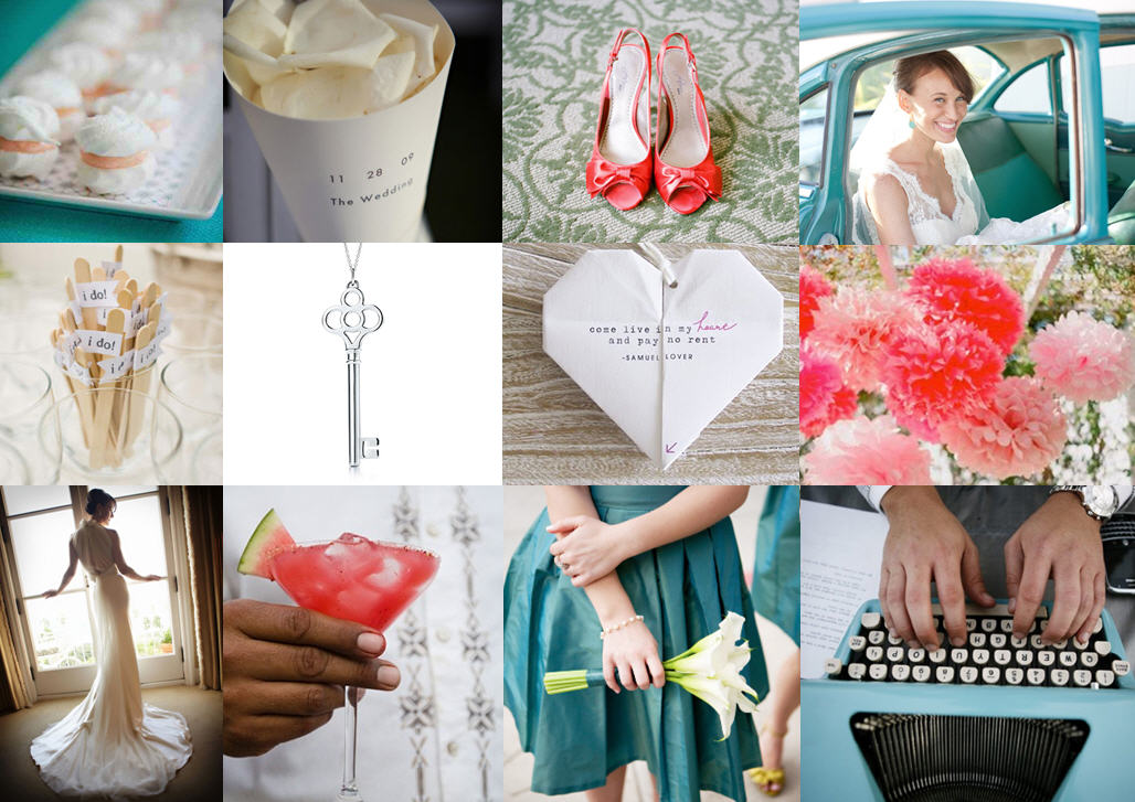
And now, before I get all depro about this again, I am going to cheer us all up with some sparkle. YAY! As you know, gorgeous colours mixed in with metallics have been huge news this year, and I think we’ll see lots more of that this season. Here’s my little take on a sort of royal wedding/princessy theme, which includes my current colour obsession (navy) combined with the prettiest powder blue, champagne and then some sparkly metallics. I can’t get enough of it! It’s almost enough to make a grown woman believe in fairytales… ;)

Colours: Navy, powder blue, champagne & gold

Top row (l-r): Princess bride; navy and gold manicure; table setting (Jill La Fleur/Jose Villa); navy bridesmaid’s dress (Kristin Vining); wedding cake with crown (Jose Villa)
Row 2: ‘Believe’ gold letters; blue and gold sequin garments; metal crown; mini Moets
Row 3:‘Once upon a time’ invitations; place setting with pumpkins (Martha Stewart); bride & groom (The Brand Studio); ‘Happily ever after starts here’ sign (Studio Eleven)

Inspiration Board: Burlap & Blueberry

Good morning! How was your weekend? I spent mine on a massive organisation kick – moving into my new office, and trying to implement a system for getting things done. Although the To Do list is massive, it’s actually really empowering to feel more on top of it all! One thing on this weekend’s task list that didn’t take me very long to complete was this little inspiration board, because I’ve been dreaming it up for ages. I am totally smitten with navy at the moment, and while I do adore a nautical wedding, there are so many other ways of using navy as a wedding colour. One of my favourite is to combine it with burlap or hessian for a stylish cross between preppy and rustic that I am just crazy about. And of course blueberries make the perfect country motif. I am dying over the blueberry bouquet below (okay, those are probably choke or elderberries, but they have the right look – your florist may be able to achieve something similar with ivy or similar, and make sure to have them wrap it in twine for the perfect rustic detail) and the blueberry cups – such a sweet dessert, or leave one at each place setting. Printed burlap elements give that extra preppy edge (don’t you just love the date ring pillow?), as do the striped navy napkins. Kraft or corrugated paper also work really well here alongside the burlap. And of course, what would a farm-style celebration be without strings of bunting and fairy lights? (Best news – the bunting invitations come from this free template!) As always, it’s the tiny details that make a big difference – matching burlap rose and boutonniere for the bride and groom, and navy nailpolish for the bridesmaids (where do I find that? sign me up). You could introduce other colours – a soft pink, coral, yellow, or green would all work, but I like the cleanness of this simply stylish palette.

Colours: Navy, white and beige

Top row (l-r): ; Blueberry ring shot (Jamie Delaine); burlap place mat (Amy Karp); blueberry cups
Row 2: Burlap Save the Date ring cushion (Shawn Connell for Christian Oth); navy and burlap garland (Domestic Construction/Max Dworkin); blue bunting love birds invitation (EE photography/Wedding Chicks); striped navy napkin and 3D glasses (Domestic Construction/Max Dworkin)
Row 3: Bride & groom (Jodi Miller Photography); blueberry bouquet (Oasis Flowers/Sakura Photography); barn (Stone Crandall Photography)

Inspiration Board: Burlap & Blueberry

Inspiration Board: Santorini Dreaming

Morning everyone! Or, should I say, kalimera, since I’m sunning myself in the Greek isles as we speak. Just me, a stack of books, the sea and a sunlounger (plus my lovely friend Michelle, of course). But before I left, I prepared this little slice of Greek inspiration for your Monday morning. I’ll actually be in Crete, which has quite a different vibe, but when I think of Greek inspiration, I picture the gorgeous rich sapphire of the roofs of Santorini (which is still on my dream travel list), and I think it would be gorgeous – used sparingly with acres of floaty whites and glitzy gold – at a (big fat Greek) wedding. Add texture with that most Mediterranean of foliage, olive branches – formed into a simple bouquet, arranged in urns, or even spraypainted gold for opulent feature pieces. Use blue for details like glass goblets and chargers, and bridesmaids’ dresses if you can match the fabric (otheriwse go for more white or pale blue). Needless to say, this is a dream for any bride to dress – most designers now have at least one Grecian-inspired piece, and you can combine this with pretty gold sandals and hair accessories worthy of a goddess. Make sure to serve some of the wonderful Greek cuisine and break a few plates after shots of ouzo. Opa!

Top row (l-r): Santorini roofs (Style Scrapbook); sandal; Greek menu board; Greek isle-style letterpress invitation (Bespoke Letterpress Boutique)
Row 2: Grecian hairstyle from Gossip Girl; bridesmaids in Santorini blue; gold olive centrepiece (); place setting (Alchemy Fine Events & Invitations/Jill Thomas Photography); chair back (Alchemy Fine Events & Invitations/Jill Thomas Photography)
Row 3: Santorini wedding (Punam Bean); olive bouquet (Punam Bean); donkeys (J. Cogliandro); bride and groom (J. Cogliandro).

Inspiration Board: Message in a Bottle

Happy Monday lovelies! I’ve been dreaming up this inspiration board for months, ever since I saw the line of dresses in the second row. I just love how the soft pinks and blues work with beach neutrals and a touch of dark grey, and it reminded me of a beautiful beach sunset. There’s a dreamy, castaway feeling to this palette, and it would make for the most romantic of seaside weddings! As always, the key is in the textures – a billowy bride’s dress, fabric floating in the breeze, and coloured glass, contrasted with rustic touches like raffia, coral and shells, and indigenous foliage like brunia. I’m obsessed with the astilbe bouquet, and I think it would be perfect to complete the look. Plus, don’t you love the sailor’s knot favours/escort cards? I pretty much just want to dive into this board and stay in it forever. If only… ;)

Colours: Pastel pink, blue, white and slate grey

Top row (l-r): Beach sunset with boat (Millie Holloman); sailor’s knot favours (Simply Bloom Photography); couple on beach (welovepictures); bottles (Millie Holloman)
Row 2: Dresses (Lane Dittoe); astilbe bouquet (Windy Dougall); urchin place setting (Elizabeth Messina); cake (Elizabeth Messina); torches (Elizabeth Messina)
Row 3: Couple with banners (Bella Sera Event Design/She Wanders); map (Bella Sera Event Design/She Wanders); flowers (Simply Bloom Photography); ceremony seating (Elizabeth Messina).

Inspiration Board: Aqua & Rose

Happy Monday, lovelies! I have so much goodness coming your way this week, it’s going to be like awesome real wedding palooza. But first, I have a very special inspiration board. This one was created especially for one of our readers, who wrote to me for some help a couple of weeks ago. She wanted a pretty, romantic look for her wedding at a beachside venue, and she wanted lots of white and aqua for her bridesmaids, but she wasn’t sure if she should introduce any other colours. Although aqua and white on their own are lovely, I always think the addition of another colour adds more dimension and gives you more options when you’re sorting out your details. There’s so much that goes with aqua – coral, lemon yellow, pretty taupe neutrals, for example – but the couple’s favourite was a mixture of aqua with rosy pink tones, inspired by the gorgeous image top left. So here’s the rest of what I came up with – light, clean and very romantic!

The key to a look like this is to base everything on a white on white palette, so that you don’t overuse the bright pink and aqua shades – you can also bring in a bit of grey or silver to help. Chantel wondered if a grey or silver damask may work for the tablecloths, and it would, but I think only if it was very subtle (as lovely as damask is, it can really dominate when used in black and white, for example). I’d suggest runners or square overlays as an alternative, and for this palette you could use pretty Cath Kidston-style prints like the pattern seen below from photographer Christine Meintjes’ gorgeous aqua and pink wedding. To bring in the aqua on the tables, I love the idea of using milk glass (or, if not actual milk glass, then glass containers spraypainted white and differing shades of aqua as in the original picture). So pretty! I also added in some beachy touches with shells and starfish, or you could get hold of some pretty white urchin shells or similar, just for a little bit of beach appeal (starfish may make a lovely motif for a romantic beachside wedding). Another place to bring aqua in is in the bride’s shoes (love these ones!) – another pretty little pop of colour alongside the bridesmaids’ dresses, without going overboard. Keep everything soft, especially the flowers (thinking peonies, roses, carnations –  maybe with a few anemones for extra visual interest). I also think the ombre trend I spoke about last week works beautifully here – in invitations that have a beachy, washed out look, in pretty cake slices, and in pink flowers that graduate from deep pink to pale pink. For a final, beachy fun touch, have an ice cream bar where guests can create their own cones or sundaes at cocktail hour (or late at night). Or why not try the absolute latest trend and have classy jelly shots instead?

Colours: Aqua, pink, white, grey

Top row (l-r): Milk glass containers with flowers; Vera Wang wedding dress (Jose Villa); shell with napkins; bride & groom (Nakai Photography)
Row 2: Valentino aqua shoes; starfish place setting (Mike Adrian Photography); table decor (Julie Lim); milk glass vases (Shay Cochrane); pink ombre cake; beach hair style (First Comes Love Photo)
Row 3: Wedding party; aqua ombre invitation; pink flowers; ice cream cones

Inspiration Board: Spring Daffodils

When you think ‘Spring’, what do you think of? A host of golden daffodils? Too right, Will Wordsworth. Daffodils are just about the most Springey flower I know, with their fresh yellow colour and buttery soft petals. I heart them big time. And I know Easter’s over, but when I started putting this yellow and aqua inspiration board together this morning, those symbols of happiness and new life kept sneaking in there. I think this would make a gorgeous theme for a Spring wedding in South African September or an Easter wedding in April, with just the prettiest flowers on the block. Hope it gives you a smile this morning if you’re back at work (I’m not! Woo!) and that whatever you got up to this long weekend you had a lovely one! :)

Colours: Yellow, aqua and white

Top row (l-r): Daffodils in aqua glass; San Pellegrino Lemon drinks; egg basket; wedding dress (Jose Villa)
Row 2: Yellow shoes; lemon place setting (Hugh Forte); Easter chick (Abby Jiu); aqua bridesmaid’s dresses (Jenna Davis Photography)
Row 3: Couple with yellow baloons (Adam LeSage Photography); aqua Hunter wellies; daffodil bouquet; blue and yellow cake bunting; flower girl (Girl Friday Weddings)

Inspiration Board: Santa Fe Love Letter

I’ve been lucky enough to travel to a few places in my time, and I hope I’ll be able to add many more to that list before my time’s up. For most of them, I try to take everything in because I accept I probably won’t be back again, but there are some places that I love so much that I have to have a second helping. Santa Fe was one of those. A few years back I spent a week there for work, and fell head over heels for the desert – for the adobe architecture, the artists’ haven vibe and OMG the margaritas! It’s one of those places I wish I could have a chance to live in, just for a year or two, and it’s definitely on my return visit list. So when I decided to do a travel-themed board for today, Santa Fe just seemed like an obvious choice for me. I’ve gone for soft, muted desert colours, and of course, succulents (will the love affair never end?). I love the chilli ristra necklace and the papel picado garlands and I LOVE the idea of a bride wearing bold South Western turquoise and silver jewellery. And how pretty is the bouquet? But I think my favourite detail is the farolitos – paper bag lanterns that are a Santa Fe feature during the Christmas season and look amazing in bulk lining roofs, doorways and pathways or making beautiful patterns on the ground. Sigh. Somebody send me a plane ticket! ;)

Colours: Muted teal, green, turquoise, and sienna

Top row (l-r): Cacti; silver ristra necklace; bridesmaid’s dress (TripleCord Photography); papel picado garlands; succulent bouquet (Michelle Warren Photography)
Row 2: Succulent; adobe entrance; Georgia O’ Keefe painting; table setting (w. scott chester photography)
Row 3: Succulent hair decoration (Stephanie Williams); invitation; adobe with farolitos; turquoise bracelet (Twin Lens).

Inspiration Board: Curacao, Peony & Russet

This weekend I’ve been having a play around with the colours included in the Pantone spring colour lineup – love all of them! There are endless combinations to consider for your wedding, all fresh and pretty and effortlessly current. This is one of my favourites (and so easy to use) – trendy aqua always makes an impact, especially against the palest of pinks, and russet provides a great neutral contrast. It works perfectly with pretty garden wedding details, cupcakes, chandeliers, ruffles and, of course, peonies. (Will I ever get tired of these? Don’t think so!) Just add guests and sunshine for the perfect, laid back, happy day.

Colours: Blue Curacao, Silver Peony, Russet


Top row (l-r): Bridesmaids; peony bouquet; chandeliers
Row 2: Cupcakes, Just Married banner; aqua mason jars; chandelier invitation; aqua shoes
Row 3: Flower girl moustaches; bride & groom; dancing shoes; outside reception.

Inspiration Board: Toile & Rose

I’m feeling a bit of love for French wedding style at the moment so I put together this little inspiration board using one of my favourite patterns, toile, combined with touches of dusky rose and a hint of grey (which just goes with everything, doesn’t it?). I’m imagining a gorgeous French chateau, chandeliers hanging from the trees, wonderful food, fine wine… Sigh. Vive la France.

Colours: Navy, powder blue, rose and grey.

Top row (l-r): Blueberries; statue; book detail; rose button favours; toile fans
Row 2: Chateau; bridesmaid’s dress; gift bags; tablescape
Row 3: Croquembouche; gift tags; table with chandelier; DIY linen satchels.

Inspiration board: Aqua & watermelon

I had so much fun putting this one together! These shades of blue and pink really play off one another beautifully, and they have such a fresh, clean and fun feel about them. (They remind me of when I was a child, and my mother used to give me watermelon to eat in the pool since I used to get it all over the place. Yum!) They play off a simple white base perfectly, so use these pops of colour sparingly for maximum effect. I also like how the typewriter-style font for details like the confetti cones and the origami heart really ties this look together.

Colours: aqua blue, watermelon pink, white

Top row (l-r): Meringues; confetti; shoes; bride in car
Row 2: ‘I do!’ sticks; key necklace; origami heart; pom poms
Row 3: Bride; watermelon cocktail; bridesmaid; typewriter guest book.