Inspiration Board: Skipping Stones

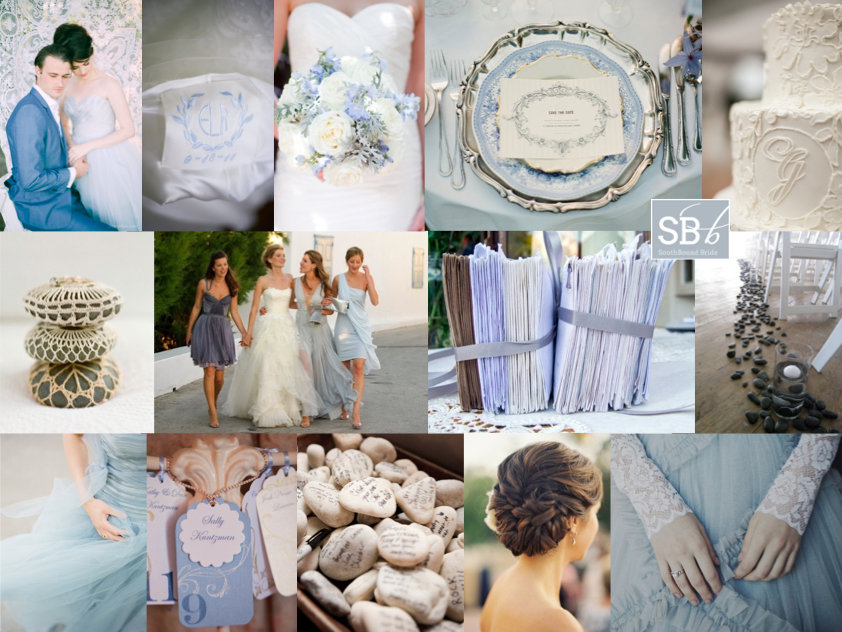
Sjoe. I have been getting more reader requests for inspiration boards than I can keep up with, but I absolutely love hearing from you and will get to as many as I can, so please do be patient! Our second board for the week is for Kelsey, who is planning a summer wedding at the college she and her fiance attended. I’ve seen quite a few college weddings on US blogs, and I think it’s a lovely place for a wedding – something I sort of wish we did in SA. Mind you, I don’t think you could pay me enough money to get married at the ugly shoebox that was the Stellenbosch arts building! Anyway, I digress. Kelsey dreams of a wedding that’s delicate, simple and romantic, and wanted to include both lace (because of the pretty vintage factor) and stones, because her fiance proposed while they were skipping rocks on the Boise River. How adorable is that? I love this sort of personal touch, and luckily I have come up with some really cute ideas. Kelsey’s palette is absolutely dreamy, and incredibly contemporary – light blue and light grey are such an of-the-moment colour combo. LOVE. I’m envisioning a classic wedding with some pretty but not too fussy touches. I adore the idea of a blue or grey wedding dress, but bridesmaids in these shades are just as wonderful, and I’d recommend bringing in quite a bit of sheer fabric if possible (also a big trend for 2013). The lace motif comes in through a lacy wrap for the bride, pretty lacy stationery (I wouldn’t use too much actual lace on the tables, to keep it unfussy), a lace decoration on the cake and even a lace backdrop for the photobooth. Flowers are mostly white, as is the rest of the table decor I’m picturing. (If Kelsey would like to keep it simpler, she could scale down that table decor.) For a vintage touch, I’d include simple details like ‘something blue’ embroidery, piles of ‘love letters’ tied together with ribbon (a new take on the book table decor trend), and how adorable are these crochet covered stones? The stone motif was the most fun to include – I absolutely heart the runner, because it reminds me a little of a riverbed (so appropriate here) but other ways to bring them in are though giving your guests wishing stones to hold during the ceremony, or stones to write on as a guest book alternative, stones inside hurricane jars with candles on the table, or even stones covered in clay with names stamped in as place cards (although not all at once please!). The end result is so pretty and romantic, don’t you think? Hope you agree Kelsey – good luck with the rest of your planning!

Colours: Powder blue & grey

Top row (l-r): Bride & groom {P: Ngg studios; S: Imbue Weddings}; embroidery; bouquet {P: Marta Locklear Photography; F: The Enchanted Florist}; table setting {P: Alicia Swedenborg; S: Vintage Honeymoon}; lace monogram cake {P: Juliet Elizabeth Photography; C: A Charleston Bride}
Row 2: Stones with crochet detail {P: Jose Villa; S: Joy Thigpen}; bride and bridesmaids {P: Costantine Delis for Vogue}; love letter decor {P: Briana Moore Photography}; stone aisle runner {P & D: Designs By Courtney}
Row 3: Sheer blue dress {P: Alicia Swedenborg; S: Vintage Honeymoon}; tags {P: Melissa Musgrove Photography: C: La Fete Weddings}; stones guest book {P: Lauren Kinsey Photography; C: Fete Weddings & Events}; hairstyle; lace cover-up {P: Samm Blake}


Inspiration Board: Denim & Berry

I’ve been focusing on reader requested boards for a while, but today I wanted to do one of my own that’s been brewing in my mind for a few weeks now. South Africans might be celebrating spring, but here in London it’s gone straight into winter, with casserole weather pretty much all of last week, boo. With that chill in the air, my thoughts begin to turn to rich cold season colours, particularly beautiful winter berries, and I’ve paired them here with dusky blue denim. I absolutely adore the idea of denim runners or napkins (ever since I featured this amazing wedding that did it), plus it’s a very of-the-moment colour (see the latest Pantone report, for example), so there’s really no better time for denim to smarten itself up a bit and have a wedding style revival. I’ve softened it up with some whimsical letterpress and charcoal accents, as well as the fresh berries and a tiny touch of gold. Doesn’t it look surprisingly spectacular?

Colours: Monaco blue, dusk blue, plum, violet & gold

Top row (l-r): Rings & denim {Levi Strauss}; bride with bridesmaids {Erin Hearts Court}; bowtie escort cards {Martha Stewart}
Row 2: Purple shoes {Lillian & Leonard}; letterpress invitation {S: Cynthia Warren}; cocktails with fresh berries {P: The Nichols Photography; S: The Nouveau Romantics}; chalkboard menu {P: Lauren Wakefield Photography}; groom in demin suit {P: Tec Petaja}
Row 3: Outdoor table with strings of lights {P: Jimena Roquero Weddings; C: KOMODO Producciones}; bride and groom with bougainvillea {P: Tec Petaja}; denim-style napkin {P: Olivia Leigh Photographie}

Inspiration Board: Trading Post

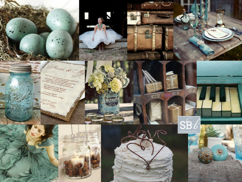
Okay, I have to tell you, I’m in love with this board. Which is a surprise, because turquoise and chocolate hasn’t always been a favourite combination of mine. I think it’s because I’ve seen it done tacky too many times, but when bride Klarissa wrote to tell me about her wedding, I knew this girl had style. After all, she chose an awesome venue – Searle’s Trading Post in Greyton. It’s super quirky and rustic and fabulous, and Klarissa knew well enough to work with its eclectic feel and just accent it with her colours. I adore the idea of a trading post ‘theme’ – a mix of found objects and rustic textures like wood and burlap. I started thinking about the sort of things you might have found at a trading post (or at least ones you might have found at my fantasy imaginary one!). How about pretty birds eggs in nests, for example? (Love these for place holders, or as part of the table decor, and they’re a fun DIY.) Old tins full of flowers. Mason jars, old door knobs, suitcases. I stumbled across this image of a poshokkie (what is the English for that, anyway?) with brown paper packages wrapped up in string – wouldn’t this make an ADORABLE escort card display? I also loved the idea of string decorations (this SBB couple did this brilliantly) and a statement turquoise necklace for the bride. It’s kind of a case of ‘anything goes’, but natural textures are the key to making it work – fortunately in a venue like this one, Klarissa will have no shortage of them. Thanks for waiting patiently, Klarissa – hope you like your board as much as I enjoyed creating it!

Colours: Turquoise & chocolate brown

Top row (l-r): Eggs in nest {Pottery Barn}; bride with turquoise necklace {Intrikate Designs}; suitcases {Retro Images on Etsy}; table setting on rough wood {P: Courtney Dellafiora; S: Valerie Metrejean}
Row 2: Blue dyed mason jar; burlap backed invitation; flowers in vintage tin {P: Heather Saunders Photography; D: The Parsonage}; poshokkie; piano
Row 3: Turquoise dress; mason jars with acorns {Pottery Barn}; cake with string ‘love’ topper {P: White Wall Photography}; vintage doorknobs on burlap runner {S: Elissa Keno; P: Kellie Kano}.


Inspiration Board: A Preppy Romance

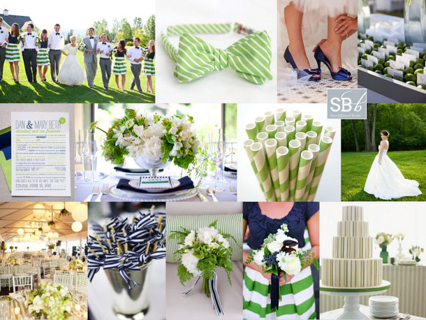
Happy Monday, folks! The inspiration board requests have been flooding in lately, and I’ve been having so much fun turning your ideas into collages. This week I’m featuring two reader request boards that couldn’t be more different (look out for the other on Friday afternoon), starting with this piece of East Coast summery goodness. Philani wrote to tell me about her colour scheme of ‘new leaf green’ (isn’t that the sweetest way of describing it?) and white with touches of bright blue (I’ve gone for a sort of royal blue here, but this could be lightened up as far as aqua if Philani prefers). She described her style as ‘plain but elegant, kind of less is more’, which together with her colour choice immediately made me think of preppy style. Think Jackie O. – simple elegance is what this whole look is about. Stripes are a key component, as are fabrics like cotton and grosgrain, and the look is surprisingly easy to put together, especially if Philani focuses on relatively clean tables with bright green flowers and punches of blue in the napkins or stationery. I adore these bridesmaids in tops and striped skirts, and groomsmen in bowties are a must! For the bride, a relaxed but formal dress – maybe a full skirt with pockets – would be ideal. Serve signature cocktails with striped paper straws on the lawn, and don’t forget lots of lovely ribbon! Hope you like your board, Philani!

Colours: Apple green, royal blue and white

Top row (l-r): Wedding party {P: Jacque Lynn Photography; D: Events by LMG}; green striped bowtie; blue shoes {P: Elizabeth Scott Photography}; escort cards in bed of limes {P: Mishelle Lamarand Photography; D: La Fete}
Row 2: Blue and green love story invitation {D: Hello Tenfold}; blue and green table arrangement {P: Studio 28 Photography; D: The Green Ribbon Party Planning Co.}; green paper straws; wedding dress with pockets {P: Crystal Genes Photography}
Row 3: Room decor {P: Sarah Rhoads Photographers; C: Party Resources}; cocktail sticks with ribbon {P: Love Life Images; D: Simply Chic Events}; green bouquet with blue ribbon {P: Studio 28 Photography; D: The Green Ribbon Party Planning Co.}; bridesmaid with green striped skirt and blue top {P: Jacque Lynn Photography; D: Events by LMG}; green striped cake {P: Mary Ellen Bartley; C: Bijoux Doux Specialty Cakes}


Inspiration Board: Pretty as a Peacock

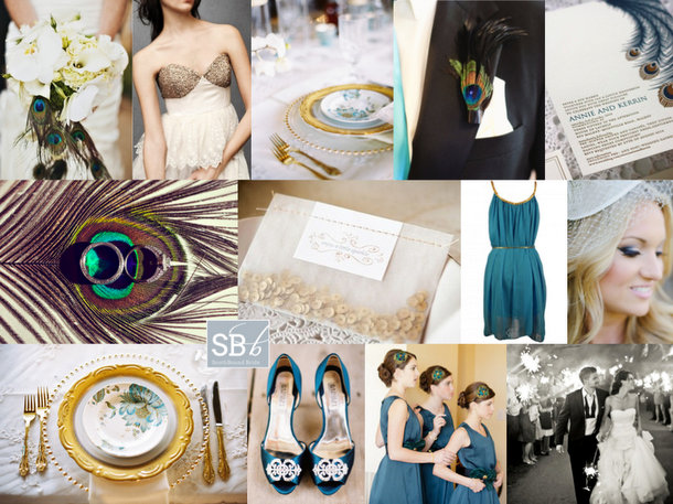
Afternoon, folks! We’re rounding off a pretty awesome week here on SBB with one more piece of pretty and awesome. I’ve been getting tons of requests for inspiration boards from all of you, so I’m working double time to try and create as many of them as I can. Reader Kristin has been waiting a little while for hers, but I hope it will be worth the wait! Kristin is getting married in a hall in summer, and she’s looking for turquoise accents to classic black and white, with peacock feathers and a general air of chic. Initially I was just going to send Kristin over to a board I created right at the very beginning of the blog (you can find it here), which was when the peacock trend was taking off. But then I thought about it, and I thought maybe we could bring the peacock theme a little more up to date. One option would be to go for a very art deco look – peacock was a key motif during the period after all – but instead I decided to add a bit of glitter to the teal, black and white palette – a look that’s very of the moment. The focus is less on actual peacock feathers – although they’re included in select spots: a boutonniere, with the bouquet, and on the bridesmaids’ headpieces – and more on beautiful peacock imagery. I am so in love with the place settings using peacock plates, gold cutlery and an ornate charger – if hiring this isn’t an option, consider a custom printed menu that fits inside a plain white plate, to give you a similar visual effect. I also adore the letterpress invitations pictured here – stationery is a great way to ‘brand’ your wedding in a sophisticated way. Add a bit of glittery texture – if not on the wedding dress (although I always seem to go back to this gorgeous wedding dress!) then maybe on one bridesmaid’s dress, and how cute is the little packet of sequin confetti? Teal/turquoise shoes and BM dresses are a must, but beyond that I’d stick to classic black and white. And there you have it. Hope you like your board, Kristin!

Colours: Turquoise, black, white & gold

Top row (l-r): Bouquet with peacock feathers {P: Jared Rey Photography; C: Gretchen Rose Events}; BHLDN wedding dress; peacock place setting {P: Ryan Ray Photography; D: Razzle Dazzle Event Decorating}; peacock boutonniere {P: Abbey Hepner Photography; C: GuGuLy Event Planning}; letterpress peacock feather invitation {Bespoke Letterpress}
Row 2: Feather with rings {Stacy Reeves}; sequin confetti {P: Greg Blomberg; D: Bows and Arrows}; teal bridesmaid dress; bride {P: Chrystal Cienfuegos Photography}
Row 3: Peacock plate place setting {P: Ryan Ray Photography; D: Razzle Dazzle Event Decorating}; teal shoes {P: Ryan Ray Photography; D: Razzle Dazzle Event Decorating}; teal bridesmaid dresses {P: Elaine Palladino Photography}; bride and groom with sparklers {P: Amy and Stuart}


Inspiration Board: Spring Pastels

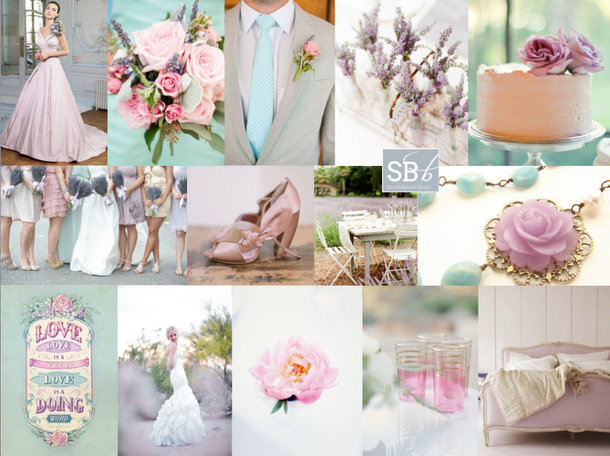
Good morning, friends! I hope you had a great weekend, and for those of you in SA, I know you will have been celebrating the official start of spring. I’ll try to ignore the fact that it means the end of summer for me here in the UK, and concentrate on a palette that is just perfect for a romantic spring wedding. It’s been a while since I played with lavender, and here I’ve paired it with one of last year’s hottest couples: aqua and rose. Don’t they make a lovely threesome? The purple really adds depth, and I love the little touch of vintage here as well. I’m imagining this in a garden, or at a beautiful farm, with clean white standing out against the soft colours. Dreamy.

Colours: Lavender, pink, aqua and white

Top row (l-r): Ian Stuart wedding dress; pink rose bouquet {F: Michele Tallent & Co.; P: Kate Connolly Photography}; aqua tie {F: Michele Tallent & Co.; P: Kate Connolly Photography}; lavender in vintage bottles {P: KT Merry; C: Sara Jean Events}; cake {P: Closer to Love Photography; C: Creamery}
Row 2: Mismatched bridesmaids {P: White Linen Photographers; F: Flowers by Antonella}; pink ribbon shoes {P: Elizabeth Messina; S: Catherine Sheppard of The Life Styled}; table in lavender field {P: KT Merry; C: Sara Jean Events}; necklace {Sora Designs on Etsy}
Row 3: ‘Love is a doing word’ {Karl Kwasny}; bride {P: Bumble & Bloom}; rose {P: Simply Bloom Photography, LLC; S: Simply Charming Socials}; pink tea glasses {P: Elisabeth Millay Photography}; lavender vintage bed.


Inspiration Board: Olympian Blue

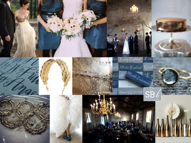
Hooray for Mondays, SouthBound Bride! And it’s no surprise I have the Olympics on my mind today. I was going to do a gold, silver and bronze board, but having just done mixed metallics last week, I thought I would focus on Olympian Blue, one of the beautiful colours from Pantone’s Fall 2012 lineup, mixed in with a bit of shiny gold, for obvious reasons. Hopefully there’ll be at least one gold to South Africa’s name by the time you read this! This blue is lovely and fresh, but it’s also quite intense, so I’ve added a light denimy blue in as well, and gone for a look that’s kind of a cross between urban and rustic, and just a bit Anthropologie. It works beautifully with the BHLDN dress top left, which I have been in love with for the last year. Another detail I absolutely adore is the calligraphed tiles for place cards (no surprise, an innovation from Martha Stewart). And for a final Olympic touch, there’s a pretty laurel-inspired gold headband. Hope you like it, and hope you’re all enjoying the games this week! (To find out more about the Pantone range and see some colour combos, check out this post.)

Colours: Olympian blue, pale blue, grey, gold

Top row (l-r): BHLDN dress {S: Alchemy Fine Events & Invitations; P: Mike Larson Photographers, Inc.}; blue bridesmaids dresses and anemone bouquets {C: Bluebird Events; P: Leo Patrone Photography}; ceremony backdrop {P: Jason Durnin}; gold cake
Row 2: Calligraphy invitation {Sycamore Street Press/Betsy Dunlap}; laurel headband; gold and white bunting; calligraphy tile place cards: topaz ring
Row 3: Olympic rings; blue shoes {C: Jenny Brown; P: Alea Lovely Photo + Video}; reception venue {P: Jason Durnin}; spraypainted bottles.


Inspiration Board: Sand & Stripes

Happy Monday, folks! I’ve been jonesing to do this inspiration board ever since I was myself inspired by this shoot in the latest Sweet Paul magazine (which you should totally check out if you haven’t already). You probably already know I’m a fan of nautical style, but I loved combining that with soft dirty orange and sand, for a wedding that would be equal parts beach rustic and South of France stylishness. Striped dresses for your bridesmaids (and peep toes for you), navy suits for the boys, and wooden tables right on the beach with flowers in soft corals and peaches. I can just imagine a bride in a chic short dress, and isn’t the rope hair accessory darling? (This post contains affiliate links)

Colours: Navy, orange, beige and white

Top row (l-r): Rustic outdoor table {S: Paul Lowe; P: Susanna Blavarg}; sailing boat {S: Green Wedding Shoes; P: Caroline Tran}; starfish; coral peonies {S: Summer Watkins}
Row 2: Navy striped sandals {S: Summer Watkins; P: Jen Huang}; invitation suite; sailor’s knot hairpiece {March & Lilly}
Row 3: Bride & groom; nautical wedding cake {Sweet & Saucy Shop}; navy striped bridesmaid dress

Inspiration Board: Sand & Stripes | SouthBound Bride

Inspiration Board: Cape Dutch

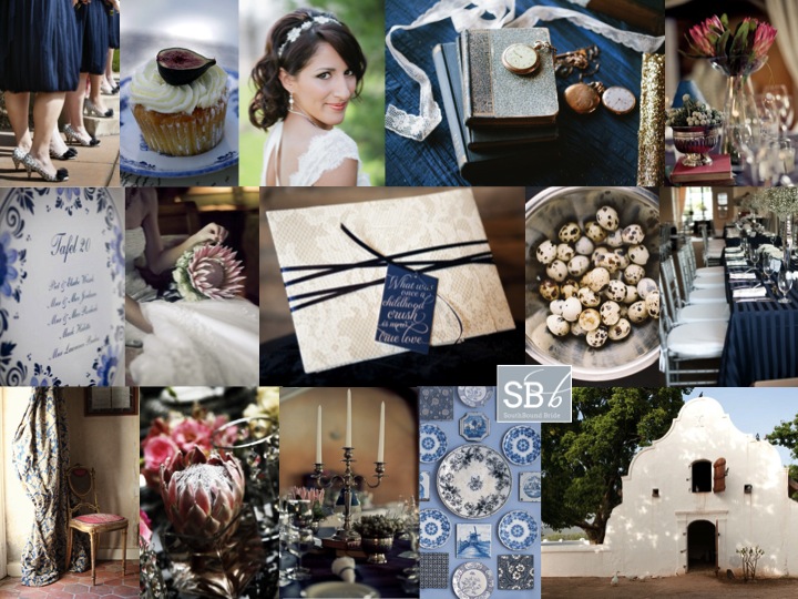
Oh I do love Inspiration Board Monday. These babies are one of my favourite things about running the site, and I’ve been getting lots of requests from you for boards for your weddings – keep ’em coming! Today’s scheme is one which is HUGE news in the South African wedding scene, and an awesome next step for brides who have loved the Victorian country vintage look of the last two years but want something slightly fresher. With this look, you can still use your proteas, still use your vintage touches, but instead of sticking to soft pinks and neutrals, you combine it with navy blue. My prediction is that you’ll see a lot of this colour next season. It reminds me a little of the Dutch still life themed tables which I have seen a few times recently, especially when combined with Delft pottery in blue and white. As I mentioned in my Love List this weekend, the look is particularly apt for the South African market, what with having so many wedding venues that include Cape Dutch architecture. Enjoy!

Colours: Navy, white, pink and neutrals

Top row (l-r): Bridesmaids’ dresses {S: Amy Bridges Events; Verite Photography}; cupcake; bride {S: Kirkbrides; P: Arielle Doneson Photography}; books and watches {S: Kirkbrides; P: Arielle Doneson Photography}; protea decor {P: Love Made Visible}
Row 2: Delft table plan {S: Aleit; P: Glee Photography}; protea bouquet {P: Love Made Visible}; lace and navy invitation {D: The Paper Guppy; S: Revel & Bloom; P: Trulife Photography}; quails eggs {S: Canvas and Canopy; P: Braedon Photography}; navy tables {S: Engaging Affairs; P: Liga Photography}
Row 3: Curtain and chair {P: Exhibit Emotions}; protea; table decor with candelabra {P: Love Made Visible}; Delft plates; Cape Dutch homestead {Babylonstoren}.

Inspiration Board: Mint to Be

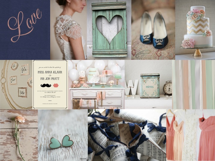
Good morning, everyone! Did you all have lovely weekends? It’s Inspiration Board Monday here on SBB, and I have to say, this might be my new favourite colour combination. I stumbled across it somewhere, and I knew I had to turn it into an inspiration board. There’s something about the way that coral and mint (two of the trendiest colours in weddings right now) work together that I just love, and when you add in navy it just has a whole new depth to it. I would have thought that it might come out a little retro or mod, but (while you could certainly use these colours that way) the board I’ve come up with is all sweet, slightly French shabby chic, with a touch of glam gold and lovely lace. Put your husband-to-be and his groomsmen in navy suits, and carry lush coral bouquets with your girls – the key to this look is knowing which of the colours to combine when, so that it doesn’t look too matchy matchy. Done right, this could make the prettiest of weddings.

Colours: Mint, coral, navy and gold

Top row: Love napkin {The Stationery Studio}; Claire Pettibone dress; heart shutter; blue shoes {Shewanders Photography via Wedding Chicks}; chevron cake {Erica O’Brien Cake Design}
Row 2: Table plan {via 100 Layer Cake}; invitation {Minted}; dessert table {Tracey Kiansky Photography via The White Library}; antique tin {Dreamy Whites}; ribbons {Andi Mans Photography and Design via The Wedding Chicks}
Row 3: Ranunculus {via Wedding Chicks}; mint heart earrings {Dariami on etsy}; confetti cones {Pink Cherry Mama on etsy}; coral bridesmaid dresses {Jose Villa via The Wedding Chicks}.

And don’t forget that you can request your own inspiration board by clicking on the button below: