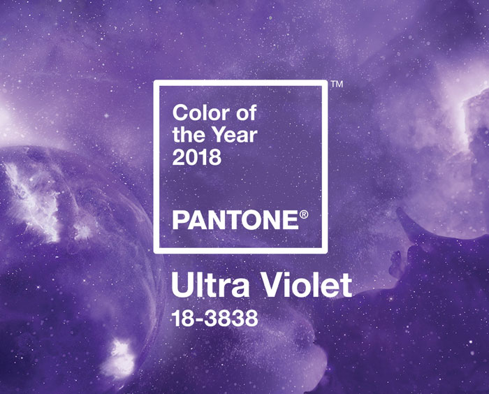
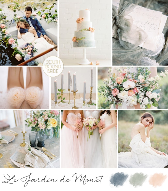
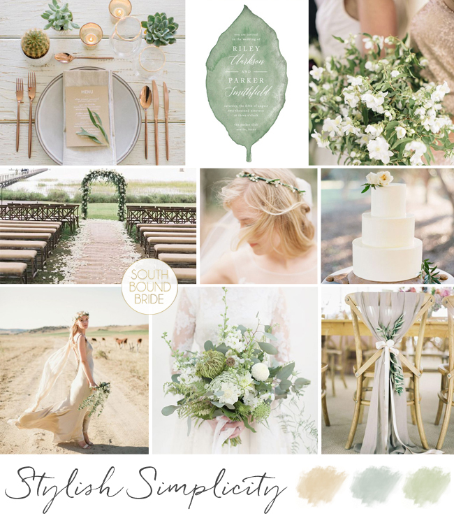
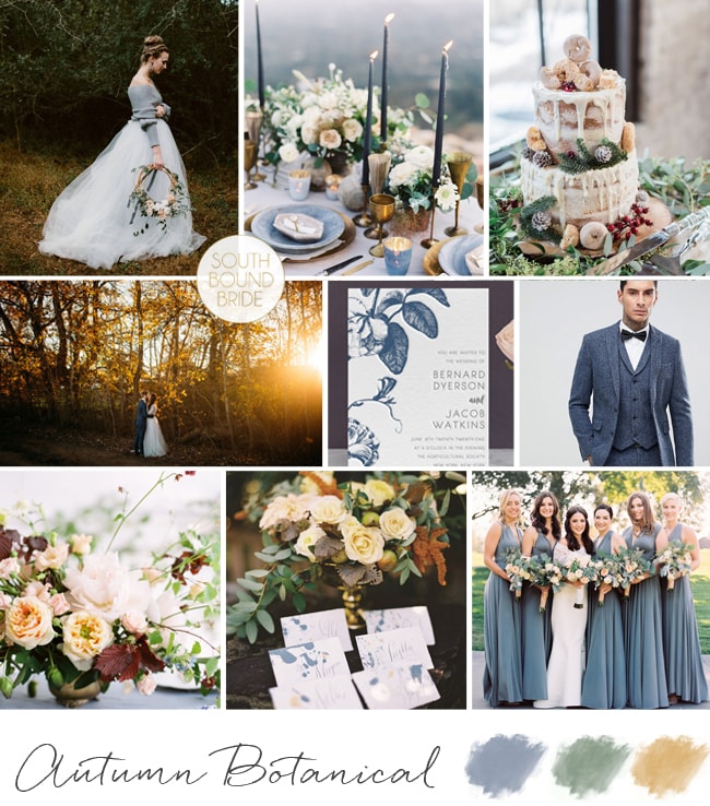
I think it’s time for me to finally admit defeat and acknowledge that autumn is here (actually, winter really, but at least we’re always a little bit behind in Durban, weather-wise!). And while I’m always super sad to let summer go, I do love the coziness of the colder months, cuddling up with my spaniel under a warm blanket, hot chocolate and cookies, hot baths, etc. And of course, the rich autumn colour palettes! As you know, I love a fresh take on a classic palette, so for today’s inspiration board, I’ve turned to one of this year’s quiet heroes: dusty blue. Millennial Pink and Ultra Violet might be getting all the press, but the more soft and subtle blue is everywhere, making a beautiful cool base for so many other lovely shades. And while it’s more closely associated with the other seasons, it works just as well for fall, especially when paired with other muted shades like a matte forest green and a very soft mustard, as I have here, for a fine art, botanical feel that’s a gorgeously fresh take on the autumn look. What do you think?
*Links in bold denote affiliate links. The cost to you remains the same, but SBB may receive a commission for any sales made.
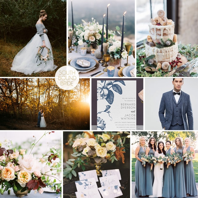
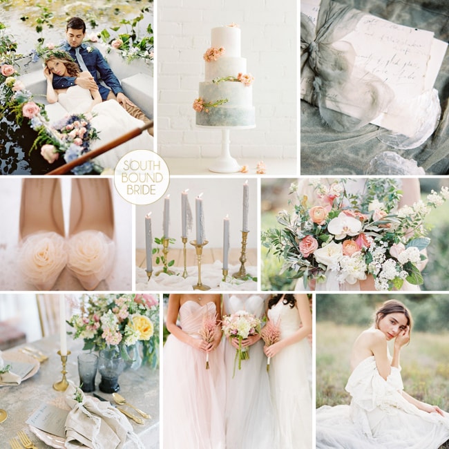
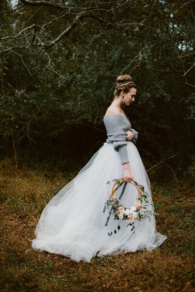
Top row (l-r): Elegant Autumn Bride (Heather Burris Photography/Amanda Blair by Design/Sweet Caroline Styles) | Tablescape (Sawyer Baird/TOAST Santa Barbara) | Semi-naked Drip Donut Cake (Tiffaney Childs Photography)
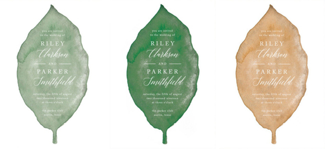
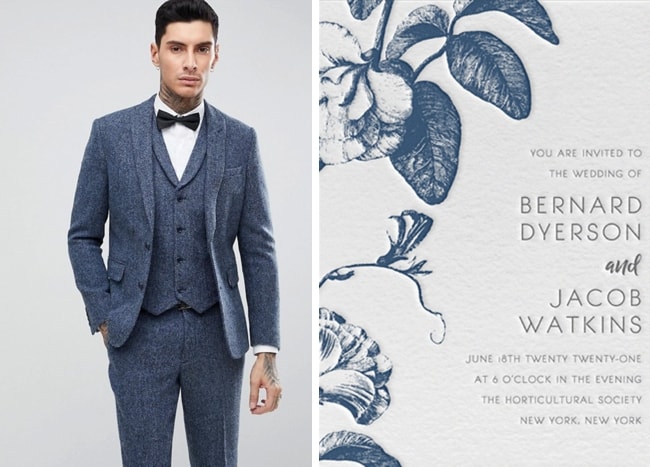
Row 2: Autumn Couple (Moira West) | Dusty Blue Botanical Wedding Invitation (Minted) | Blue Tweed Suit (ASOS)
Row 3: Centrepiece (Hannah Duffy Photography/Louise Beukes of BLOVED Blog/Bo Boutique) | Escort Cards with Flowers (Joey Kennedy Photography/Lora Kelley/Mallory Joyce) | Dusty Blue Bridesmaid Dresses (Erin Stubblefield Weddings and Portraiture/Magnolias)

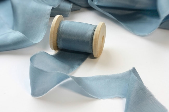
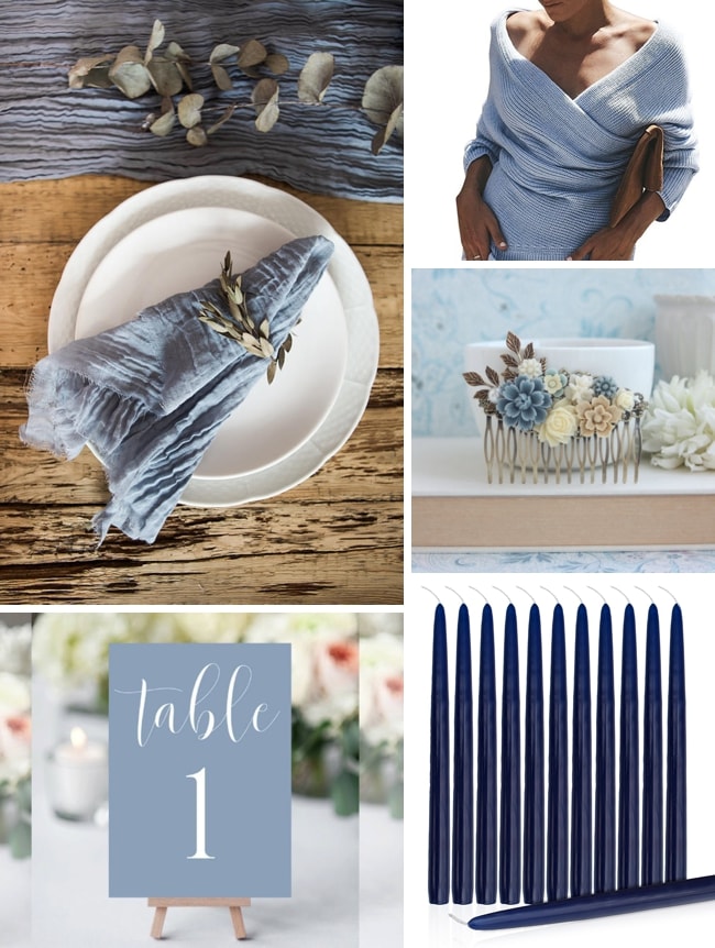
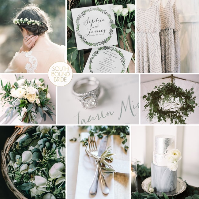
Row 1: Norma J Skirt in Slate by Sweet Caroline Styles | Row 2: ASOS Slim Suit in Blue Mini Check (left); floral noir Wedding Invitation from Minted (right) | Row 3: Gray Blue Silk Ribbon by Krasnova Silk | Row 4: Dusty Blue Gauze Napkins by Linen Lark (top left); Dusty Blue Printable Table Numbers by Heaven and Fifth Studio (bottom left); LAICIGO Womens Cross Wrap Off The Shoulder Sweater (top right); Dusty Blue Flower Comb by Marolsha (centre right); Elegant Navy Blue Dripless Taper Candles (bottom right)